Spotify beautifies
The streaming-music service modernizes with a cleaner look across its iPhone, desktop, and Web platforms, with some organizational and "Browse" improvements tossed in.


- Three Folio Eddie award wins: 2018 science & technology writing (Cartoon bunnies are hacking your brain), 2021 analysis (Deepfakes' election threat isn't what you'd think) and 2022 culture article (Apple's CODA Takes You Into an Inner World of Sign)

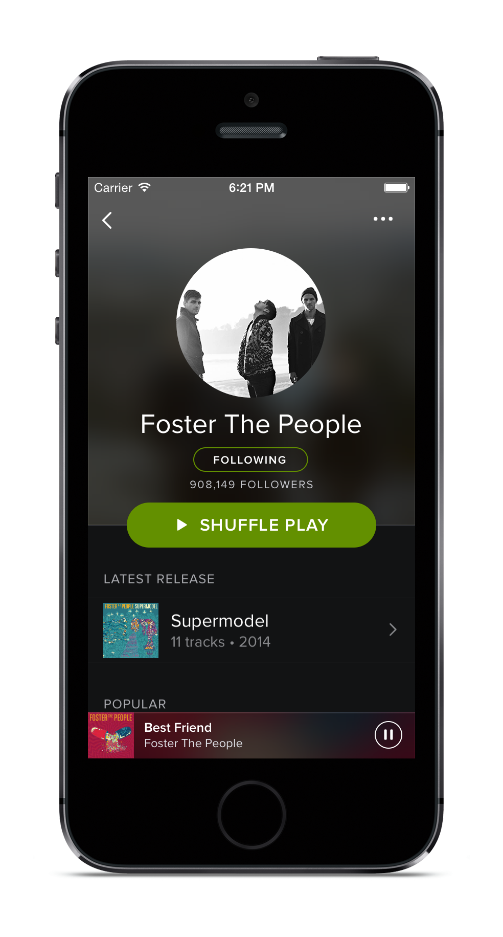
Spotify launched a new look Wednesday, with a darker palette, defused colorful panes of album art, and less visual distraction.
It's the first major overhaul to Spotify's look across different platforms in years, following the redesign of the Spotify logo last year and some sprucing up to certain elements more recently, like a fresh coat of (darker) paint on its desktop app late last year.
Since Spotify has risen to relative prominence in the US as a streaming music service after dominating in many parts of Europe earlier, its look has largely remained static while new competitors -- like Beats Music, for example -- have launched with more modern interfaces.
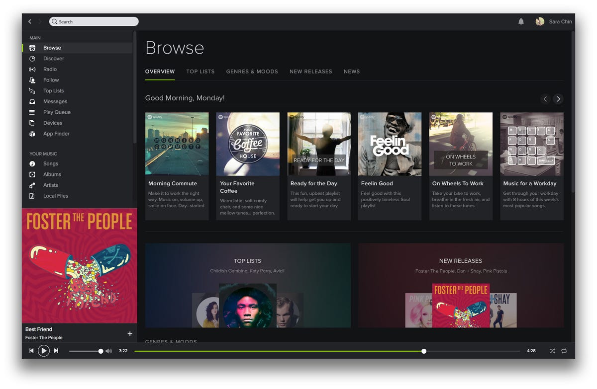
The company said it's also kicking off a Your Music section, which is designed to help you save an album or song you like to a personal collection, organize them, and browse your music more easily. It is also offering its "Browse" playlist section with "more relevant and localized content."
Michelle Kadir, Spotify director of product, told CNET that after Spotify launched a lot of features and rolled out to various platforms, the company wanted to take a step back and give a holistic, cohesive look to the service. She referred to a Swedish concept "lagom," which has no direct English translation but generally means perfect balance or "just enough."
The black theme came from user feedback, she said.
Dark Swedish winters may have had something to do with it too.