Slack's new logo is weird
Commentary: When you go from a "#" to a colorful splat, it's just strange.


What have you done, Slack?
Changing your well-known logo can be a risky move, and I'm still not sure if Slack's revision makes sense.
I came in on a Monday morning, fired up the work MacBook Pro , and found odd new icons replacing the familiar hash logo on my Chrome browser.
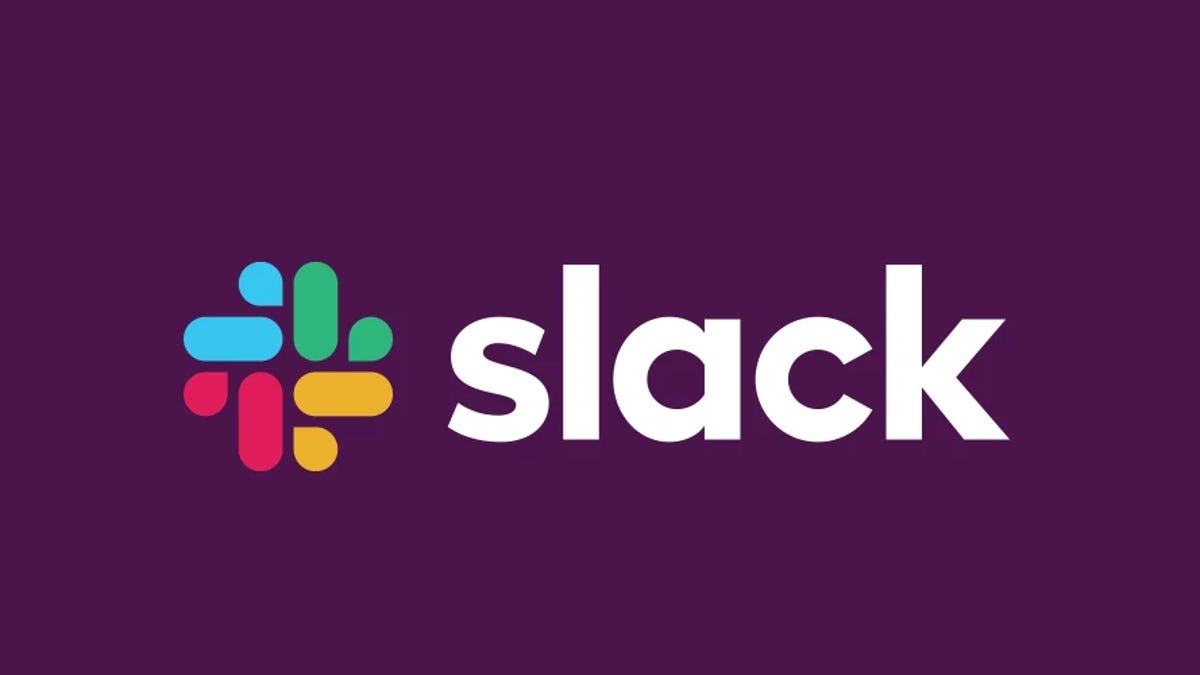
Slack, the instant messaging app that makes it easier to talk to your colleagues, had switched its logo last week to a brand-new one that well, kinda sucks.
If there's anything I really hate, it's the humid Singapore weather, but new logos are up there. Slack's new logo makes no sense. Why did the company replace the comfortable and familiar "#" logo with what looks like symmetrical spit?
Perhaps I'm turning into someone who hollers at young kids to get off my lawn, but Slack's new logo is, in my considered amateur opinion, ugly and uncomfortable. The old logo, based on the hash sign, did a great job in associating what the product meant.
The hashtag symbol has become representative of a conversation topic, a topic like-minded folks can chat to each other about. The new logo? Not so much. I mean, I wouldn't know what it's supposed to represent. Windmills, maybe? Ducks? Or even...
I know people at Slack, and I know they're smart, capable and caring people. But once you hear "swastika made of dicks" it's kind of over for the new logo.
— T Carter Baxter (@tbaxter) January 16, 2019
You’ll never unsee this new slack logo refresh pic.twitter.com/2qv2APkLG9
— Kyle 🤙 (@DesignByKyle) January 16, 2019
We all love ducks! 🐣🐥🦆 #slacklogo #slack pic.twitter.com/IhVlkyTg9a
— Dan (@Betraydan) January 17, 2019
Slack apparently has good reasons for the change. The older logo was complicated, and consisted of 11 (really?) colors that made it easy to get wrong. It had to be placed at the right angle -- exactly "18 degrees rotation" -- to be correct.
When wrong, the logo was, as Slack puts it, "simply awful."
Though I'm not sure if anyone really noticed whenever it was at the wrong angle or color, since you know, it's a freaking hash sign.
The new splatter of a logo though, is supposed to change that, with a design that's "a simpler, more distinctive evolution of it that could do that job better." Hmm. I don't think Slack understands what the word "simpler" means. Then again, Slack got the designer behind Hillary Clinton's presidential campaign logo to work on the redesign, so what do I know?
Well, I know that they maybe should have hired this guy instead.
Slack’s new logo could have looked so much better! pic.twitter.com/xyIhWTyKTJ
— Darren Webber (@DarrenWeb) January 17, 2019
But the corporates have spoken, and the new logo with its simpler (that word again) color palette is here to stay. Slack says it's still representative of the company though and will be more instantly recognisable, which I'm guessing means we'll all get used to it over time, the same way we all bitched about Apple and Microsoft's logo changes over the decades before finally settling in.
And as a curmudgeon in the making, I'll be doing my part in not updating my Slack app until I'm forced to, just so I can hold on to the better logo. Trust me -- I didn't update Instagram for a whole year after they changed the icon -- I'm that stubborn.
Cambridge Analytica: Everything you need to know about Facebook's data mining scandal.
Tech Enabled: CNET chronicles tech's role in providing new kinds of accessibility.