Redesigning bloat: How Microsoft Office got a makeover
The software giant added scores of designers to create the next version of workhorse productivity suite. The goal: "over-the-shoulder" envy typically reserved for Apple products.


REDMOND, Wash. -- Microsoft has been beefing up its design chops in recent months, pushing the sleek Metro user interface in Windows 8 and diving into hardware design with its striking Surface tablet prototype.
But maybe the most daring makeover comes today as Microsoft unveils the new-look Office. The productivity software suite is among Microsoft's longest-in-the-tooth products, dating as it does back to 1989. It's ballooned from a relatively compact offering of word-processing, spreadsheet, email and presentation software to a vast collection of applications, each of which gets countless new features with every release.
Elegant design is often about simplicity. Office, more than just about any other Microsoft product, is anything but simple. As Microsoft pondered the next version of the workhorse product, it faced up to the challenge.
"People didn't have much of an emotional connection to Office," said Owen Braun, principal group program manager. "Our brand researcher said it's like a dependable SUV. It's useful, but you don't really care about it that much."

It will be months before Braun will know if Microsoft has succeeded in creating the kind of customer connection usually reserved for Apple fanboys. Microsoft won't say when the new version of Office, which gets an unveiling today at a press conference in San Francisco, will go on sale, though it won't be before Windows 8 debuts in October. Much of the focus will be on the new touch-computing features and build-in connection to Microsoft's SkyDrive Web-based storage.
But the new design, more than a passel of new capability, may be the key to building a bond with customers. That's why Microsoft took an entirely new approach to developing the new Office.
Design is king
"We have ramped up the size of our design team," said Kurt DelBene, president of Microsoft's Office Division. "We have made them an integral part of the development goals of the product."
The 5,000-employee Office division now includes 170 user experience designers and researchers, twice as many as it had a year ago. And they have baked the modern Metro interface that's now at the heart of Windows Phone, Xbox, and Windows 8 into the new Office. There are some striking changes, such as the lack of "chrome," the frame that separates Office applications from other apps and the desktop. And there are subtle tweaks too, such as animations that let customers know that specific tools that could help are available, but don't scream for attention.
"The phrase I like to use is over-the-shoulder envy, so that if you're sitting beside somebody who's using a previous version of Office and they see you using the next version, they say, 'Oh my gosh, what are you using? I've got to use that," DelBene said.
Microsoft has also weaved touch into Office so that it doesn't feel added on. In touch mode, for example, the icons and other targets automatically spread out, making it easier for fat fingers to tap precisely. Microsoft has added thumb controls for users holding a tablet with both hands so they can quickly delete or reply to emails, for example.
It's a bold bet for a product that may be one of the most dominant offerings in business history. Office runs on roughly 1 billion computers worldwide. Microsoft vanquished its packaged productivity software rivals years ago. In fact, Office is so lucrative that the Microsoft division that includes productivity software generates the biggest revenue and profits of any group at the company -- even more than the Windows unit.
At the same time, Office faces a host of new Web-based rivals, such as Google Apps and Zoho, which are either free or far less expensive. And while they still account for a tiny slice of the productivity application market, those offerings are gaining traction with customers who, in a different era, might have turned to Office. Most seem not to mind that the Web-based apps don't offer all of the functionality of Office.
"There are enough undercurrents that if Microsoft doesn't pay attention, they will really start hemorrhaging revenue," said Guy Creese, an analyst with the Gartner research firm.
Microsoft needs to continually prove to the customers that pay for Office that the product is worth it. And with the latest version of Office, the company is leaning heavily on design to make that case.
"It's a change from the old culture, which was 'We have a gazillion features, how can we add more?'" Creese said. "The user interface is much simpler. It's less overwhelming."
Bloat is in the eye of the beholder
With Office, though, there's only so much refining you can do. Office critics often complain that most customers only use about 10 percent of the productivity suite's functions. The rest is seen as bloat. The problem, though, is that it's a different 10 percent for each user. That makes it hard to simplify the software. Hiding any given feature is going to alienate millions of people.
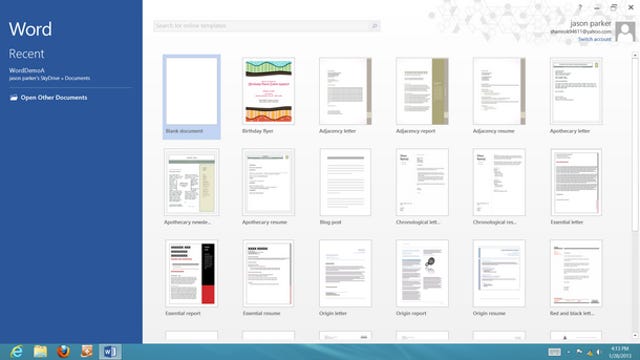
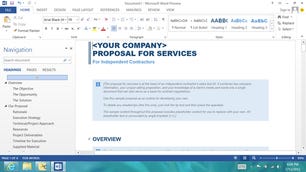
It was a problem designers faced as they began rethinking the appearance of Word when users first opened the application to begin working on a document. Word 2010 is a cluttered collection of icons, lines, words, and colors, all screaming for users' attention in order to let them know that the function they might need was just a click away.
The designers, wanting to clean that up, came up with an approach that was diametrically opposed. They proposed a virtual blank slate. The designers eliminated much of the gradient in the coloring of the application that made it feel dense, creating more white space and a cleaner look. They refined the toolbar, removing the lines around the words "File," "Home," "Insert," and the others, that create the impression that they are folder tabs.

"We were saying, 'Look, let's dial it as far down as we can,' because we know that there is this feeling that people have when encountering the full capability of Office, that it can be overwhelming," Braun said.
Most daringly, the designers removed the ribbon, that collection of dozens of Word's vast functions, available at a glance. The ribbon isn't just a huge real estate hog. It's ugly. To the eye of a designer, there's nothing sleek or modern about it.
"It ended up at a whisper versus this carnival that was happening," said Steve Kaneko, Microsoft design lead, who also worked on the design of Xbox, Zune, and Windows and was Microsoft's first industrial designer when the company hired him in 1991.
Ribbonless Word: A step too far
Turns out, it was too daring. Even though users could open the ribbon if they wanted, the fact that it wasn't on by default was jarring when Microsoft tested the new look. In their bid for simplicity, the designers went too far. They were whispering too quietly.
"We found that when we went into the labs and did user research studies on Word in particular, frankly, people want all those editing capabilities right in front of them," Office president DelBene said. "We learned over time and really got things right."
As pleasing as the clean slate of ribbon-less Word looked, it was bad design. Users felt challenged to find the features they wanted at the moment they needed them. And so the ribbon returned.
The design group also pushed to give the new Office a bit of personality, maybe even a bit of whimsy. With the new Office, when users puts their cursors over the zoom icon, they get a message: "Zoom to the level that's right for you. For zoomier zooming, use the controls in the status bar."

For the button-down, workplace application that is Office, it's a big shift. The language replaces the much more stiff, pedantic wording in Office 2010: "Show the Zoom dialog box to specify the zoom level of the document. In most cases, you can also use the zoom controls in the status bar at the bottom of the window to quickly zoom the document."
The conversational persona pops up again and again. Want to turn on spellcheck? You'll see a dialogue box that reads: "Typos? Not on our watch. Let us check your spelling and grammar." Need to find the sum of selected cells on a spreadsheet? You'll get: "Automatically add it up. Your total will appear after the selected cells." (For now, the tone in the two international versions Microsoft is releasing--Spanish and Japanese--remain mostly straightforward.)
The new tone isn't just about creating a sense of fun. Designers wanted Office's tone to be conversational, easy to approach and understand.
"You're building a character, almost like a character in a novel, where you have to decide on a particular personality," Braun said. "The fact that we're willing to be a little bit less serious in places and a little bit more restrained in others (creates) dimension. It's more like a person. It's more interesting. People are not 100 percent consistent. Occasionally they surprise you."
Of course, Microsoft has tried infusing Office with personality before, most notably with Clippy, the paperclip character that eagerly offered to help folks write emails or create spreadsheets, often too eagerly. With the new Office, designers considered and then dismissed some phrases such as "Aw snap," "Yikes," and "My bad."
Individually, the changes of removing lines or adding personality might seem like quaint touches. But collectively, Microsoft is betting that they'll infuse the new Office with a design that users will crave.
"We don't think we're done," Office president DelBene said. "This is a sea change for the Office development team that will run for many releases to come."