OS wars 2013: How the latest Mac and Windows upgrades compare
After reviewing Mac OS X Mavericks last week and with the release of Windows 8.1 the week before, I figured it's time to take another look at how operating systems are evolving -- for better or worse.


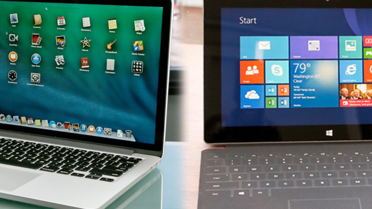
Last year when Mountain Lion and Windows 8 were released, I wrote a piece comparing the Mac and Windows operating systems, and concluded that Apple took the better path by keeping its tablet and desktop operating systems separate. With Windows 8 Microsoft gave its operating system a complete makeover, asking that people change the way they use their computers. Now that the two operating systems have updated with Mac OS X Mavericks and Windows 8.1, I thought I should take another look at both to see if the update did anything to change my mind.
For full disclosure, I primarily cover iOS and Mac software here at CNET including both operating systems, but that doesn't mean I know nothing about Windows. I've covered Windows software extensively here at CNET, including when Windows 8 first launched, and have been the primary reviewer of Microsoft Office since 2010. I also have a Windows 8 gaming rig at home that serves as my main home computer.
In other words, I am no stranger to Windows and use Windows 8 on a daily basis, which is why I haven't changed my perspective much since the last major upgrade. I still think Mavericks expands on an already familiar operating system that makes the overall experience more efficient, whereas Windows 8.1 continues stubbornly on the idea that one system can work on both desktops and tablets. I like that Windows 8.1 brought a few familiar features back, such as the Start button, but it just doesn't go far enough toward making it as useful as it once was in Windows 7. Furthermore, the tiled Metro UI (don't call it Metro!) is pretty, but is still largely a waste of time for people using a desktop, which -- I might add -- is the majority of users.
Mavericks improves on a familiar interface
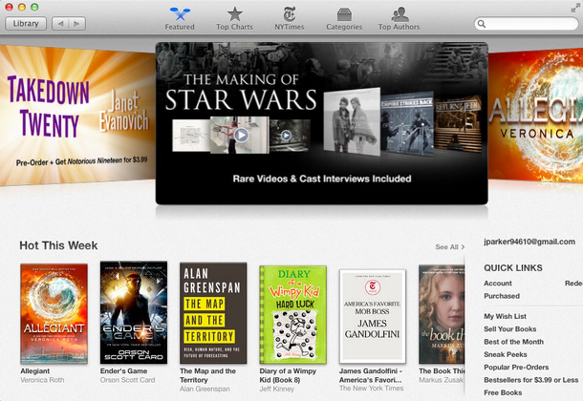
Let's start with how Apple is doing it right. Mavericks is a free upgrade that makes your laptop battery life better through improved power management; adds useful apps brought over from iOS such as iBooks and Maps; and adds smart interface tweaks to make things easier without completely changing how you use your computer.
Tons of interface tweaks make actions easier than they were before. To give some examples, Top Sites in Safari now lets you rearrange your favorite sites so when you open a new tab you know exactly where to click to get your best sites up fast. New Finder tabs make it easier to transfer files between two locations. Full screen apps have been fixed to work on multiple monitors, finally fixing a problem that plagued users of more than one display.
In other words, what you get with Mavericks are improvements for an already familiar interface, but with additions that let you do more with your Mac. Sure, there are still confusing things like the Launchpad, when you can open apps from the finder, but I think it's pretty clear -- as a free upgrade -- it's easy to recommend because it improves your experience all around.
Windows 8.1 fixes some problems, but still isn't ideal
Windows 8.0 was a jarring upgrade for many users with the loss of the Start button, a whole new way to look at the Start Menu, and confusing gesture-based actions that didn't make sense for desktop users. Frankly, they didn't even make sense for tablet users either until you had some training. I'll never forget having to ask Seth Rosenblatt, who reviewed Windows 8.0, how to close a Metro app because it wasn't in the least bit intuitive. Why not just keep the red "X" at the top right instead of having to pull down from the top (more awkward with a mouse) and pull to the bottom of the screen? But I digress.
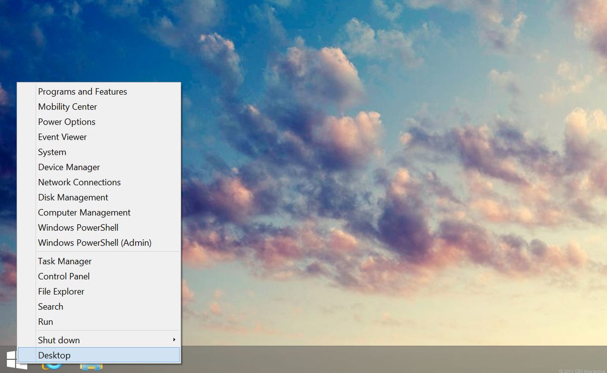
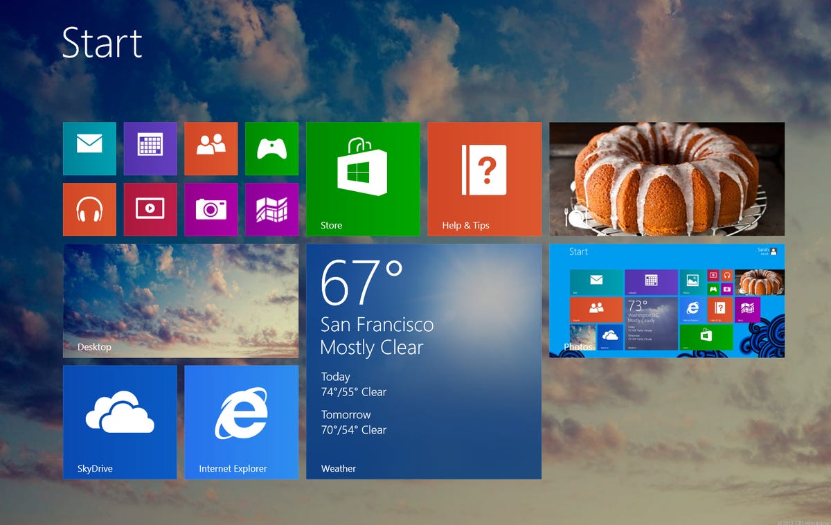
I was excited when I learned that Windows 8.1 would fix the major problems from the initial launch and bring back the Start menu. The problem is, the new Start Menu popup added in 8.1 isn't nearly as powerful as the one we had in Windows 7, and the fixes ignore the fact that the Metro interface is still much more suited to touch screens than desktops. Frustratingly, clicking the Start Button just brings up the Metro UI, but at least a right-click on the button brings up some of the features you had in the Windows 7 start button. As Dan Ackerman pointed out in his review, it's exactly the sort of passive-aggressive "compromise" that backs up claims that Microsoft has lost touch with what consumers want.
The way I use Windows 8 at home is just as I would in Windows 7. The second the Metro interface loads up, I immediately hit the desktop tile to use the computer the way I always have. From there I can check e-mail, browse the Web, and do everything I've always done with a Windows computer. And yet, I know there is this entirely other Windows experience that will get me most of the same things if I want to live in the tiled world. I know there are live tiles that show information in the new Start window, but how often am I really just staring at live tiles? The answer is never; When I turn on my computer, I have a mission in mind and I get to it. Though tablet users may disagree, to me it doesn't matter how colorful and pretty the modern UI is, nor does it matter that it's great and makes sense on a Windows phone or tablet; it's simply just another way to do the same things on a desktop with no appreciable advantage other than the look.
Surprise! The news isn't all bad -- Windows 8.1 is an improvement
If I ignore the live tiles entirely, Windows 8.1 is the best Windows operating system yet. It boots incredibly fast, has a vastly improved task manager, better security, and I find I spend much less time force quitting programs than I ever have in previous Windows versions. It's more stable, it's faster, and works better than ever. That's why I have such a hard time talking about Windows 8 with friends and colleagues; I can go on a rant about all the things I think are wrong with Windows 8, but in the end I'll still recommend you upgrade.
Change is good, but you have to do it the right way
If I've learned anything over my long time here reviewing software at both CNET Download.com and Reviews, it's that -- as a rule -- you should always update your software. It's fine to wait for a couple of weeks to make sure a developer has ironed out the bugs, but in the end you're probably going to get better stability, better security, and probably more useful features if you move on to the next version. Certainly there are cases where you upgrade to a program that makes it worse (such as putting iOS 7 on an iPhone 4), but by and large, staying up-to-date with your software is the best practice in my experience.
Mavericks is exactly the good kind of update I'm talking about. It comes with new apps and new time-saving features that make common actions easier and more efficient.
But with Windows 8.1, you get a mixed bag. It does indeed make using your Windows computer more efficient, adds security, and brings back the useful Start button, even if it's not as good as what you had before. But until Microsoft finds a way to make the "Modern UI" useful to desktop users, you're going to see people bypassing the tiles for a way of computing that makes sense with a mouse.