Nokia redesigns Windows Phone with bubbles, balloons, oh my!
Concept designs apparently created by a Nokia designer show a radical new look for the Windows Phone interface.


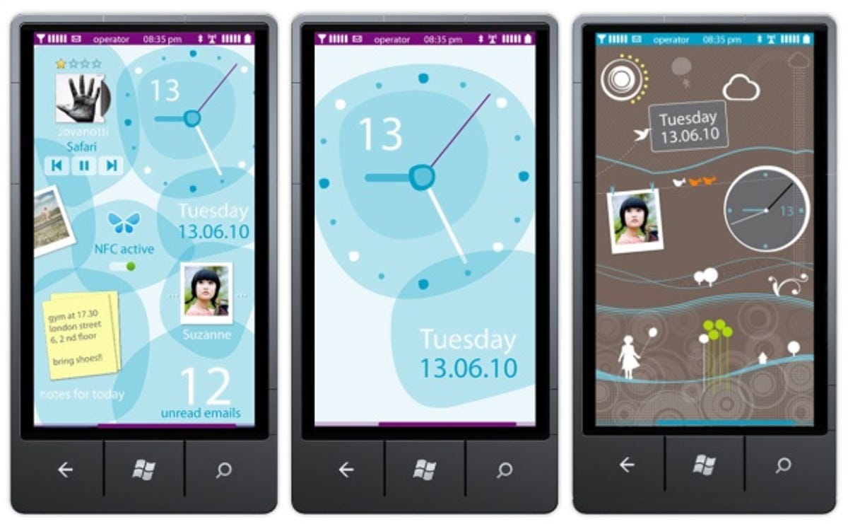
Ever wondered what Windows Phone would look like if Nokia had its way? Concept designs apparently created by a Nokia designer show a radical new look for the software found in the Nokia Lumia 800 and Nokia Lumia 900.
The new-look interface features playful amorphous blobs instead of the coloured squares used by Microsoft. The time and date float next to calendar appointments and other shortcuts and widgets in overlapping splodges of colour. The lock screen features cutesy birds and balloons floating past, with contacts hanging from a washing line.
Pocketnow reveals the speculative designs, which it claims were created by one of Nokia's senior graphic designers. The cutesy, fun designs seem more feminine and friendly than the harder-edged squares of the official Windows Phone design. It reminds me of something manic pixie dream girl Zooey Deschanel might come up with.
Nokia has disavowed the designs, but I imagine this sort of speculative design goes on all the time at every phone company. After all, most phone manufacturers slap their own interface on top of Android, so what's wrong with doing something similar for Windows Phone?
The advantage of creating your own front end for software used by various manufacturers is that it distinguishes your phones from the rest. Samsung has TouchWiz, HTC has HTC sense, Sony has the Xperia UX, and Motorola has MotoBlur.
The disadvantage is that it prevents updates from reaching customers -- just look at the hullabaloo surrounding Ice Cream Sandwich updates, as manufacturers and networks have to make sure their skin works with the new version of Android before they can offer it to impatient customers.
Still, I don't think Windows Phone needs prettying up in the same way as Android, which is deliberately designed as a blank canvas to be built on by manufacturers. Windows Phone meanwhile is a gorgeous, playful and beautifully simple interface. It's not for everyone, but I love it.
What do you think of Nokia's concepts for a new-look Windows Phone? Does Windows Phone need prettying-up? And what's the best looking phone interface ever? Tell me in the comments or on our Facebook page.