Microsoft simplifies Bing search results page
A revamp of the page reveals a more streamlined layout with a focus on the search results in the middle and related searches on the right.


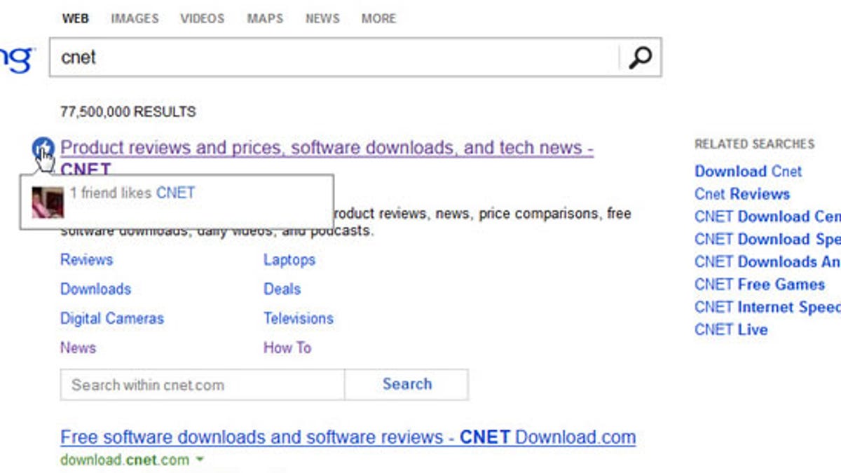
Bing is now taking a "less is more" approach with the latest redesign of its search results page.
Microsoft's new tweaks to its search results have eliminated all of the information previously squeezed on the "left rail," offering a less-cluttered look and feel. The search results themselves take center stage, so you're not distracted by peripheral information.
In a nod to social networking, certain results now might sport a thumbs-up icon next to them, indicating that one or more of your Facebook friends likes that result. Hovering over the thumbnail of your friend's profile photo reveals the person's identity.
And related searches now appear on the right under sponsored ads.
The menus at the top offer the most popular types of searches -- Web, Images, Videos, Maps, and News. Some of the options previously available on the results page itself can be found by digging into the More menu. There you can access social network results, local information, and your own search history, among other details.
The changes extend beyond just the page's look and feel, according to the latest Bing blog. Users should experience faster page loads and more relevant results, says Microsoft. Further tweaks are in the works, including a larger version of the image that greets Bing users each day.
The latest revamp also one-ups Google in the simplicity department. With a full column of information on the left side, Google's search results now seem more crowded in comparison with those offered by Bing.
Both pages are still left-justified, leaving a fair amount of white space next door. But in the search engine game, the goal seems to be to make the screen as sparse as possible.