Maps show Hurricane Harvey flooding is worse than you thought
We knew the destruction from Hurricane Harvey was bad, but this interactive map of Houston's floods show exactly how severe it is.


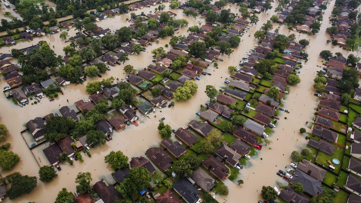
Online maps have already changed the way we move around in the world. But now, a project called U-Flood promises to show us exactly how bad the flooding from Hurricane Harvey really is.
The project, by consultants at the environmental firm Marine Weather and Climate and the tech company Tailwind Labs, is an interactive map of flooding in Houston as well as other cities like Galveston, Baton Rouge and New Orleans. It relies on the community to update the map, and so far has received more than 1,500 reports. Currently, it's counting 991 roads inundated in Houston as a result of Hurricane Harvey.
Of course, this isn't the first time tech has been used to help in a catastrophe. Facebook's "Safety Check" feature is so popular that it's become a permanent placement on its site. Apple has used iTunes to collect donations for disasters. And Google has done everything from making satellite photos publicly available to creating an online person-finder.