Mapping the U.S. carbon footprint
Researchers map the country's carbon production. Next, they plan to pinpoint global-warming gases down to each rooftop.
Which parts of the United States emit the most global-warming gases? The best view until now came via satellites, which could capture only snapshots at about the state level. Total carbon emissions were known, but their distribution remained a mystery.
That changed on Monday with the release of the most detailed map to date of U.S. carbon emissions from fossil fuels.
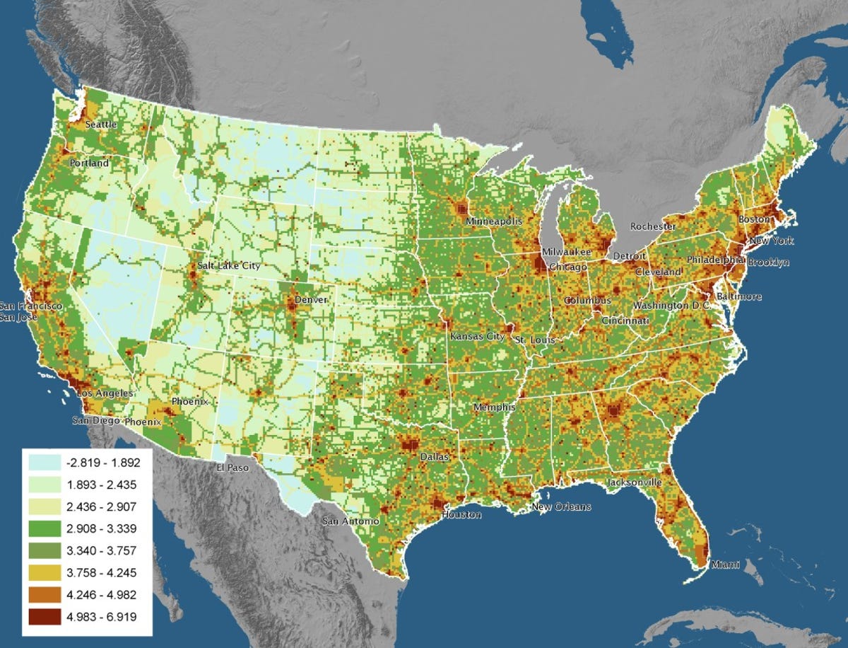
The map, by the Vulcan Project, took more than two years to complete and cost nearly a quarter of a million dollars, with backing from NASA and the Department of Energy. The result, named after the Roman god of fire, is 100 times more detailed than earlier imagery, according to its researchers.
"We knew that the previous emissions inventory of fossil fuels probably wasn't perfect, but we were a little surprised at how far off it was," said Kevin Gurney, a Purdue University assistant professor of earth and atmospheric science, who led the project. Additional researchers come from Colorado State University and the Lawrence Berkeley National Laboratory.
They pooled together data from 2002 about carbon dioxide originating from power plants, roads, factories, businesses, and homes, and illustrated how the gas travels across land and oceans.
The overview map (above) appears at first to correlate emissions with population density. However, closer inspection reveals surprises, such as carbon dioxide clustered in semirural areas of the Southeastern United States, where manufacturing has shifted from the Northeast and Midwest.
"We've pushed power plants to where people don't live, so emissions have gotten spread out. Interstates run out in the middle of nowhere," Gurney said.
His team built a software program from the ground up to produce a video (see below) that shows great plumes of carbon dioxide trailing off from Southern California into the Pacific Ocean, and spreading from the northeast into the North Atlantic. Three-dimensional views display how thunderstorms and other weather patterns influence the migration of emissions.
The data is expected to be paired with findings from the Orbital Carbon Observatory satellite, set to launch in December to collect data about carbon in the Earth's atmosphere.
Gurney said he has been inundated with calls from lawmakers, businesses, and software makers seeking details and offering suggestions related to the Vulcan Project. The data available for download, for instance, could help support sophisticated carbon-trading programs.
"If we can show the reality of emissions and potential for people to change by buying hybrid cars, putting insulation on their homes, then this would be a great way to interact with consumers," Gurney said.
His team's next ambitious effort is the Hestia Project, a global map and climate portal named for the Greek goddess of the hearth.
"We want to make it even finer, to the individual-building level, and put it down to a 3-D, Google Earth kind of system that would allow people to zoom in anywhere," Gurney said. "Numbers in a table just do not connect with people. When they see their world and house--a photorealistic view--it resonates with their lives."
Next month, the Hestia Project, which is collecting partners and funding, will launch a prototype to track Indianapolis. Gurney aims to have that city mapped within a year or two. As a contrast, he hopes to focus on a city in China before mapping the planet.
Over the long term, a system ideally should take into account other global-warming gases, such as methane, in addition to measuring land use and carbon sequestration efforts, he said.