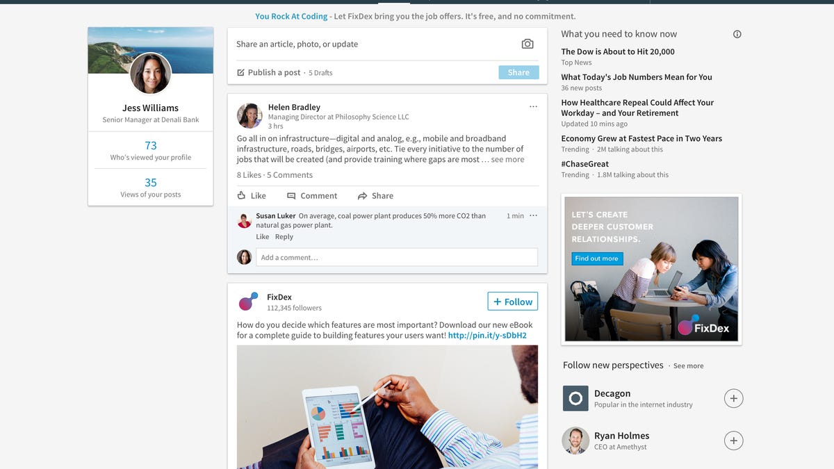
LinkedIn, synced in: Website now feels 'more like using an app'
The professional network's much-anticipated redesigned home page for computers is finally in sync with its mobile counterpart.

LinkedIn has a redesigned desktop homepage to complement its mobile app.
After more than a year in the making, LinkedIn's desktop redesign has arrived.
If the makeover, which launched Thursday, looks a lot like the professional network's overhauled sleek mobile app -- well, that's part of the master plan.
The professional network doesn't merely want the overhauled home page on desktop computers to resemble the mobile app. It wants that version to be in sync with the app, which has seen a 50 percent increase in usage since getting its new look in December 2015.
"The desktop site is not just a visual redesign, it is totally rebuilt from the ground up to complement our mobile site," said Chris Pruett, a senior director of engineering who spent the past 12 months redesigning the desktop site. "Hopefully, the changes will make it feel more snappier, fluid and more like using an app than a website."
About 60 percent of LinkedIn's traffic from its 467 million members comes from a mobile device, while the remaining 40 percent comes via desktop computers as users scour for possible jobs, make connections or search for news. People often switch between phones and desktops several times a day.
And having the ability to do so seamlessly was a constant concern and challenge for users, said Amy Parnell, a senior director of user experience design. "The changes will allow us to innovate on both platforms at the same speed, at the same time," she said.
In a nutshell, the new desktop site has far less clutter, with a lean and vertical look. As with the mobile app, it's much easier for users to see where to post content and to spot who's looking at their profiles and what companies they're from. There are also key buttons on the top of the page, including Home, My Network, Jobs, Messaging, Notifications and Me.
"We'd hear members say things like, 'Well, I have a LinkedIn account because I know I'm supposed to, but I don't know what to do with it,'" Pruett said. "What we're aiming for is giving our members more confidence they are using LinkedIn correctly and they know what they are posting and seeing on their pages."
The desktop revamp is among a series of recent releases for LinkedIn, including Conversation Starters, which offers tips on how to connect with users in the messaging feature, and Salary, a feature to help users maximize their earning potential. The popular Skills and Endorsements feature has also been updated.
Another feature, Open Candidates, allows members to discreetly notify recruiters they're job hunting without their current employer finding out.
Last month, software giant Microsoft completed its acquisition of LinkedIn for $26.2 billion. The companies plan to focus efforts on artificial intelligence, machine learning and the cloud.
Tech Enabled: CNET chronicles tech's role in providing new kinds of accessibility. Check it out here.
Technically Literate: Original works of short fiction with unique perspectives on tech, exclusively on CNET. Here.

