iOS 7 is winning me over but...
After a spending a couple of days with Apple's latest OS, Lance Whitney has grown surprisingly fond of it but still has some gripes and grievances.


When I first saw preview images of iOS 7, I knew I would hate it. The new look and layout seemed clumsy and amateurish. Now, the new OS is installed on my iPhone and iPad, and I don't hate its new look. In fact, I like it, though that doesn't mean our budding relationship is perfect.
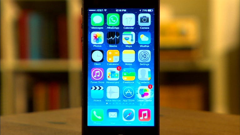
The biggest and most controversial change in iOS 7 has been the new flat design and basic color scheme. Throwing out the older skeuomorphic style, Apple has adopted a minimalist approach with bare-bones icons, folders, and controls. At first glance, the new look appears too simplistic, almost as if it were created by a child, as some critics complained, and not by Apple design guru Jony Ive.
But the new design has definitely grown on me. It's simple but not simplistic. The icons and folders look cleaner than their older counterparts. There's a certain appeal to them that I didn't think I'd appreciate.
The style may be an acquired taste, so I can understand people who still don't like it. But I actually now prefer it to the pre-iOS 7 scheme.
Does that mean I've totally fallen for iOS 7's new look and layout? Hmm, no, not quite. Along with the new style come some quirks that bug me.
Some of the icons are almost too stark. For example, the icons in the new Control Center are black and white and nameless. I'd like to see a little splash of color there and also some hint at what each icon does.
Tapping on an icon or folder now triggers a zoom-in effect, while closing an app or folder zooms you out. That effect can be dizzying. I'd like to have an option to turn it off.


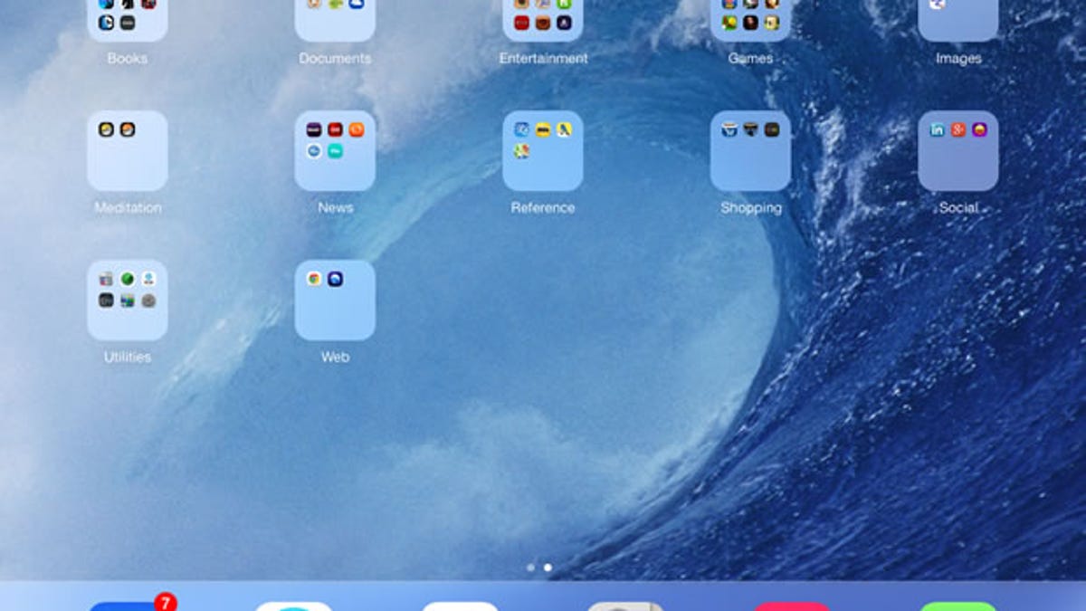
Folders are now a mixed bag. You can add as many icons as you'd like to a folder. But iOS 7 only displays nine of them at one time. To see another screen of icons in a folder you have to scroll to the right, which almost defeats the purpose of having a single folder in the first place.
Your folders also now open up in full view. That's not so bad on the iPhone. But on the iPad, it leads to a lot of wasted space around the open folder.
iOS 7 comes packed with lots of other changes, some of which I like and some of which I don't. Here, I wanted to focus just on the new look and layout.
Overall, I'd say the relationship is off to a better start than I would have expected. Where will it go from here? I guess it depends on what Apple cooks up for iOS 7.1.