How Apple screwed up the iPad music app with iOS 5
<b style="color:#900;">commentary</b> The upgrade to iOS 5 changed the iPad's music app, and not for the better, ticking off users and calling into question why Apple fixed something that wasn't broken.


commentary "If it ain't broke, don't fix it," is a motto that Apple should have applied to the iPad's new Music app.
iPad users who updated to iOS 5 may have noticed that the old iPod app is now named Music, a name that makes sense. But other changes to the app have ticked off users by making playing and managing music on the tablet decidedly less user-friendly.
What's even more confusing is that these changes are specific to the iPad. The music app on the iPhone and iPod Touch works the same as always, post iOS 5. I don't understand why Apple would not only tinker with something that worked fine before but only tinker with it on the iPad.
And apparently I'm not the only one.
The Apple Support Forums have seen various discussion threads and posts critical of the new Music App.
One commenter named Trager summed it up as follows:
I have no idea what they were thinking. I suppose it still performs the function of playing music, but it's awful for music management now, and they removed the ability to use playlists for navigation while editing playlists. The faux old radio look is pretty bad, but what's really killing me is the navigation stuff. I keep a lot of playlists on my iPad, and not being able to see the list of playlists and the contents of the currently selected one at the same time just *****.
Prior to iOS 5, the iPad's music app worked relatively smoothly.
Your library of music, podcasts, audiobooks, and other content appeared on the left, letting you easily jump from one category to another. Tapping on a specific category displayed the names and thumbnails of each album, podcast, or other item on the right. Tapping on a specific item showed you its contents, allowing you to play a specific song or track.
Tapping on certain items, such as a song, podcast, or iTunes U lecture would display a screen with a larger version of the album art or other image and a full set of controls to play and manage the audio. You could easily jump backward or forward, move to the previous or next track, pause and play the audio, loop or shuffle the selections, and rewind the audio by 30 seconds. A handy button in the lower right let you switch between the image and the names of all the tracks. The interface was smooth and simple to use.
But with iOS 5, Apple got rid of the music app's smooth and simple UI and replaced it with something that simply doesn't work very well.
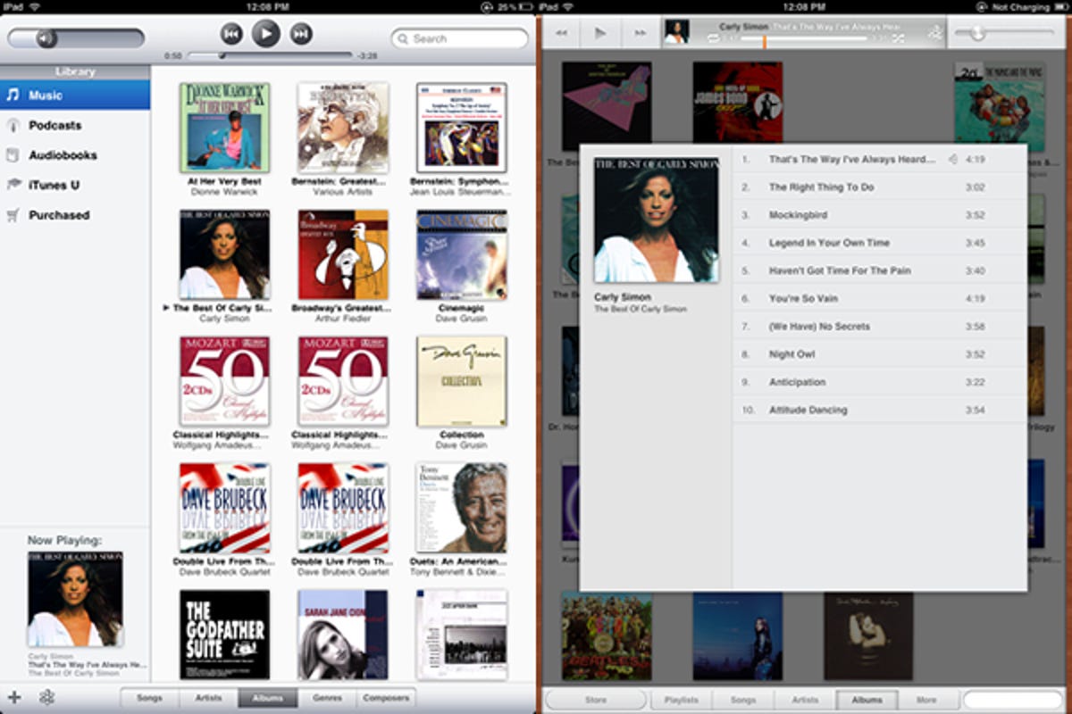
Now when you open the app, you no longer see your library of music items on the left. Instead, you have to tap among a list of categories at the bottom. If you want to see your podcasts, audiobooks, or iTunes U content, you have to tap on a More category to display them. And unlike on the iPhone's music app, there's no way to edit which categories appear at the bottom on the iPad, so you're stuck with Apple's default choices.
• Why iOS 5 is a big deal
• What iOS 5 brings to iPad
• Apple iOS 5 review: Modest, but definitely worthwhile
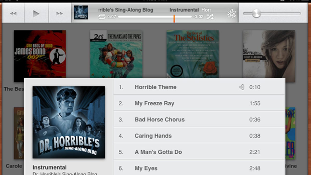
Tapping on a specific item no longer by default displays a full music player with the album art in the background. Instead, you stay on the same screen, only with a stark, minimal set of controls added to the top. You can play and pause the audio, move along the track, jump from one track to another, and control the volume. But that's about it.
Tapping on a tiny thumbnail at the top of the screen does offer a different interface, similar in some ways to the older full music player. Here you can see the full-screen album art and switch between the picture view and a view of individual tracks.
The controls in this full audio player sport a more pleasant look and feel, but still seem half baked. There are no options for looping or shuffling your audio or to rewind 30 seconds. The progress bar that lets you move forward or backward along a song is much smaller than in the previous version, making it more difficult to use accurately.
The changes to the Music app may be minor amid the other new features in iOS 5. But as someone who regularly listens to music, podcasts, and iTunes U content on my iPad, I think Apple dropped the ball here. Let's hope we see some fixes to this new and improved Music app in the next iOS update.