Google+ rolls out a redesign for mobile Web similar to desktop
Switching up its mobile interface to look more like its desktop design, the Web giant adds "cards," cover photos, and larger tap targets.


After unveiling an extensive revamp for the Google+ news stream on desktop, Google is now updating what users see when accessing the social network with their cell phones.
The Web giant announced Tuesday that it's working on "improving the look and feel of Google+ on the mobile Web."
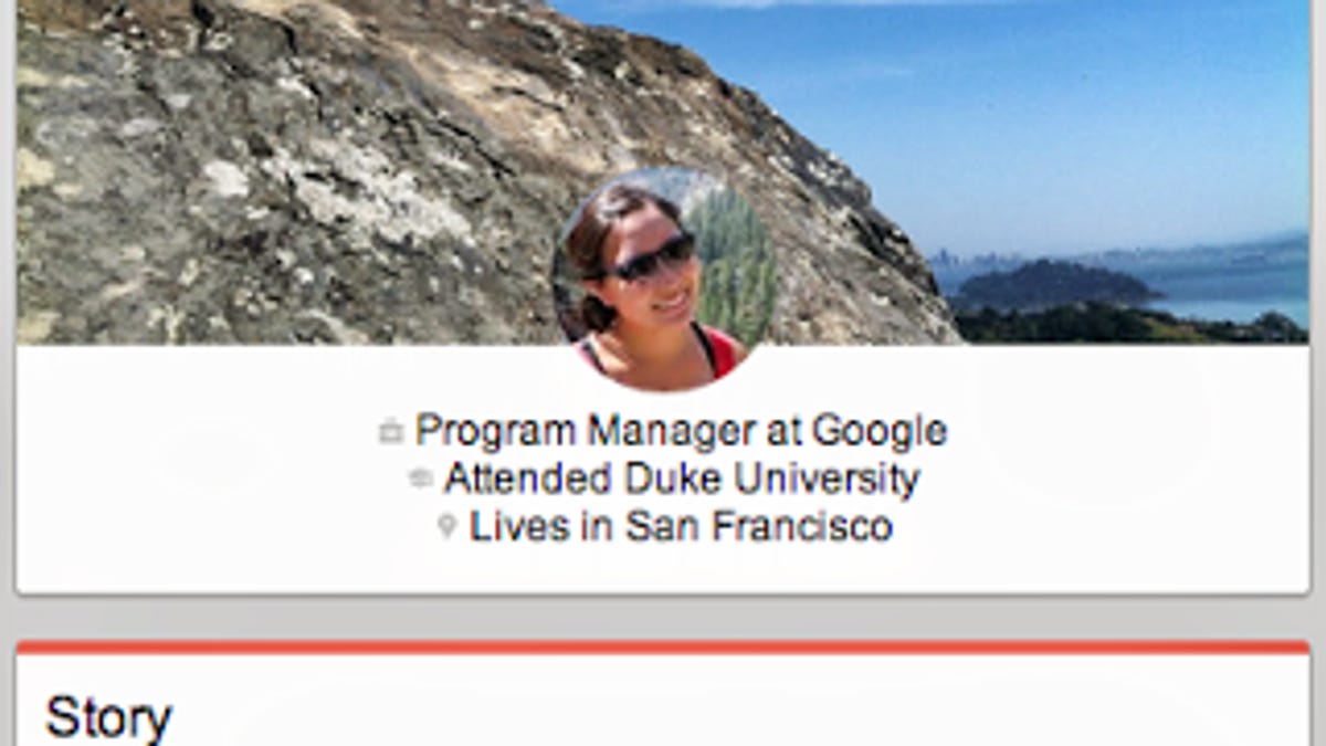
The redesign includes making posts now appear as "cards" in the stream, which is supposed to make them easier to read and share. The social network also changed the way Profiles and Pages look to include cover photos and larger tap targets.
This mobile Web redesign mimics what Google has recently done to update Google+ for desktop. At first blush, when viewed on a large screen, the new design bears some resemblance to the social-networking site Pinterest. However, Google gave certain types of media, like large photos and videos, even more exposure on desktop by making them stretch the full width of the screen.
During Google's I/O conference last week, the company announced 41 new features for its Google+ social network, including its desktop redesign, autogenerated related hashtags, "Awesome" photo options, and a streamlined messaging experience.