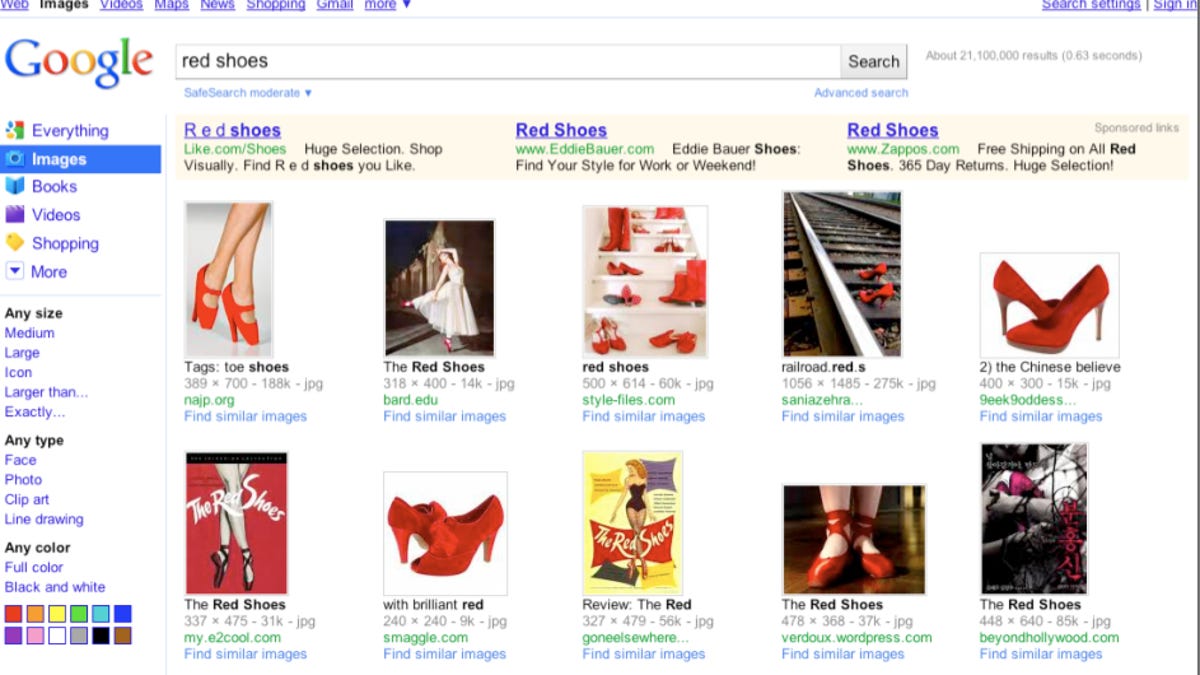
Google gives search results pages a makeover
A new color scheme and more prominent placement for search options are the centerpiece of one of Google's larger redesigns: even the logo got an update.
Starting Wednesday, Google users will see something very different on search results pages as the world's leading Internet search company trots out one of its most significant redesigns in years.
Google search result pages will get a lot more colorful as Google formally introduces a redesign it has been testing for several years. It's not a huge surprise since Google has been actively testing the design with users for several months, and testing for this particular revision dates back even further, said John Wiley, senior user experience designer for Google.
With the new look, Google is emphasizing the menu of search options that had previously been hidden on the left-side rail of the search results pages. First unveiled in May 2009, search options required a searcher to click on a "show options" link at the top of the page. Now they will be permanently affixed to the left rail, and Google will surface different search options based on whether they are relevant to the query, Wiley said.
For example, a search for "red shoes" would produce the usual set of results, but on the left rail, Google will surface a link to Google's shopping search pages. In the same vein, a search for "NFL draft" would surface news and real-time updates on that rail. Users can access the full list of search options by clicking on "more" but will see a changing list of highlighted options on the left rail for different queries.
And those options themselves will be quite visible: Google is using strong colors to highlight those options, in what Wiley called "a modern crisp clean look." Even Google's logo is getting in on the act, with a subtle overhaul that brightens the colors and drops the shadowing cast by the letters.
"This was one of our larger visual experiments we've ever run at Google," Wiley said. The company tested different designs in the wild, with members of the public in Google's testing labs, and its usual "dog-fooding" process among employees, and assembled enough data on preferences to put together the final product.
Google has been criticized for this data-driven approach to design in the past, perhaps most prominently by former employee Douglas Bowman, who in departing the company last year wrote "I won't miss a design philosophy that lives or dies strictly by the sword of data."
While not responding directly to Bowman's concerns in light of the new design, Wiley pointed out that individual designers at Google have to use their intuition to figure out which kinds of visual experiments to test before subjecting those tests to data analysis. "I think that we are very lucky at Google to have the resources to be able to run the kinds of experiments that give us great data," he said.
Google is also changing the way search tools and search refinements appear on the left hand side of its search results page. A search for "rolling stones" will trigger a list of results under the header "something different," which in this case would bring up other classic rock bands such as Aerosmith and Led Zeppelin.
The changes will appear on a rolling basis to most users over the course of Wednesday, Wiley said, but could take longer for some users of Google search in languages other than English.
