Google evangelists release bible of good Android design
The Android design guide, created to help programmers make apps look and work better, carries a deeper message: Google cares about users.


- Shankland covered the tech industry for more than 25 years and was a science writer for five years before that. He has deep expertise in microprocessors, digital photography, computer hardware and software, internet standards, web technology, and more.
Google doesn't reject apps from the Android Market just because they're ugly.
But that doesn't mean the company doesn't care--especially now that Matias Duarte has seized the spotlight as director of Android user experience. So, absent the banhammer, Google is trying gentler persuasion to get others besides itself to care about designs that look and work well in the Ice Cream Sandwich era.
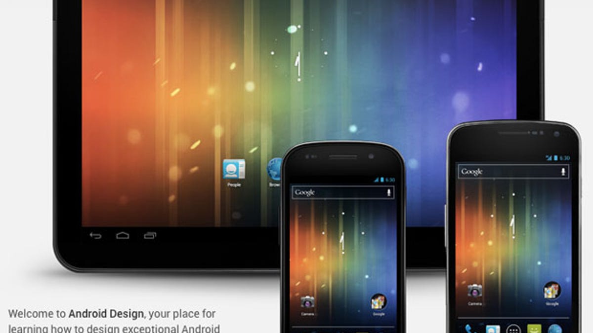
For that reason, Google has released an Android design guide for ICS, aka Android 4.0. As my colleague Kent German observes, Google's accommodating ways up to this point have led to an inconsistent user experience and varying app quality. Perhaps this guide will lead programmers down the One True Path.
Maybe programmers should know intuitively that they must present alerts with short, direct, informal prose. Or that a long press now means select an item, not trigger a menu of actions. Perhaps, but I doubt it.
If nothing else, there's an army of new programmers jumping into mobile coding who need all the help they can get.
Programmer Dion Almaer called the Android guide "much-needed help to make sure your ice cream sandwich doesn't melt all over your users."
Mission accomplished?
Duarte, in an interview in Wired, called the guide the second part of the ICS launch and said, "I can feel like it's finished. Like ICS is truly complete."
Complete? There's only one phone shipping that uses it, and Samsung's Galaxy Nexus is expensive. The design guide is helpful, but coaxing programmers to implement its tenets is another matter altogether. Even eager coders will require time to adjust to the new look.
Maybe Duarte meant that Google has completely laid the Android 4.0 foundation. Because in the real world, ICS has barely begun.
Duarte has been making the rounds last year ever since Google released Android 4.0, trying to convince the world that good design is a priority for Google and that it will pay off for those in the Android world. A public-relations road show is only so helpful, though.
Ice Cream Sandwich has won praise as the best Android version to date, but ICS' success hinges on more than just the apps and underlying OS that Google has released: people spend a lot of time using third-party apps. The guide could help make Android more consistent and easier to use--and therefore more competitive with Apple's iOS.
There's plenty of vagueness in the guide: "Make the user feel safe, happy, and energized," for example, or "Android apps empower people to try new things and to use apps in inventive new ways."
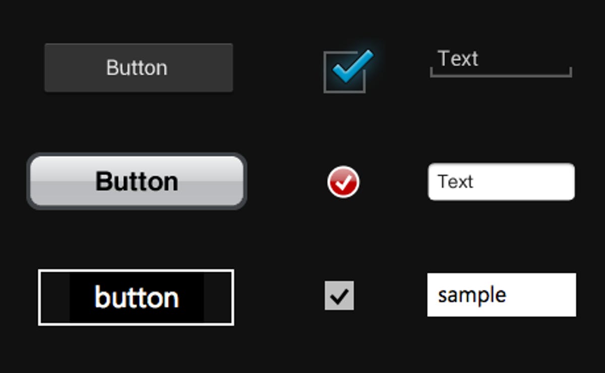
But a certain amount of aspirational guidance is perfectly appropriate, and the guide has lots of more concrete advice, too, for things like when to display notifications and sizing elements with density-independent pixels (dp).
Room for improvement
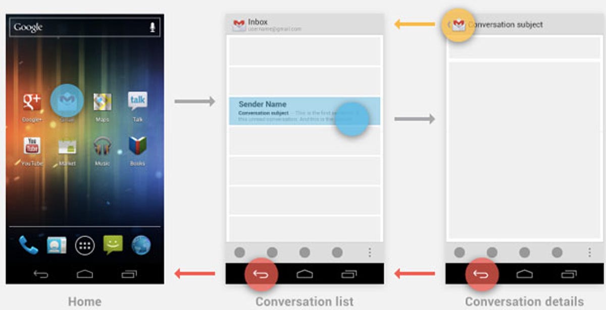
I still see plenty of room for improvement. I can see people being confused whether they should look to the navigation bar and action bars to get things done. I've found the back button handy on Android, but it behaves unpredictably for me sometimes, and there's no forward button to undo your action. Now ICS introduces the up button as well as the back button, only the up button points left, not up. Perhaps Google should have gone all the way and ditched the back button altogether. Perhaps the idea of dropping the original design so completely in favor of something so iOS-like stuck in Google's craw.
Well, at least programmers have a better idea of what to do. Overall, the guide is helpful as a resource for programmers.
Perhaps just as important, it tells consumers that Google is trying to help them, too.