Google bids farewell to Play Store's shopping bag logo
Now you'll just see a colorful triangle.


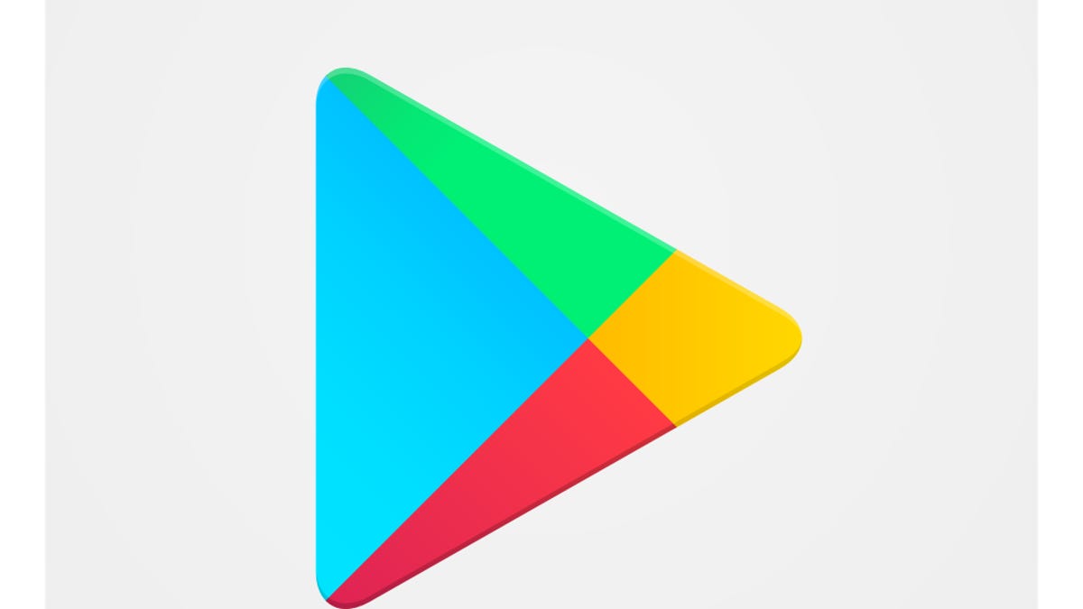
The Google Play Store icon no longer has the shopping bag image, it's simply the colorful triangle.
Google has quietly tweaked its Play Store logo.
Now instead of a multi-colored triangle inside of a gray shopping bag, you'll see just the triangle.
Android Police was the first to notice the change and adds that notification icons have also been slightly modernized by also removing the bag.
Google unveiled a new corporate logo in 2015 changing the font and brightness of its iconic six-character brand. Other tech giants have also made high-profile logo changes. Facebook updated its logo in 2015 by switching to a typeface designed to show up better on smartphones. In 2013, Yahoo CEO Marissa Mayer opted for a new typeface in changing Yahoo's logo.
Even with Google's corporate icon update, the company still maintained its playful use of color. The same could be said for the new Play Store logo.
"It has been on our wishlist to make the Play icon more modern, simple, and, yes, Play-ful," said a Google spokeswoman. "It's tough to say goodbye to the shopping bag, but we're clearly not playing games anymore. You still should, though, after you tap that cool new icon."
First published May 11, 2:28 p.m. PT.
Update, May 12 at 11:12 a.m. PT: Adds comment from Google spokeswoman.