Flickr trends highlighted via Google-based app
A Google App Engine service shows the relative popularity of Flickr photo tags over time. Good vs. evil. Yankees vs. Mets. Kittens vs. sunsets. Let the games begin!


- Shankland covered the tech industry for more than 25 years and was a science writer for five years before that. He has deep expertise in microprocessors, digital photography, computer hardware and software, internet standards, web technology, and more.
What do you do when you can use the Internet to data-mine a collection of billions of photos?
Find out whether cats are more popular than dogs, of course. Or whether good outdoes evil. Or the Yankees beat the Mets.
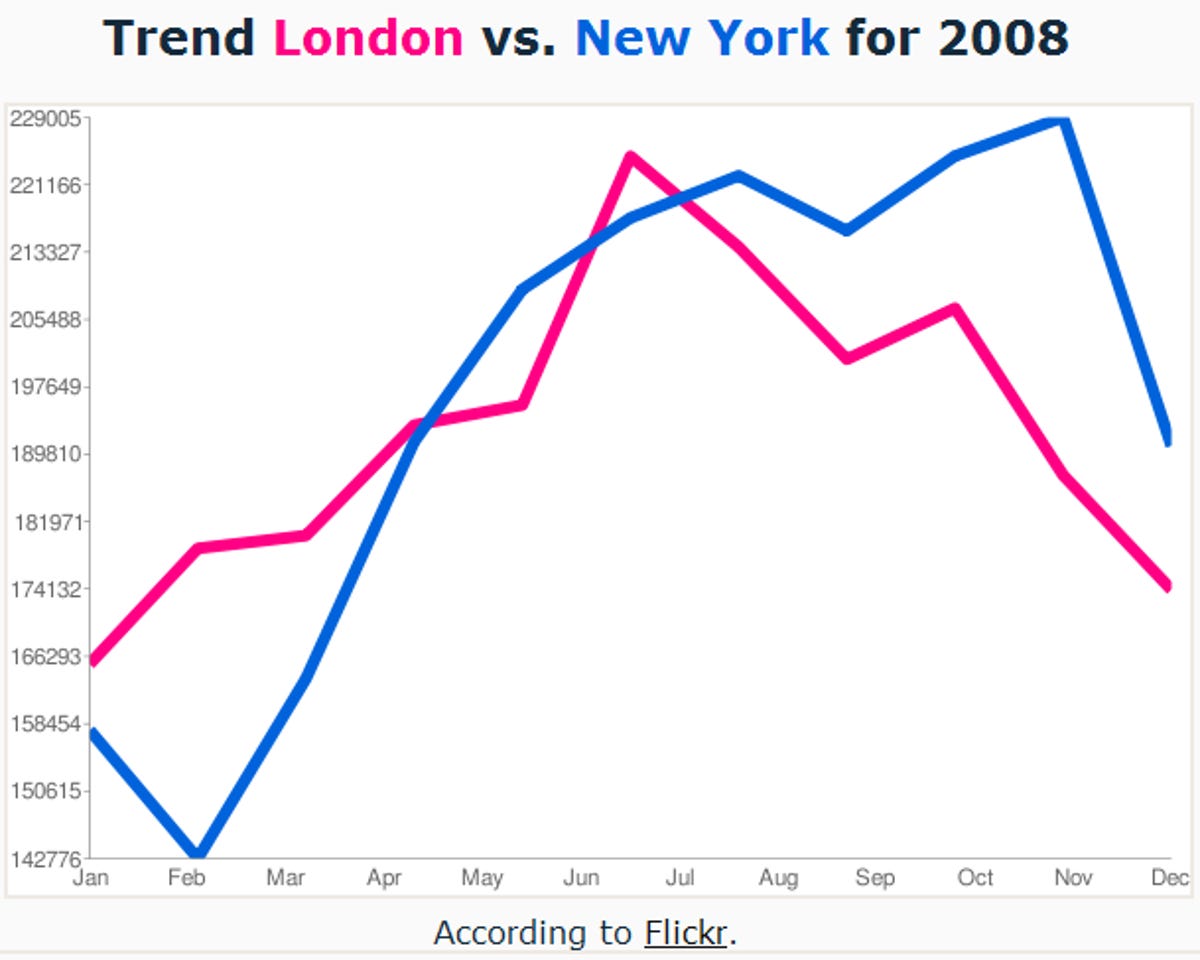
The FlickrTrends application takes advantage first of the API (application programming interface) at Yahoo's photo-sharing site, Flickr, which can show how many photos have been tagged with a particular word over a period of time. Second, it uses Google App Engine to present the relative popularity of two tags in chart form to show what's waxing and waning.
Flickr employee Kellan Elliott-McCrea wrote the application, deriving it from another by Derek Gottfrid that compares how often terms are mentioned in The New York Times. The idea came to broader light on Wednesday with a posting on the Flickr Code blog.
By showing usage over time, the application shows come seasonal curiosities. For example, it appears that people consider summer and winter each to be longer than spring and fall.
Flickr fans quickly embraced the tool this week to run a variety of comparisons, including some photography-specific ones such as bokeh vs. HDR and Canon vs. Nikon.