Design guru Nielsen: Windows 8 UI 'smothers usability'
Jakob Nielsen says that Microsoft's new operating system is plagued by "hidden features [and] reduced discoverability," among other issues.


User interface design guru Jakob Nielsen is none too pleased with what he's found in Windows 8, which he calls a "misguided" product.
Nielsen, who has spent much of his career analyzing all kinds of user interfaces, including most notably Flash software for Web animation, says that the new Windows 8 user interface "smothers usability with big colorful tiles while hiding needed features."
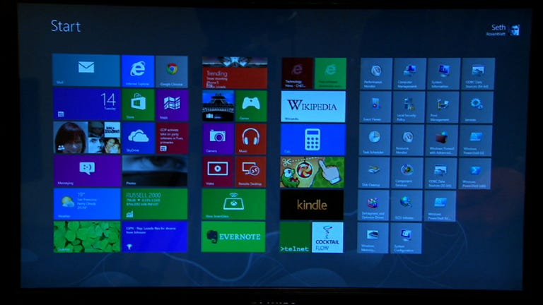
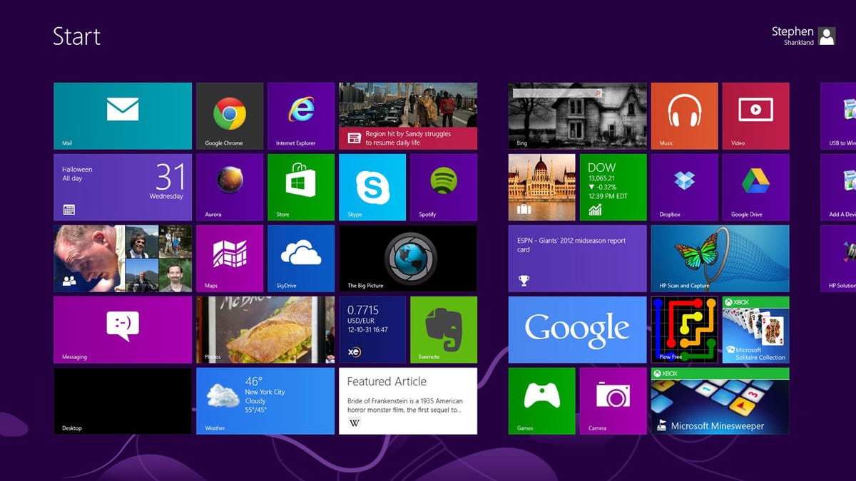
To arrive at that conclusion, Nielsen brought in 12 "experienced PC users" to try out Windows on both PCs and Surface RT tablets. In that study, Nielsen found that the users took issue with the operating system's supposed "duality" that includes a tablet-focused Start screen and a more traditional "PC-oriented desktop screen." According to Nielsen, those different design concepts force users to "remember where to go for which features." In addition, the duality creates an "inconsistent user experience," hurting overall usability.
Microsoft launched Windows 8 late last month. The operating system is a major departure from previous versions of the software, ditching the traditional start button and design for a tile-based system. Microsoft says that the new design will increase usability. Many people who used the software, however, have criticized it for a steep learning curve that impacts both novices and experienced PC users.
Speaking of experienced users, Nielsen said his study revealed that those folks were downright confused by a software called Windows not actually supporting windows.
"Windows" no longer supports multiple windows on the screen. Win8 does have an option to temporarily show a second area in a small part of the screen, but none of our test users were able to make this work. Also, the main UI restricts users to a single window, so the product ought to be renamed "Microsoft Window."
That lack of multiple window support forced Nielsen to dub it "one of the worst aspects of Windows 8 for power users."
In the end, Nielsen believes that Microsoft has focused on tablets with Windows 8 to the detriment of PCs. He argues that while Windows 8 is "weak on tablets," it's "terrible for PCs," adding that "on a regular PC, Windows 8 is Mr. Hyde: a monster that terrorizes poor office workers and strangles their productivity."
Of course, this isn't the first time we've heard complaints of a steep learning curve in Windows 8. When CNET senior editor Seth Rosenblatt reviewed the operating system last month, he noted that "the learning curve is steep and in-app navigation isn't obvious." Overall, however, he gave the operating system four stars out of five, earning it an "excellent" rating.
Nielsen softens the blow a little at the end of his account. "I happen to think that Windows 7 is a good product and that Windows 8 is a misguided one," he wrote. "I'll stay with Win7 the next few years and hope for better times with Windows 9. One great thing about Microsoft is that they do have a history of correcting their mistakes."