CNET product pages redesigned--just for you
We've rolled out lots of changes to our product review pages, but our top priority is encouraging you to write your own reviews.


In the past few weeks I've shown previews of new home pages for CNET News and CNET.com. While both of those are still in testing (which is why you may not have seen them for yourself yet), we have completed the redesign of a page that is the real home page for many CNET users: the product page.
A large chunk of CNET traffic comes via Google, Bing, or Yahoo directly to our product review pages, making them instantly recognizable to millions of CNET visitors. As a result, tinkering with them is always very tricky, not just because we are messing with users' habits and expectations, but potentially impacting page views and revenue.
When we do decide to rework these pages we typically have a specific goal in mind, such as driving more video streams or increasing the amount of time spent on the page. In this case, we wanted to encourage more users to leave their own product reviews.
Our research has shown that user reviews are the second-most valued portion of a product review, ranking nearly as high as our own editors' opinions. And we've known that we have not treated user opinions in a way that acknowledged their value to other CNET readers. Elevate the visibility of the user reviews and make them easier to create, we reasoned, and more users will leave more reviews. And more reviews means more opinions for CNET users to consider before making a buying decision.
After months of bringing CNET users into our research lab and picking their brains from behind one-way glass, followed by A/B testing of various designs, the final outcome can be viewed on this example of a cell phone review.
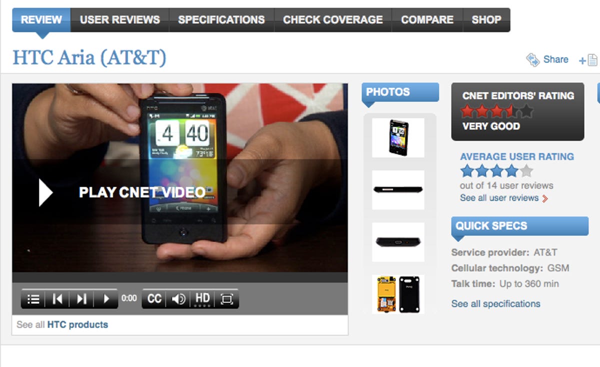
The key changes, as outlined by CNET senior product manager Karen Badenfort, are:
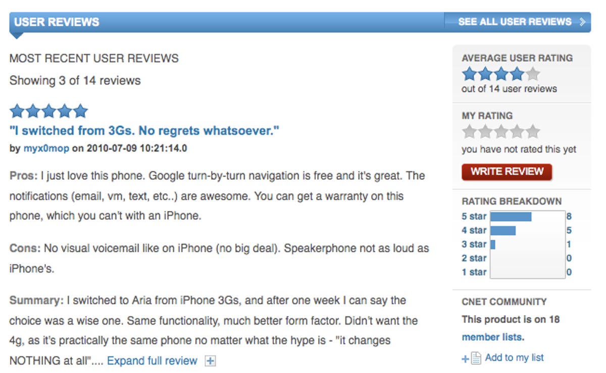
- Better promotion of user reviews by bringing user reviews higher up on the page and showing more text.
- Navigating user reviews requires fewer clicks. For example, the full text of user reviews is also available on the user reviews' listings page (seen here).
- A bar graph that shows how user reviews were distributed, from 1 to 5 stars.
- A new "Pros & Cons" view on the listings page where all of a product's pros or cons can be seen in a single list.
As long as Badenfort had the patient on the operating table, she decided to tune up some other areas of the page, including:
- Larger "Where to Buy" boxes with red "shop" buttons.
- A new location for the MPU (the large ad) that is significantly higher on the page.
- Incorporation of a new universal player with playlist functionality to encourage users to view multiple (and related) videos.
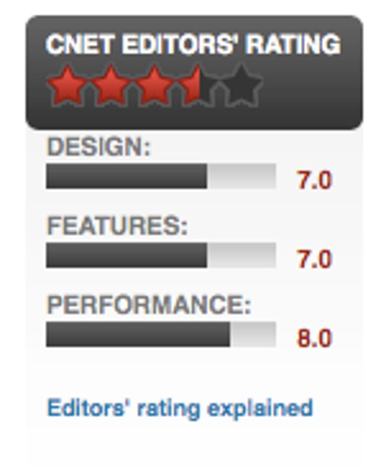
- Exposure of the editors' subratings to show the rigor of our review process, as well as a new rating graphic and editor photos.
Based on the feedback we've already received during our testing, we're confident you like the new pages and will be more inclined to rate some products. If not, let us know in the comments. After all, we did it for you.