Can Windows 8 win over CNET's Mac reviewer?
There is a lot to like with Windows 8, but by merging a desktop and tablet OS, I think Microsoft made a big mistake that could have been avoided if it followed Apple's lead.


Apple's Mountain Lion and Microsoft's Windows 8 are now out in the real world. And this time more than ever, the two companies are taking the computer into two distinct directions.
After using both of the new operating systems, it's easy to see that each is more solid, more stable, and filled with more-compelling features than ever before. It's also true that Microsoft's radical new operating system is gorgeous, but this is not a beauty contest. Like I pointed out in my review for Mountain Lion, I still think Apple made the better choice in keeping the touch-screen and desktop OS separate. In applying Windows 8 to both tablets and desktops, Microsoft has added a significant learning curve for both devices, and ended up making the OS needlessly difficult and jarring, especially for desktop computer users.
In fact, I've realized that we're now at a place where we've never been before. In a big change from 11 years ago, Windows 8 is the slick upstart competitor, whereas Mountain Lion adds useful changes, but is the more familiar user experience. If you'll remember, when Mac OS X first arrived on the scene in 2001, it was a huge change from Mac OS 9. The Dock, the various graphical changes, and window animations were a big shift from what Mac users knew; Windows 2000 (and later XP) stuck to a tried and true aesthetic and workflow that users understood. Contrast that with 2012, where Microsoft is blazing its own trail, fundamentally changing how people interact with a computer.
Before I begin, though, a small disclaimer. As you may already know, I'm the iOS and Mac software editor here at CNET, but that isn't to say I only use Apple products. In fact, I have Windows 7 machines at both home and work, and I use each constantly. My Windows 7 computer at home is a gaming rig I built and acts as my primary computer, while at work I switch off between my Mac and Windows 7 machines for various testing purposes. I like both operating systems and think I come from the perspective of not just an Apple user, but a user of both major operating systems along with iOS.

It's true: You can't please everyone
In concept, Microsoft's new OS philosophy is solid: Windows 8 is a unification of the user experience across all devices with colorful live tiles and hidden controls you can access with mouse movements or screen swipes. But by making the interface touch-screen ready, the company had to make design decisions that change the Windows user experience for desktops and tablets. Change can be a good thing, and Windows 8 on a tablet makes sense (with some training), but Microsoft is still asking you to relearn even the most basic computing tasks.
Consider, for example, the apps that come preloaded with every new Windows 8 machine. You've seen these apps before, but the new software for Windows Media Player, Messaging, Mail, and Internet Explorer 10 all have special ways of using them that is different from their desktop counterparts. These special Windows 8 apps were designed for touch screens, leaving tool bars and other features absent, presumably so you get an unfettered experience as you swipe to browse and interact with a tablet while you sit on your couch. There's nothing wrong with catering to a touch screen, but when you mix a tablet operating system with a desktop, that's when trouble starts.
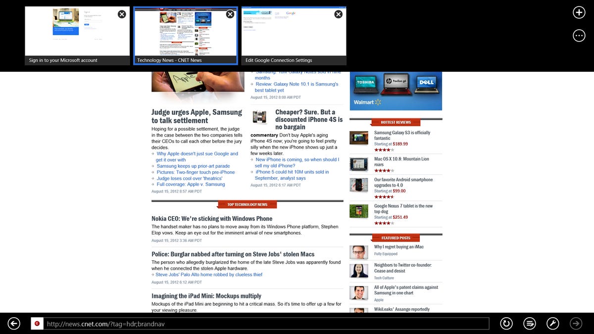
The problem is, if you work on a desktop or notebook with no touch screen, you'll still have to use the interface for these apps. And that step requires unnatural mouse gestures that just don't make sense when the keyboard and mouse combination is already so precise. Why would you want to do a new gesture like sliding your cursor up to the top left corner, then slide down to see open applications when the task bar is clearly easier to use for a mouse? You wouldn't, so Microsoft handles this by changing the desktop you've grown accustomed to into an app so you can still get the old Windows 7 experience. To add to the confusion for new Windows 8 users, there's a separate Internet Explorer (that shares history and bookmarks with the touch version) for the desktop app, but now you've got two IEs with two different user experiences on one desktop computer. Useful? Not really. Confusing? Absolutely.
Yes, I understand that the argument for the new colorful touch interface is that it is really an enhanced Start button. Frankly, though, when you take this very basic and long-established element away, there's going to be a steep learning curve. Sure, some will get it, but if you have millions of users accessing the main controls of your OS from a Start button in the lower left of your screen, changing it completely and adding a whole new layer of controls for desktop users isn't helping anyone. Forcing users into a touch-screen world every time they want to interact with their computers makes daily use unnecessarily difficult, but that's the only way you can get the OS to play nice on both interfaces.
Apple has the right idea, but it's not perfect, either
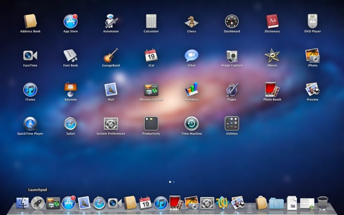
Apple, on the other hand, continues to offer an OS designed for a keyboard and mouse in Mountain Lion, while adding more and more syncing capabilities with the iOS for iPhones and iPads. By having separate operating systems for desktops and iOS devices, Apple is able to deliver a tailored experience for each. Meanwhile, with the release of Mountain Lion, Apple has pulled iOS features like iMessage, LaunchPad, and Game Center into the desktop OS and added more iCloud integration to share files across all its devices.
Keeping the touch-screen interface as a separate OS is an advantage because you don't need to force anyone to learn a new way of doing things. The iPhone was already popular when the iPad came out, so it was an easy jump for iPhone users (and anyone that had played with one) to start using Apple's tablet immediately. Meanwhile, Mac OS X went through several new OS updates with added new features, but kept the core concepts the same: the Dock is on the bottom, the menu bar is on top, and System Preferences is under the Apple if you want to change the settings. Apple did add touchlike trackpad gestures that let you swipe to get around and open Mission Control, which were certainly not totally intuitive, but those still didn't change the core concepts of the Mac OS.
Still, Apple's melding of the mobile and desktop worlds isn't perfect, either. The addition of Launchpad in Lion (which was further enhanced in Mountain Lion with better search) introduced a new way to do something you could already do through the Finder. I understand why Apple would carry a design aesthetic over from the iPhone with so many iPhone users already onboard, but I don't really agree with offering more ways to do something you could already do (sound familiar?). Some things simply work better on a touch screen than they do on desktops and vice versa. Why do they need to be the same?
What should have happened
Clearly, Windows 8 is on its way to desktops and tablets this fall no matter what I think about it. And I have no doubt that a lot of tech-savvy people will learn the ropes with the new interface, with others jumping to Windows 8 tablets to sample some of that touch-screen goodness. Make no mistake, Windows 8 is something to behold once you get the hang of it, and with a little practice, it starts to become second nature on a tablet. The goodness doesn't stop at the interface, either; start-up times on Windows 8 are the fastest in the business, and there are a lot of other great things under the hood to make installing Windows 8 a no-brainer. That said, I also think there's going to be another, much larger group of people who are going to get a new laptop or desktop preloaded with Windows 8 as a gift over the holidays, and, once they manage to find the desktop app, will be on the phone to Microsoft support asking what the company did with the Start button. There's simply no way around it.
A better plan would have been for Microsoft to take Windows Phone and upgrade it to tablets (while adding much more), just like Apple moved iOS from the iPhone onto the iPad. By keeping the desktop separate (as Apple did with Mountain Lion), it could have avoided all the confusion that will soon be coming its way. People still would have marveled at the original Windows 8 design elements, loved swiping through Metro tiles with live updates, and enjoyed fast boot times right before shopping for new apps at the Windows Store. In this scenario, the desktop users would also share the quick boot times, added security, and other myriad perks of the new Windows OS, but they wouldn't have to muddle through a touch-screen-based interface to get there, and the Start button would still be sitting pretty in the lower-left corner of the desktop.