Adobe, Google deliver first pan-CJK open-source font
This free font integrates regionally appropriate Japanese, Chinese, and Korean language promises to be a boon to designers and developers.


What's so complicated that it took 5 years and 5 companies to develop yet you can get and use it for free? The first open-source pan-CJK font, Source Han Sans, co-developed by Adobe and Google. It will be called Noto Sans CJK from Google, and 源 ノ角ゴシック in Japan.
The complete set of fonts will include:
- 7 Multilingual OTFs (Opentype files) in 7 weights, approximately 18MB each, with support for all languages: J, K, CS (Simplified Chinese), CT (Traditional Chinese), and Latin
- 7 Multilingual OTCs (OpenType Collections)in 7 weights , approximately 19MB each, with support for all languages: J,K, CS, CT, and Latin
- 28 language-specific OTFs at approximately 5MB each: 7 each of Japanese OTFs, Korean OTFs, Chinese Traditional OTFs, and Chinese Simplified OTFs
We westerners, with our Latin-based fonts, don't appreciate how easy we have it. Because our languages are alphabet- rather than ideogram- or syllable-based, the set of components required to write them is relatively small. Even adding diacritical marks, like those used by French, Spanish, and German, don't add much to the language's full character set. That gives us a lot more latitude when digitizing, with the ability to add design touches such as ligatures and old-style numerals, as well as multiple variants (like regular, light, condensed and extended) and weights (like bold and italic).
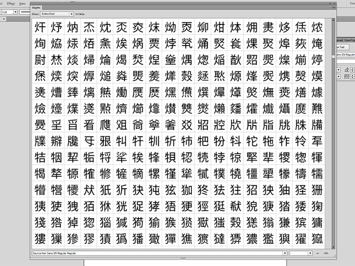
Not so for the so-called CJK (Chinese, Japanese and Korean) fonts. Chinese alone has tens of thousands of characters -- no one is quite sure how many, though the consensus seems to be that "only" about 2,000 - 3,500 are regularly used. But it has two types, Simplified and Traditional, and several regional dialects that require variations on a lot of characters. Japanese Kanji, based off Chinese from as far back as the 6th century, also has tens of thousands of characters, though once again, a typical reader knows between about 2,000 - 3,000. Korean Hangul is the most simple of the pack, with a 24-symbol alphabet.
This isn't the first pan-CJK font -- that was Bitstream Cyberbit in 1998. And while there's a modern pan-CJK font, URW++ Nimbus Sans Global (in light, regular, medium, bold, and monospace) and Nimbus Roman Global (regular and bold), each of those options I just listed has to be purchased separately, and each costs $2,653 (or €2,320 including VAT). For 5 licenses. That's prohibitively expensive for all but the biggest companies. According to Adobe, Asian fonts costs as much as 10 times as much as Latin fonts because of their complexity.
In addition to being complex, pan-CJK fonts have some design requirements that Latin fonts don't usually face. Scroll down to the "http:="" cweb.canon.jp="" eos="" index.html"="" rel="follow" target="_self">Canon's Japanese site or this page on Samsung's Korean site -- what do you see? Native languages intermixed with English. That means the designers and Web developers need a font in which the Latin characters match the aesthetic of the regional ones.
When you take into account the modern trend toward cross-platform applications, it adds another wrinkle for interface designers: you want a seamless look from phone to tablet to desktop. That means the font has to be readable at very small sizes, and scale well. An additional design requirement is that it not be Web-only. Print, at least in business, is not dead. A company's website and printed materials also need to match.
And finally, it has to be small. Google worked with Monotype type designer Steve Matteson on the now-ubiquitous Droid Sans. In an outtake from a series of interviews he did with Lynn La, he talked about designing smartphone fonts:
On a phone, there's always a trade-off of space in terms of memory and how much pizzazz [Google] want to put into it. With fonts, they take up a fair number of MB [or megabytes] inside of a phone. With Android, they only wanted two sans-serif designs (a regular and a bold), but they wanted it to cover Vietnamese, extended Cyrillic, the Russian alphabet (literally 900 characters in these fonts).
In 2012, he also spoke to Lynn about the development process for what eventually became the Droid Sans "fallback" font:
They [Google] also knew they would be doing [developing a] web browser [app], so they needed a four-member family serif typeface for reading text. And then they also commissioned a Chinese, Japanese, and Korean typeface (which is like 30,000 characters) that matched the designs of [the font known as] Droid sans. We had a developer in China that we worked with to make sure their design went well with Greek, Cyrillic, and Latin. Latin designs (English, German, French), design changed completely [compared to] other languages, (non-Latin, like Thai, Hebrew, Arabic).
Unfortunately, the fallback font has one big drawback: the glyphs aren't regionally contextual. This is another big issue with pan-CJK fonts, where Adobe says there can be as many as four regional variations, a problem that Source Han Sans addresses.
And it all has to fit into the 16-bit OpenType character map table, which limits it to 65,535 glyphs. Source Han Sans hits that ceiling.
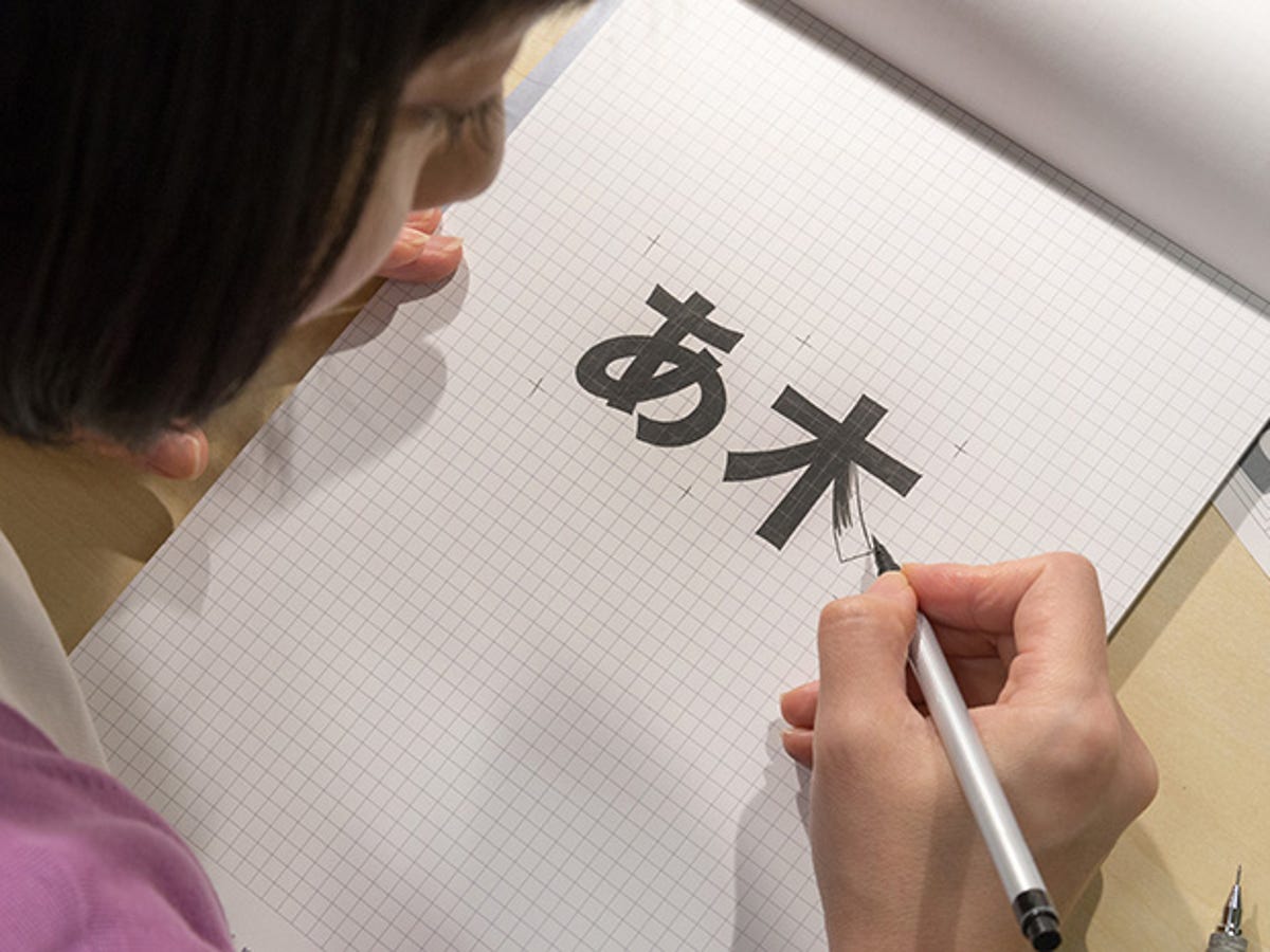
The project was driven by Ken Lunde at Adobe, and if you feel a bit geeky, here's a presentation he gave in 2010, The Design and Development of Pan-CJK Fonts (PDF). To design the face, designer Ryoko Nishizuka drew thickest and thinnest versions of the typeface, building on the aesthetic of Adobe's Source Sans face to mesh with the that Latin face as well as Google's Roboto and Noto Sans faces.
To build the font, Adobe took advantage of some old tech: its Multiple Master font engine. When PostScript fonts (which are essentially read-only) died out as a popular format, replaced by more flexible TrueType and OpenType the necessity for Multiple Master's capability of generating new weights and widths on the fly became almost nonexistent.
Adobe used MM to interpolate 5 weights between the thick and thin designs of each stroke. They then worked with type foundries Sandoll in Korea, SinoType in China and Iwata in Japan, where designers verified the character design and tweaked each glyph -- Sandoll had to create the Hangul glyphs from scratch -- and created regionally appropriate version where necessary.
Google drove the requirement that the font be open-source (under the Apache 2.0 license); that's the only practical way to make it universally available to developers. But it's a huge boon to designers like this guy and other folks held back by the huge expense of licensing an alternative.
Syncable versions of the font are available via Typekit (for Creative Cloud subscribers), and you can download them via Github, SourceForge, and Google's Noto page.