Why Facebook isn't rushing the rollout of its new News Feed
The social network is releasing a new look to make the site feel less cluttered, but it's doing so at a snail's pace. Here's why.


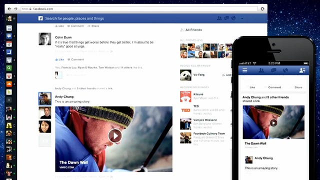
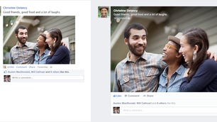
Three weeks ago, Facebook unveiled a new look for News Feed to make its often overwhelming stream of updates feel less cluttered. The new News Feed features photos and stories that are twice as big as before, individual feeds for filtering the stream by people or content, and an altered bookmark-based navigation model.
"As we looked at general trends, we saw a world that was rapidly shifting over to mobile," Chris Struhar, lead engineer on the project, said about the inspiration behind the new look, during a phone interview with CNET yesterday. The new News Feed, he said, embodies a simpler, less cluttered design aesthetic inspired by mobile interfaces.
Though Struhar admits that News Feed had become overwhelming, Facebook isn't rushing out its fix for the problem anytime soon.
"We've turned it on to a small group of people initially," he said. "We're trying to observe, to iterate...the idea is to make [the new News Feed] polished before full rollout."
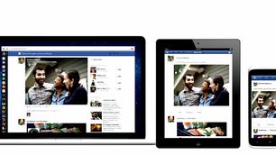
In fact, Facebook, he said, is still very early on in a rollout process that will take some time. Exactly how long, he wouldn't say, but the company does plan to push forward with the release of the mobile version of the new News Feed in a few weeks. The rollouts, however, won't be aligned, which means some members will receive access to the mobile version before the new look for News Feed lands on their desktop.
The snail's-pace release strategy may seem counterintuitive, especially considering that the social network is under pressure to grow revenue and that advertisements are shown twice as large in the new design. But for Facebook, the new look is a big risk; it's an opportunity to borrow from mobile to reinvent the desktop experience, but the challenge involves not totally disrupting an experience that's become familiar to people.
Change is not always appreciated, particularly by Facebook members, which means the company must tread lightly as it moves ahead with its new design.
"Our goal is to build the highest quality product for people, however long it takes," Struhar said.
Facebook, he said, is actively collecting and monitoring feedback, and making changes based on member input. The social network is encouraged by the response so far, which Struhar characterized as "generally positive." Members have written in, through a "give feedback" option on the site, to say that the new News Feed does indeed feel less cluttered, he said.
Since the debut of News Feed's new look, Facebook has made at least two tweaks to the design based on member input. People were complaining that they couldn't find their way back to the home page, so Facebook added a "Home" link to the blue bar that sits atop the site. The company also inserted a "Chat" button at the bottom of the bookmarks section on the left-hand side to make it easier for folks to start conversations with friends.
The additions, more like necessary corrections, show exactly why Facebook is taking its sweet time. If Facebook forgot to give members a link to find their way home and hid its chat function too far from view, then what other things has it overlooked?