Why Facebook isn't making your eyeballs bleed
Vision care professionals are in agreement: despite rampant complaints, a design change to Facebook's home page that shrinks the font size will not, in fact, make anybody go blind.


Facebook's frequent home page design changes are known to get momentary griping from users who say it's ugly, difficult to use, or hides their favorite features, but this is a new one: scores of ticked-off members go so far as to claim it's detrimental to their health.
That's what happened after Facebook on Wednesday made an unannounced tweak to its home page design, shrinking the font size that appears on users' "news feeds" of their friends' activity across the site. Facebook, in a statement, said it's "constantly testing new ways to make the site more efficient for people."
But reactions across the social Web ranged from "I feel like I'll go blind from reading its updates" to "What kind of bionic carrot-flavored crack rock are the Facebook developers smoking to make the font this small?" There were even accusations of ageism, considering that the over-55 demographic is one of the fastest-growing on Facebook and that older eyes could have trouble reading smaller print.
Not so fast. If your eyes are hurting from the text on Facebook's home page, they were probably already subject to eye strain--the term for the discomfort, dryness, redness, and other unpleasant symptoms that can result from focusing on a computer screen or other object for too long--long before you loaded up the social network to check up on your FrontierVille homestead or to remove some unflattering photo tags. Eye care professionals say the smaller font size is unlikely to affect users' vision or eye health any more than its larger-type brethren. Eye strain, too, is temporary and very preventable.
"Making the font smaller doesn't necessarily increase eye strain for most people, especially with newer monitors that have better contrast," said Dr. Jody May, an ophthalmologist at the York, Penn.-based May Eye Care. "The fonts are much better than they used to be, and refresh rates on the LCD monitors are now adequate on anything you can buy."
And the activity that causes eye strain--looking at something like a computer screen for a long time without taking time to give your eyes a rest--will happen whether the font on the screen is big or small.
"If you concentrate and spend a long time looking at something like a Facebook page, whether the font is big or little, you can run into the same symptoms," explained Dr. Richard Bensinger, a clinical correspondent for the American Academy of Ophthalmology. "When you're trying to focus, you're blinking a lot less. "If you look at somebody, and you just talk with them casually, they're blinking about 16 blinks a minute, and if they concentrate looking at a computer or reading, the blink rate drops to 5 or 6 times a minute. And then the eyes dry out."
So what happens then? May said the best strategy is to consciously avoid behaviors that will cause and prolong eye strain.
"Any time you're using a computer for a long period of time, especially if you're not looking away, you put yourself at risk for eye strain," he said. "Eye strain doesn't cause any permanent vision damage or permanent eye damage. What it does is give you a headache, dry eyes, red eyes. [It will] make your eyes feel fatigued, make you sensitive to light. But the way around that is not to keep staring at the screen for more than 20 minutes at a time. The rule is the 20-20 rule. You use your computer for 20 minutes, and then you spend 20 seconds staring away from the screen."
That said, while eye care professionals seem to be in agreement that small font sizes won't cause eye strain, some believe that it can make it worse for eyes that are already strained. "The issue with smaller font sizes is that people have to look more intently and more closely at what is written on the screen, and that requires them to stare a little bit more, and the blink rate will go down even more," said Dr. William Trattler, a Miami-based ophthalmologist who says he's recently seen heightened numbers of hard-core video gamers showing up and complaining of irritated eyes.
As for the critics accusing Facebook of ageism by putting a smaller font onscreen, May said that, yes, older computer users are going to experience worse eye strain than younger ones. This is due more to the fact that it's significantly harder for their eyes to focus.
"The biggest problem comes when people start to develop presbyopia, that is, the inability to focus to read," May explained. "Once you've passed age 50, and you're looking at smaller text on a monitor, you're going to have eye strain. The way around it is to wear reading glasses for that distance, or get a larger monitor where the font is bigger just because the monitor's bigger."
So should Facebook be obliged to offer a large-print option? Probably not: Unlike a book, a Web page is not static. Unless you're using a browser dating back to the golden age of AOL dial-up, it undoubtedly has a function that lets you alter font sizes or zoom in.
Real trouble reading small print might also be an indication that corrective eyewear is needed.
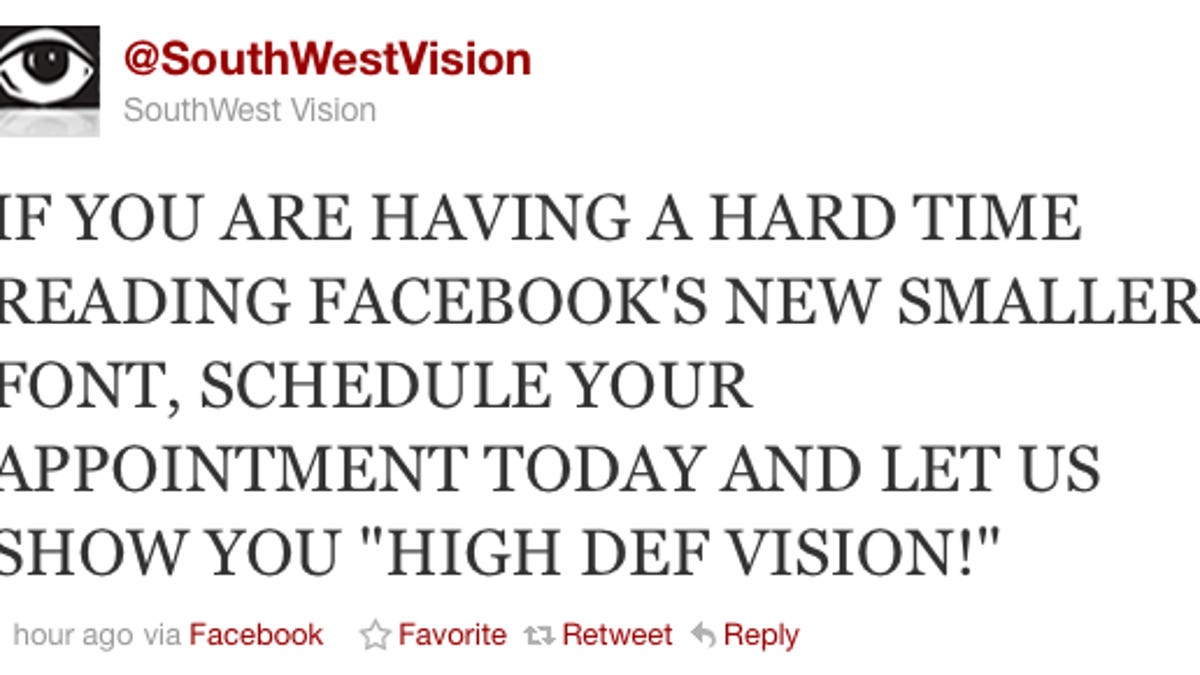
That possibility was raised by at least one opportunistic eye doctor's office with a Twitter account, the St. George, Utah-based Southwest Vision, which proclaimed in very loud and very easy-to-read capitals on Thursday that "IF YOU ARE HAVING A HARD TIME READING FACEBOOK'S NEW SMALLER FONT, SCHEDULE YOUR APPOINTMENT TODAY AND LET US SHOW YOU 'HIGH DEF VISION!'"