New Yorker's cover might be most digital ever
The New Yorker magazine, famous for its playful, timely covers, ran one recently that captures a tiny part of our digital lives.


In almost nothing in life is the most venerable institution also the most forward thinking. But, in the world of magazines, "The New Yorker" comes pretty close.
The magazine, founded in 1925, continues to be its outstanding self in print. I try to read almost every issue cover to cover. And the ones I don't? Well, they chastise me from the side of my bed when they pile up.
But what's unusual is how well the magazine has done in the digital space.
Smart use of its Web site: NewYorker.com offers up the right mix of free and subscriber-only content. That means giving away just enough familiar content and features, but locking away the bigger, more important stories. See this week's table of contents to get an idea of the mix. Meanwhile, the 15-plus blogs, the deep and rich audio and video content, and even the animated cartoons provide hours of free, online materials. Its Twitter feed (@NewYorker) and Facebook page (FB.com/NewYorker) are good models for publications trying to navigate social media.
Digital archive: As a subscriber, you can get access to the entire archive, or as a promo puts it: "every article, essay and cartoon dating back to 1925." Several years ago, the magazine offered a hard disk with that archive loaded on it--now it's easy to just get it on the Web site. At a time when we talk about the "long tail" of content to describe the longer shelf life for good quality items, this might be the longest tail of them all.
iPad app: Most interesting is what they've done with the iPad app. It's a gorgeous rendition of the magazine experience and I like the fact that, if you're so inclined, you can look at all the cartoons without letting all those pesky articles get in the way.
What I really wanted to highlight today, however, isn't any of those things. Instead, it's the cover from the recent February 2012 double issue. Sure, the magazine has printed a lot of techie covers--David Hockney's iPad and iPhone paintings come to mind--and it does countless techie cartoons--including the most famous Internet cartoon of them all--but this particular cover tops them all.
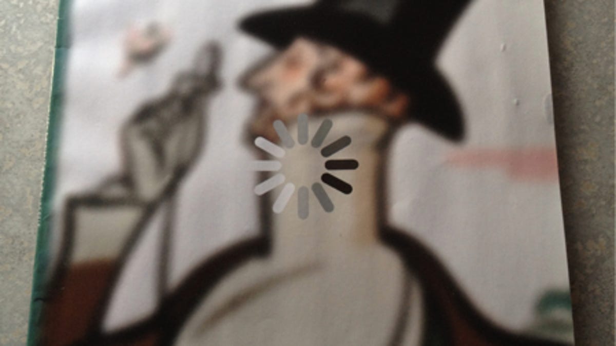
It's called "Loading..." (above) and captures today's digital experience perfectly. We are sitting (or standing) around and waiting for various things to load--on our tablets, smartphones, and laptops, even at ATMs. The actual loading time might be minuscule, but can seem like an eternity for our modern brains. The way the "loading" icon is displayed is really well done, making for almost an optical illusion-like quality.
This particular cover was part of an entry for the annual Eustace Tilley (the name of that dandy) cover design contest, and was submitted by Brett Culbert, a landscape historian. You can read about how he won in this post by the editors and this post by Culbert. I especially liked that the credit line went to both Culbert and Rea Irvin. As he explains, "I am thankful to be credited for this collaborative work in a table of contents byline happily shared with Rea Irvin: the artist behind the original Eustace Tilley cover from 87 years ago."
READERS: What do you think of this cover, or the concept of "Loading..." in general? Post your thoughts in the comments below, please, or via @sree or #sreetips on Twitter.