Following up on letting iPhone apps run my life
After experiencing problems with several apps when Daniel Terdiman let the iPhone take over for a day, he decided to give them another try at home.


A week ago, I wrote a story about a morning and afternoon I spent in Seattle letting iPhone applications control my day.

And while I vouched for the concept of turning my life over to the various apps--a couple for finding restaurants, one for finding music, one for playing Internet radio, one for AOL Instant Messenger, and so on--I also said that I'd had some problems with several of them.
I also got a lot of feedback from readers who pointed out that I hadn't needed to take photographs of the apps because there is a way to take screenshots directly off the iPhone. Simply clicking on the phone's home button and its power button simultaneously takes a perfect screenshot.
So, in the interest of being fair to the apps that I couldn't figure out, I decided to try them again once I was back home to see if I could figure them out or whether they were beyond that.
It turns out, of course, that it was basically user error. After spending a little more time with each of the apps I got them all working, though, in my defense, I think there were definitely some things about the apps' interfaces in each case that were extremely unintuitive.
First off is Urbanspoon, an app designed to help you find restaurants wherever you are that meet several criteria: neighborhood, type of cuisine, and pricing. It's designed with sort of a slot machine interface where you can "shake" it and each column spins and spins, finally resolving to a single suggestion.
What I'd not understood was how to get the app to give me a suggestion based on my specific criteria. Every time I chose to "shake" it, it spun all three of the wheels and gave me a totally random suggestion. If I wanted Japanese food, for example, it might give me Chinese instead.
Frustrated, I had finally given up and used another restaurant suggestion app instead.

But now, I discovered that there is, in fact, a way to get it to do what I wanted, something I admit I should have been able to figure out before.
Below each column there's a small lock icon. It turns out that clicking on a lock sets that column in stone. So, by setting my criteria for each category, then clicking on each of the locks, and finally "shaking" it, it does indeed present suggestions based on my needs.
Next up on my list of apps I couldn't get working properly was Twitterific, an iPhone Twitter app.
I had had problems getting Twitterific to let me enter my Twitter account information after I'd inadvertently entered it incorrectly the first time. It asked me to enter it again, but I was stumped trying to figure out how to do so.
And, again, it turns out there was an easy solution, and one I missed most likely because I was in a hurry and wasn't thinking analytically. The answer was to click on the little wrench icon at the bottom of the Twitterific screen, which brings up the account information screen. I re-entered it there and sure enough, the app started working right away.
While I was in Seattle, I had abandoned Twitterific in favor of another app, called Twitterlator. But now I've started using one called Twinkle, and it seems even better because it offers more features, including the ability to view tweets from people in your immediate vicinity.
I'd also written that the tip calculation app I'd downloaded--CheckPlease--didn't look in any way like the screenshot presented on Apple's App Store. In fact, it had a very unattractive interface though it was simple to use.
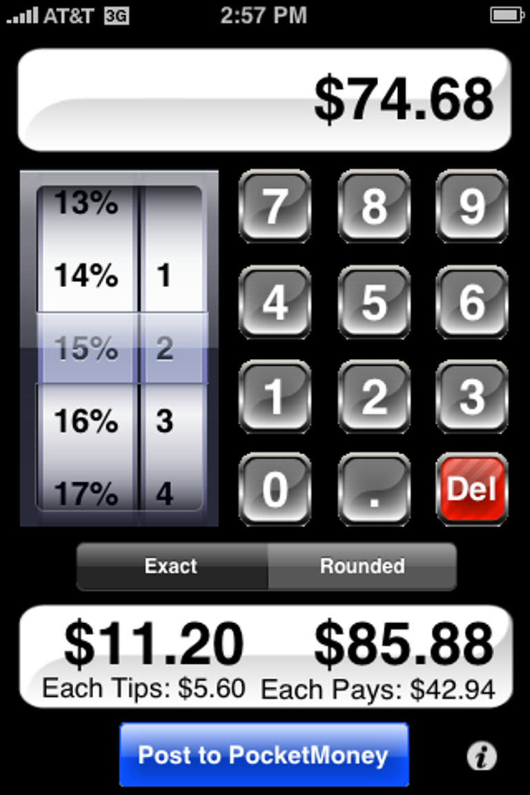
But a couple of days ago, my iPhone alerted me to the fact that there was an update available for CheckPlease. When I downloaded it, there was the interface that the App Store had originally promised. And indeed, it is now much better, more elegant, and more useful. Instead of unattractive sliders and results that give you a total restaurant check but not the specific tip amount, it now has a nice system with punch keys for entering the amount of the bill, a click wheel for the tip amount, and it presents the subtotal for the tip and the total amount for each person.
Much better, for sure.
In the end, then, I have to give props to the designers of each of the apps I'd said I had problems with. I suppose I would encourage them to make their interfaces a tad more intuitive or to include helpful directions. But then again, I have to also take some responsibility for not employing analytical skills to solve the issues I was having when I was having them.
Either way, it's nice to see them working properly now. Which, ultimately, reinforces my notion that spending a day letting iPhone apps run my life was a worthwhile and fun experiment.