Android Market slashes refund time to 15 minutes
An update to the Android Market, on all devices running Android 1.6 or higher, will bring an interface overhaul and significantly cut app refund times.


In a dramatic and potentially frustrating change to the Android Market, the time period in which you can get a refund on purchased apps has shrunk from 24 hours to a mere 15 minutes.
Google will roll out an update to the Market to all devices running Android 1.6 or higher over the next two weeks. The update will focus on improving "discoverability and merchandising", according to the Android developer blog, with an interface refresh to sweeten the deal.
The move will make the Android Market a more attractive place for developers looking to profit from making apps, which in turn should improve the overall quality of apps on offer. Google says the change will "help developers manage their businesses more effectively".
Fair enough, but that's a huge reduction, and a quarter of an hour may well prove insufficient time for a user to figure out whether or not an app is what they really wanted.
The iPhone App Store has no equivalent refund system, so Android still trumps Apple's offering there, but Android fans accustomed to taking a day to figure out if they like a download might rue the changes.
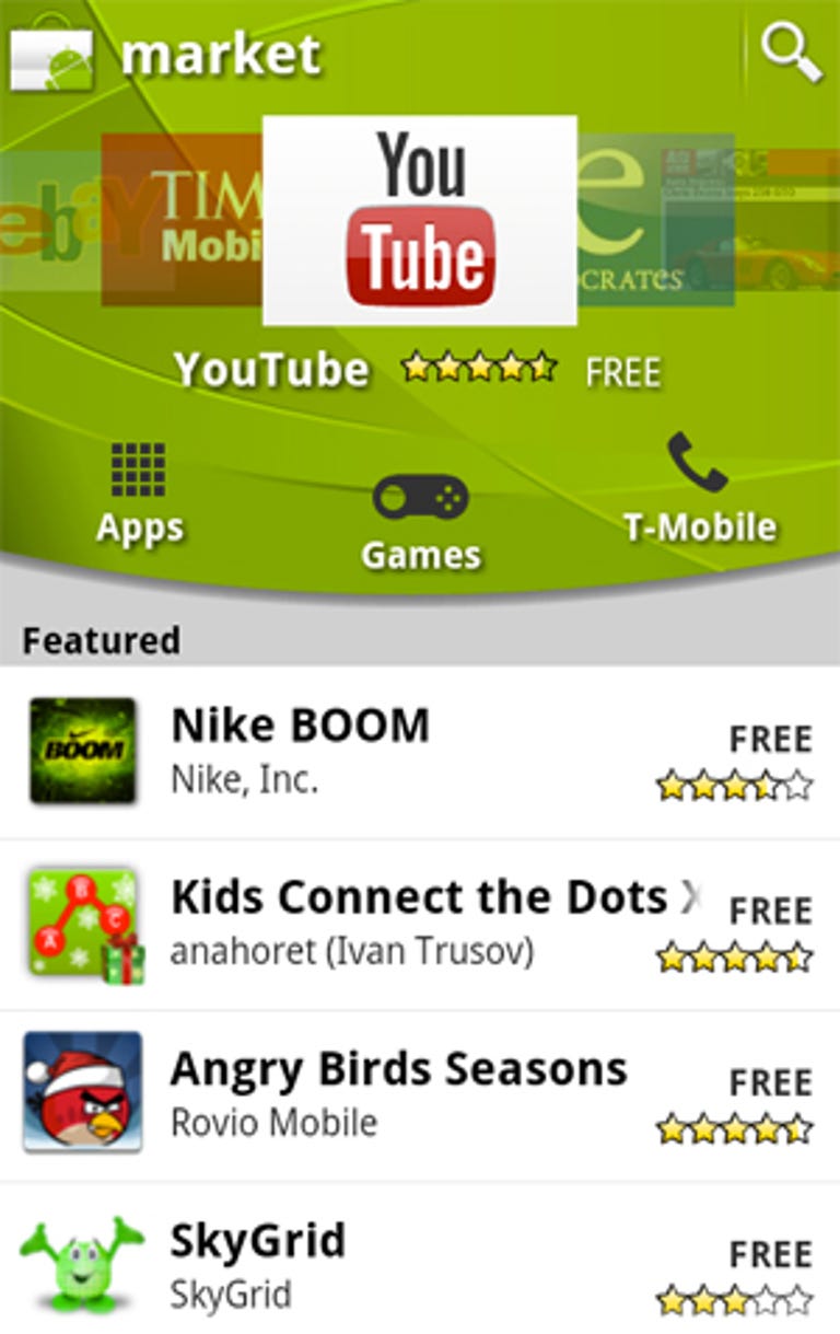
In more appealing news, a massive aesthetic overhaul is also due. We've long thought the Android Market was a little unfortunate looking, with its hard to navigate menus and ugly interface. The new update will add a carousel on the home and category screens, which should help users discover new and cool apps, or just those that are being mercilessly promoted.
There are also two new categories, for widgets and live wallpapers, with more promised in the weeks ahead.
Most importantly, all the information on an app is now available on a single page, with the tabbed view for investigating an app thrown on the scrapheap. Hopefully this will make evaluating new apps a much simpler process, and brings the design more in line with the excellent iPhone App Store.
What do you think of the changes? Let us know in the comments or on our Facebook wall.