MyFord Touch gets graphics, performance update
The MyFord Touch interface, which received much criticism for cluttered screens and slow performance, is getting an update to solve these issues, Ford announced.


Ford has announced an update to its much-criticized car tech interface, previously plagued by slow performance and cluttered screens.
Ford came out with its new MyFord Touch interface on the 2011 Edge last year. This interface featured LCDs on the instrument cluster showing navigation, phone, audio, and trip data, along with a big center touch screen allowing control over these different car tech functions. But the touch-screen interface came under much criticism by CNET and others for its slow performance and cluttered displays.
Today, Ford showed off an update to the system intended to address its various problems. According to the company, the MyFord Touch update features refined graphics on the more than 1,000 screens in the system, responsiveness improved by two times or more, and a few added goodies, such as iPad compatibility and Audible.com integration.
John Schneider, Ford's chief engineer for HMI, Driver Controls, and Infotainment, said, "The front end has been simplified and the system has been given selective functional improvements."
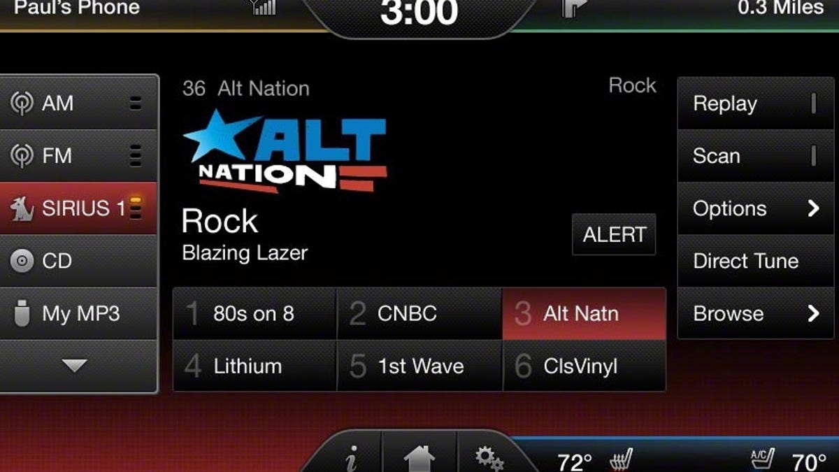
Extraneous information was removed from the screens, and the touch buttons were arranged in a grid pattern, so users would not have to hunt for a particular function while trying to drive. Ford released an image of the new satellite radio play screen. Comparing it with the old screen shows larger fonts and more distinct touch buttons. The preset buttons were moved from a vertical menu on the right to a strip along the bottom, similar to the way most systems are organized, and some buttons were removed entirely.


MyFord Touch still uses an audio source menu down the left side of the screen, but it is easier to read, with more distinct graphics than the previous version. Ford left the basic architecture intact, with different colors for phone, navigation, stereo, and climate functions, accessible in tabs at the four corners of the screen.
Schneider also notes, "Things are about twice as fast, and the transitions from different function areas are smoother."
The HMI team improved performance by optimizing the system's subprocesses, freeing up bandwidth from its Freescale iMX51 CPU for more critical tasks. The result should be a better customer experience, with touch response times more in line with what people have come to expect from other devices.
Ford announced other improvements to the system, such as updated Navteq maps for the TeleNav-powered navigation system. These maps show more 3D landmarks. The Gracenote database has been updated with the latest music data and album cover art, and Ford improved the system's ability to reconnect with a previously paired Bluetooth phone.
The updated system will be shown at the upcoming Los Angeles Auto Show, and will come out on the 2013 Ford Escape, Flex, and Taurus. Further, owners of existing Ford cars equipped with MyFord Touch will be able to update their systems. This update should be available early next year.