How to read a TV review, part 2: Calibration results (photos)
CNET's calibration results can tell you a lot about a TV. If only there was a guide to help you read them. Wait, there is! It's right here!
Main calibration report
In my "How to read a TV review" article,
I detailed the basics of a TV review. With this slideshow, we'll check out the highly detailed Calibration
Results.These are the objective measurements of what a TV is capable of doing, in terms of brightness, colors, and so on.
For our discussion, we'll again be using the Sony Bravia XBR-55HX929.
Each slide has only a portion of the full discussion. For more detail, check out the full article.
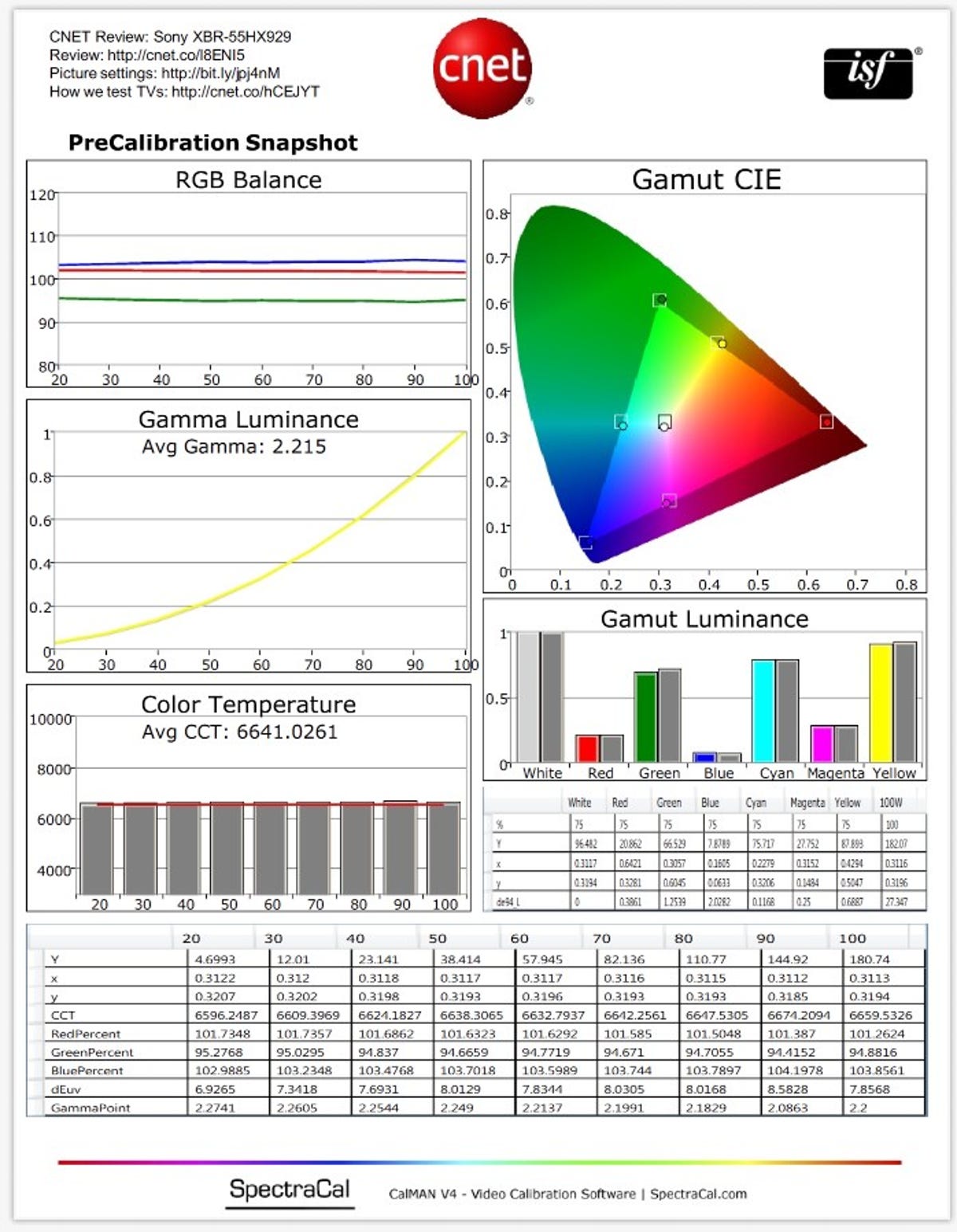
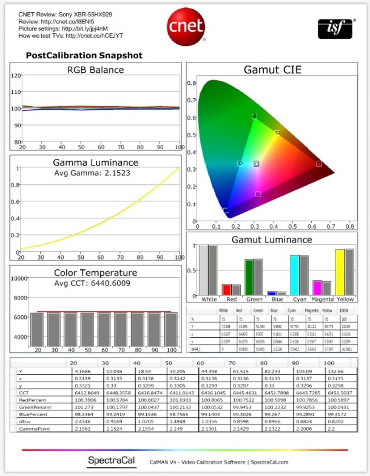
RGB Balance
TVs create light with the three additive primary colors: red, green,
and blue. In order for a TV to create "white," it needs fairly equal
parts of R,G, and B. Too much blue, and the image will appear "cool."
Too much red, and the image will appear too "warm."
Our example image here is the precalibration measurement showing that across the entire grayscale from dark images (20) all the way to bright images (100), there is a consistent lack of green.
A well-calibrated TV will have all three lines overlapping across the entire brightness range.
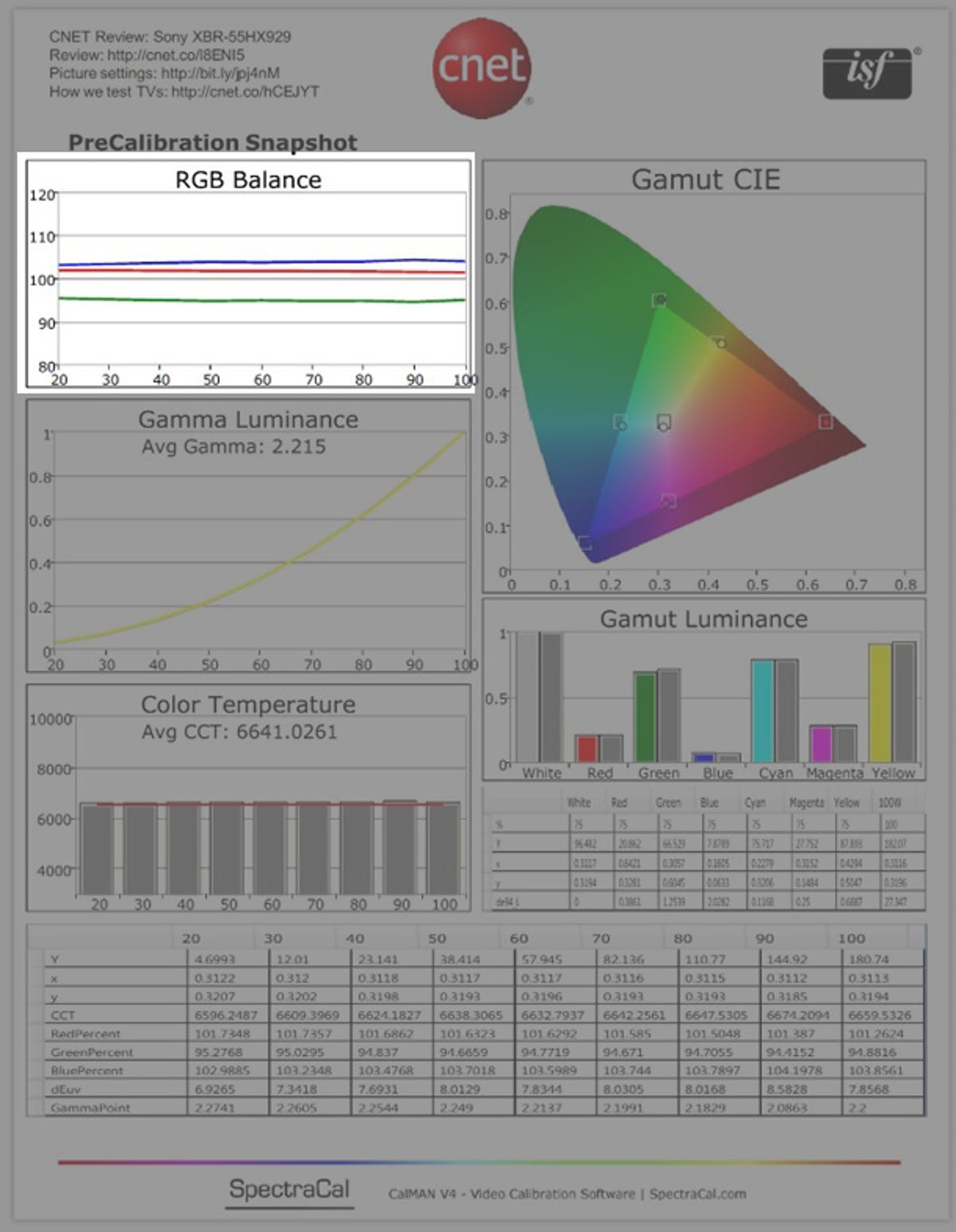
Gamut CIE
This triangle represents all the colors the TV can create with its three color primaries. There are set standards as to the size and precise points of each corner (and midpoint secondary colors). The idea here is having the small dots within the squares. Too far outside each square indicates that color is inaccurate. Inaccurate colors can make the picture look unrealistic.
The color points in our example here are pretty spot on. A common inaccuracy in many other televisions is an oversaturated green, which would put that color point above the corresponding green box on this cart.
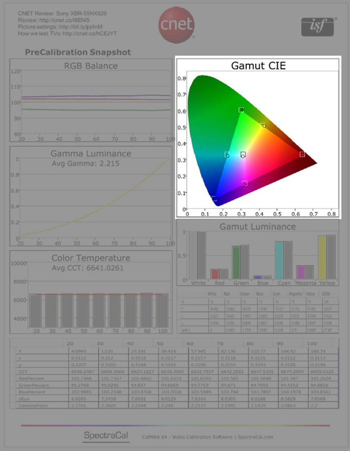
Gamma luminance
Gamma, as CNET's How we test page describes it: "Gamma is a measure of how much light a display produces when fed a certain level of signal." The Wikipedia page is actually quite good for this topic (especially the images).
CNET recommends a gamma of 2.2, and judges accordingly how much
higher or lower the gamma is from there.
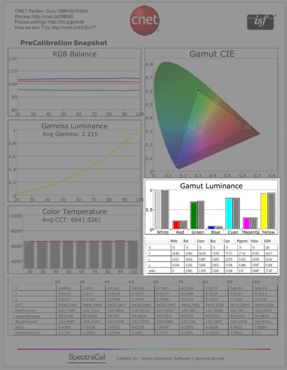
Gamut luminance and numbers
The Gamut Luminance chart shows the light level (luminance) of each primary and secondary color. The gray bars show the ideal, while the colored bars show the actual measured level. The closer each color is to the reference in level, the better--this especially important for the primary colors of red, green and blue. If there is too much red, for example, the TV is referred to as "pushing red. This can result in people with lighter skin tones having a reddish, sunburny complexion.
Below the Gamut Luminance chart are the x/y coordinates for the different color points, plus their deviation from standard.
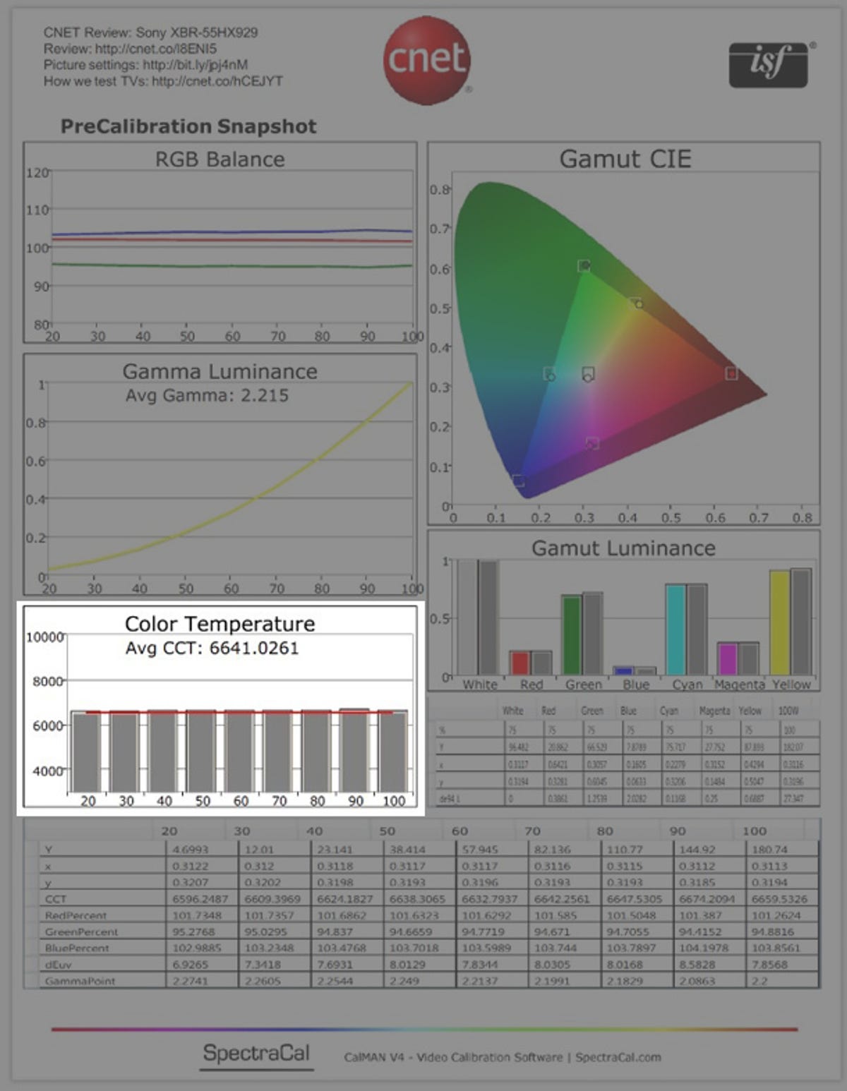
Color temperature
This, in kelvin, is what we were discussing in the RBG Balance section. Ideally you want all the bars to be roughly the same height, which they are in this case.
For most people, without a reference, the difference of a few hundred kelvin is hard to spot. It's more important for a TV to be consistent than to be accurate with certain levels of brightness and not with others.
There's a lot that goes into all this, which I cover in my article on color temperature.
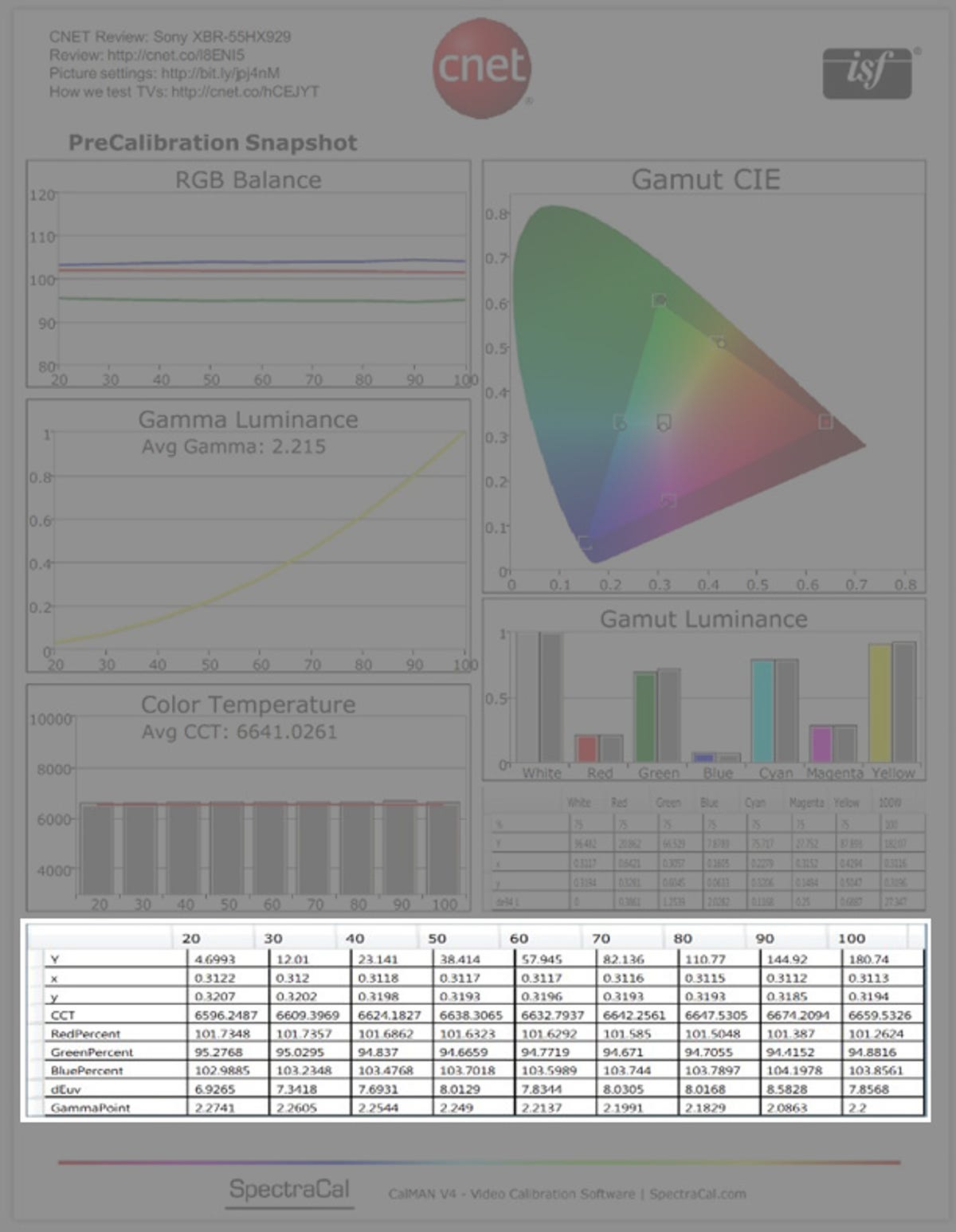
More numbers
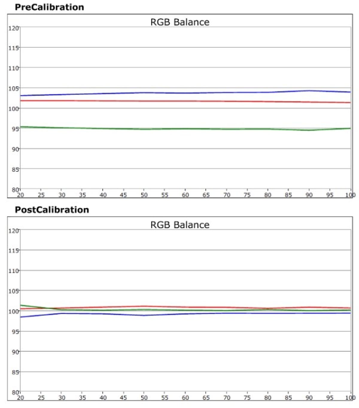
Pre- and post-calibration RGB balance
Here is an expanded version of the RGB Balance chart. As you can see, after calibration the red, green, and blue of the TV match up nearly perfectly with dark images (left) all the way to bright images (right).
The very darkest images, after calibration, will be slightly warm. This is because, as you can see, blue drops down slightly. They'll also be slightly greenish, with the slight tick up of green. This isn't likely to be visible. I mention it only to help describe the chart.
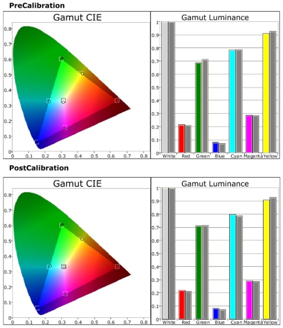
Pre- and post-calibration Gamut CIE
This expanded Gamut CIE chart shows the difference in color points (left chart) and gamut luminance (right chart).
If a TV has adjustable color points, the left chart can be dialed in, so the dots are in the "accurate" boxes. In this case, little adjustment was needed as the color points were quite accurate to start.
Gamut luminance, or the amount of amount of each color compared to its ideal amount (gray bar), also needed little adjusting on this TV. A common problem is "red push" where there is too much red. This can cause Caucasian skin tones to appear reddish, like they're sunburned.
Post-calibration
More Galleries

My Favorite Shots From the Galaxy S24 Ultra's Camera
20 Photos
Honor's Magic V2 Foldable Is Lighter Than Samsung's Galaxy S24 Ultra
10 Photos
The Samsung Galaxy S24 and S24 Plus Looks Sweet in Aluminum
23 Photos
Samsung's Galaxy S24 Ultra Now Has a Titanium Design
23 Photos
I Took 600+ Photos With the iPhone 15 Pro and Pro Max. Look at My Favorites
34 Photos
