Double-take: Is Apple's iOS 7 really all that new-looking? (pictures)
At WWDC 2013, Apple introduced the refreshingly elegant design of iOS 7. But is it really all that new? CNET takes a look at how eerily similar the new face-lift looks to other mobile OSes.


The familiarity of iOS 7
At WWDC 2013, Apple unveiled its updated mobile OS, iOS 7. And while it may look fresh, clean, and totally modern to some, to Microsoft Windows Phone 8, Android Jelly Bean, and even BlackBerry 10 device users, Apple's new OS has plenty that looks familiar. Take a look for yourself to see how much Apple has borrowed from other UIs. What do you guys think? Is the company committing the highest form of flattery, or are we just stretching our imaginations?
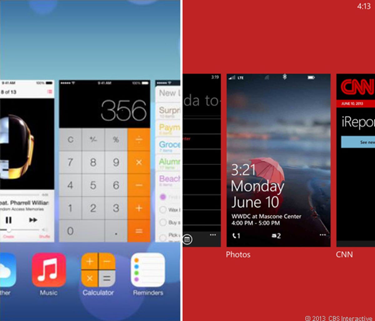
Multitasking between apps
The iOS 7 interface (left), which highlights the software's multitasking abilities, is very similar to how Windows Phone 8 and BlackBerry 10 flaunt the same skills (though the former did it first). Note the close use of tiles and square icons that represent open and operating apps.
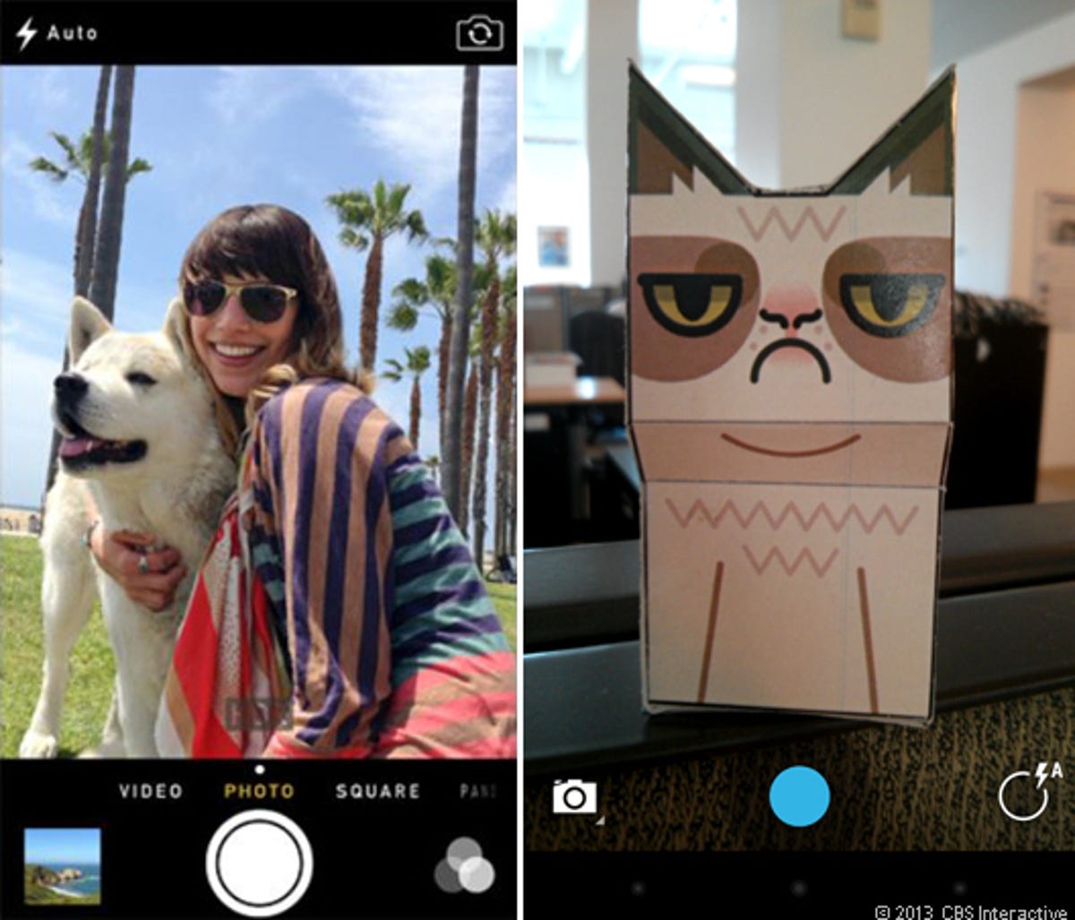
Clicking that shutter button
Gone from the iOS camera is the big gray button with a camera inside and a toggle to switch between photo and video. Instead, iOS 7 (left) has two plain circles that are on top of one another. This has been seen in multiple iterations of Android, which features a small blue circle on top of a slightly transparent black one.
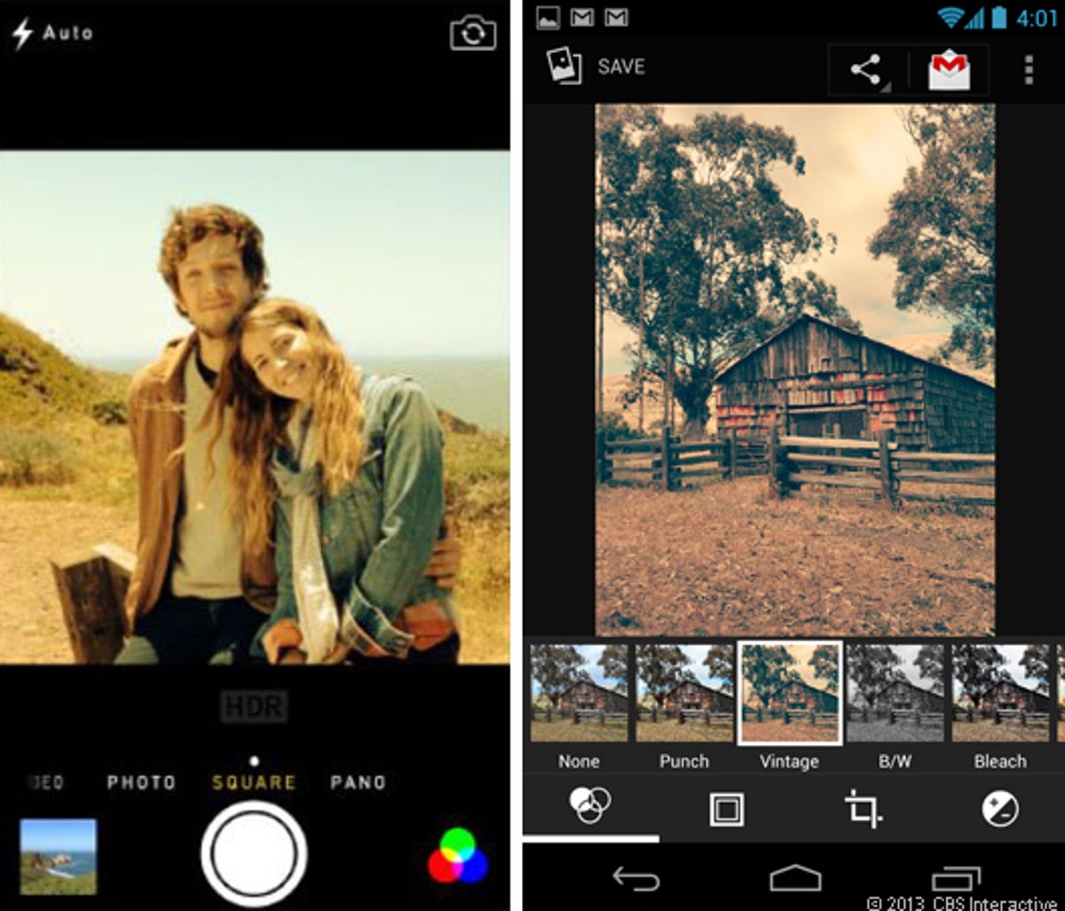
Circles for photo filters
iOS 7 also brings new photo filters directly in the camera app (left). You can see that the icon for these new effects is indicated by a colorful Venn diagram of three circles. We've seen this icon before, though not in color, in pure Android Jelly Bean on the right slide's bottom-left corner.
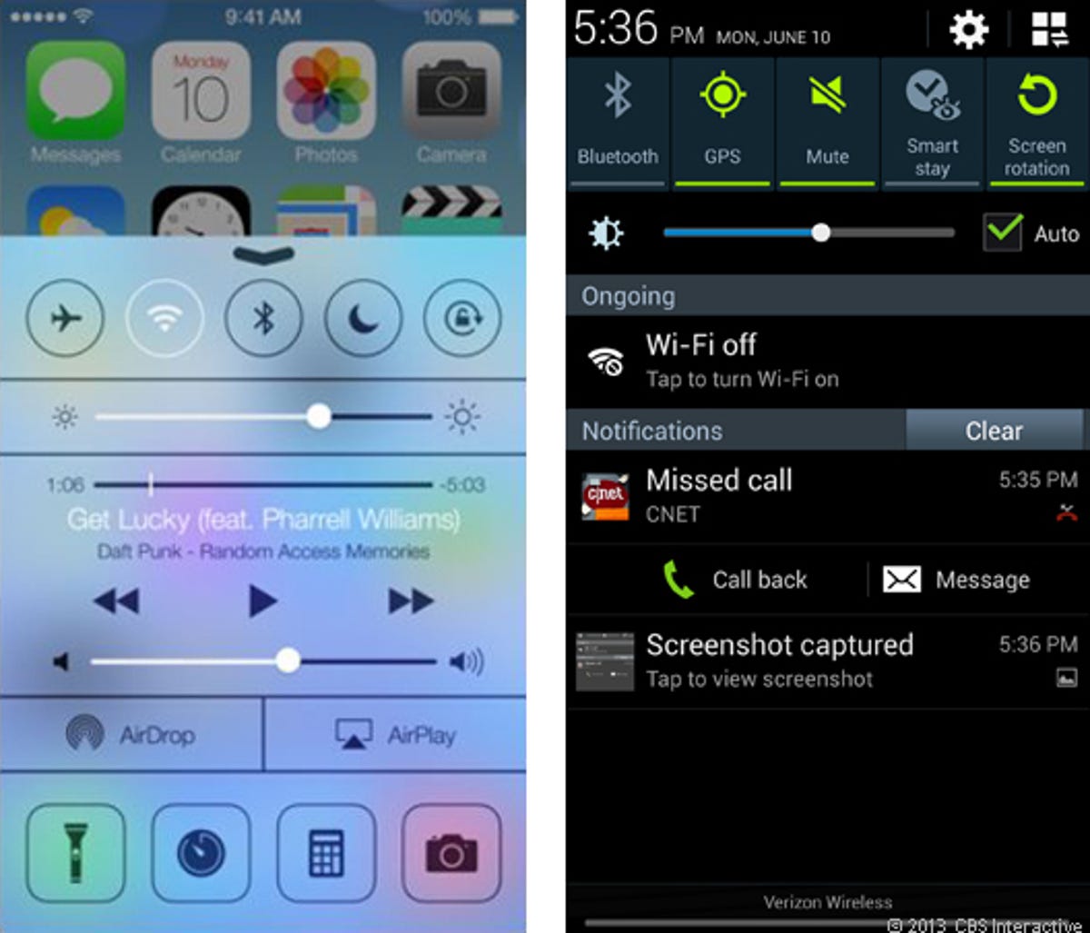
Control at your fingertips
We're glad that iOS 7 finally has a swipe function to call up control settings (left). It's a feature that has long been included in Google Android, so we weren't that surprised that when it finally arrived, it looked a lot like the notifications bars we've seen before, like in Samsung TouchWiz's UI.
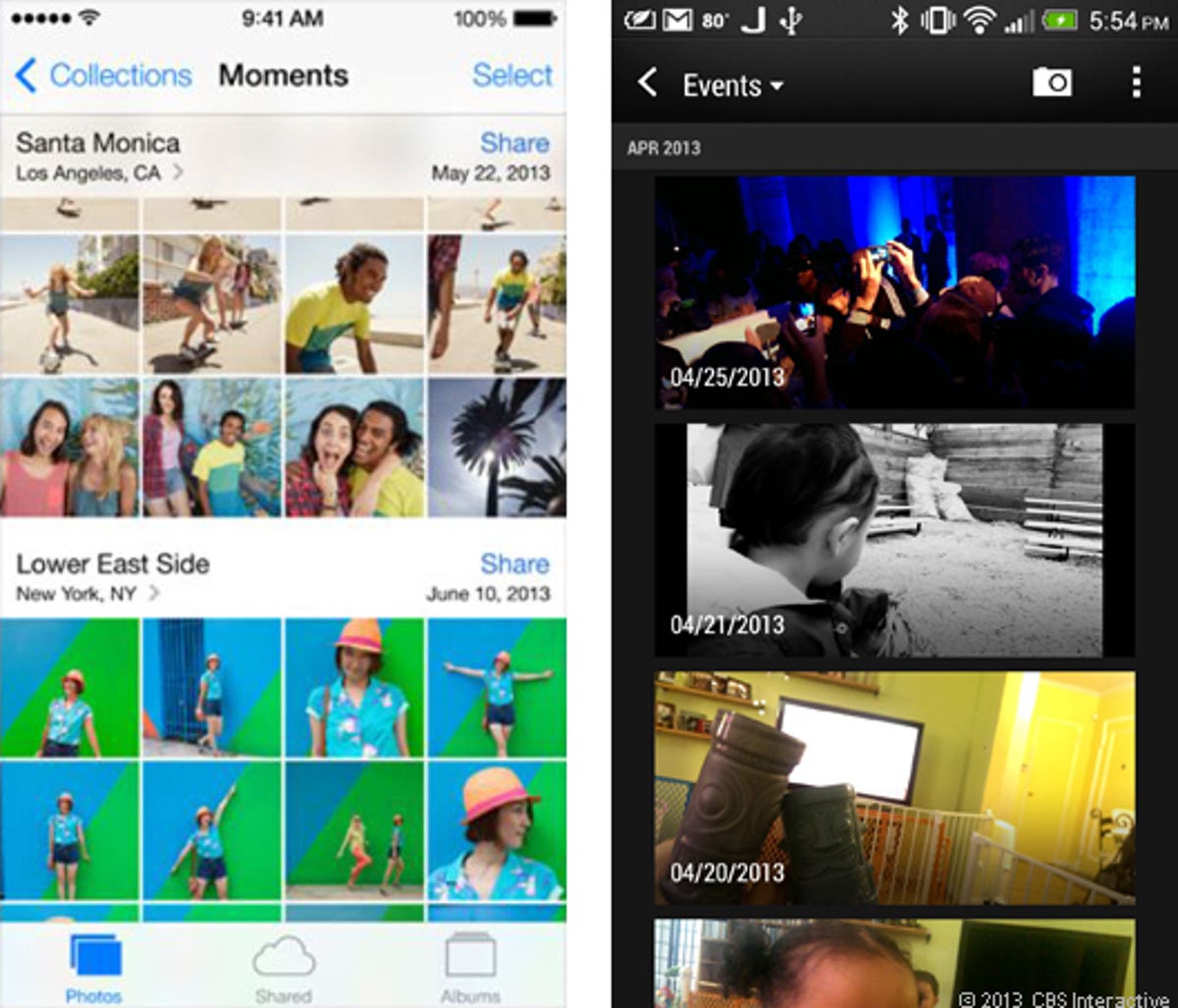
Photo managing by events
iPhoto on Macs may have been grouping images by date automatically for years, but iOS 7 is the first of the company's mobile operating systems to behave in such a way. Of course, owners of the HTC One's new Sense UI (right) know that their phone's camera gallery also associates photos with events in time.
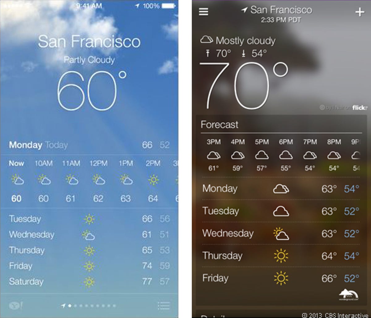
What beautiful weather
While iOS 7's new weather app (left) looks tremendously better and more elegant than before, it looks pretty familiar to the popular weather app from Yahoo. True, iOS' weather app always gathered information from Yahoo (as indicated in the bottom-left corner), but now it has taken up the aesthetics as well, complete with white text overlaying a large graphic of current weather conditions
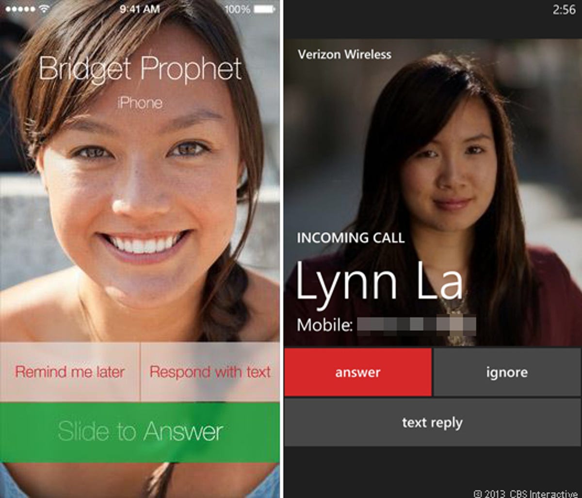
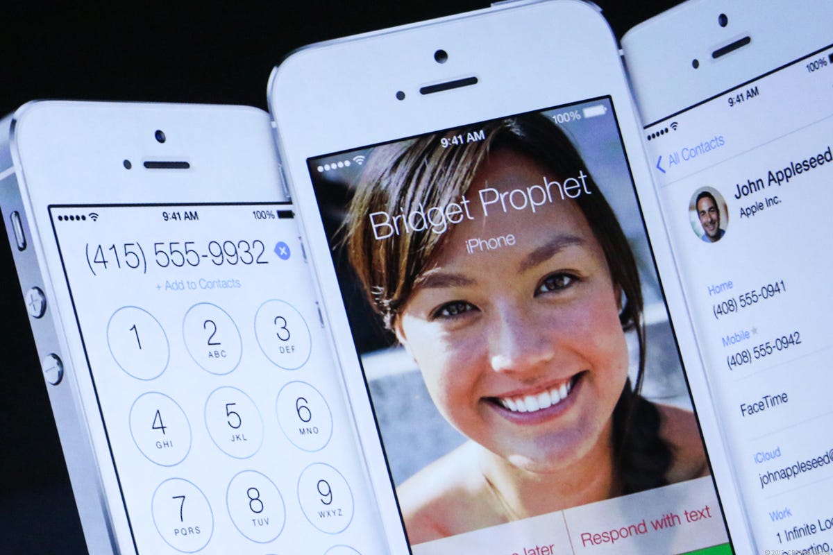
WP8 users choose to ignore
iOS 7 handles incoming calls (left), at least graphically, in much the same way as Windows Phone 8. Users see a large image of their caller, if it's available, and they have the option of responding with a canned text message. But, we do acknowledge there is a difference between opting to be reminded later of a call and ignoring it altogether. Hint: The latter makes your friends sad.
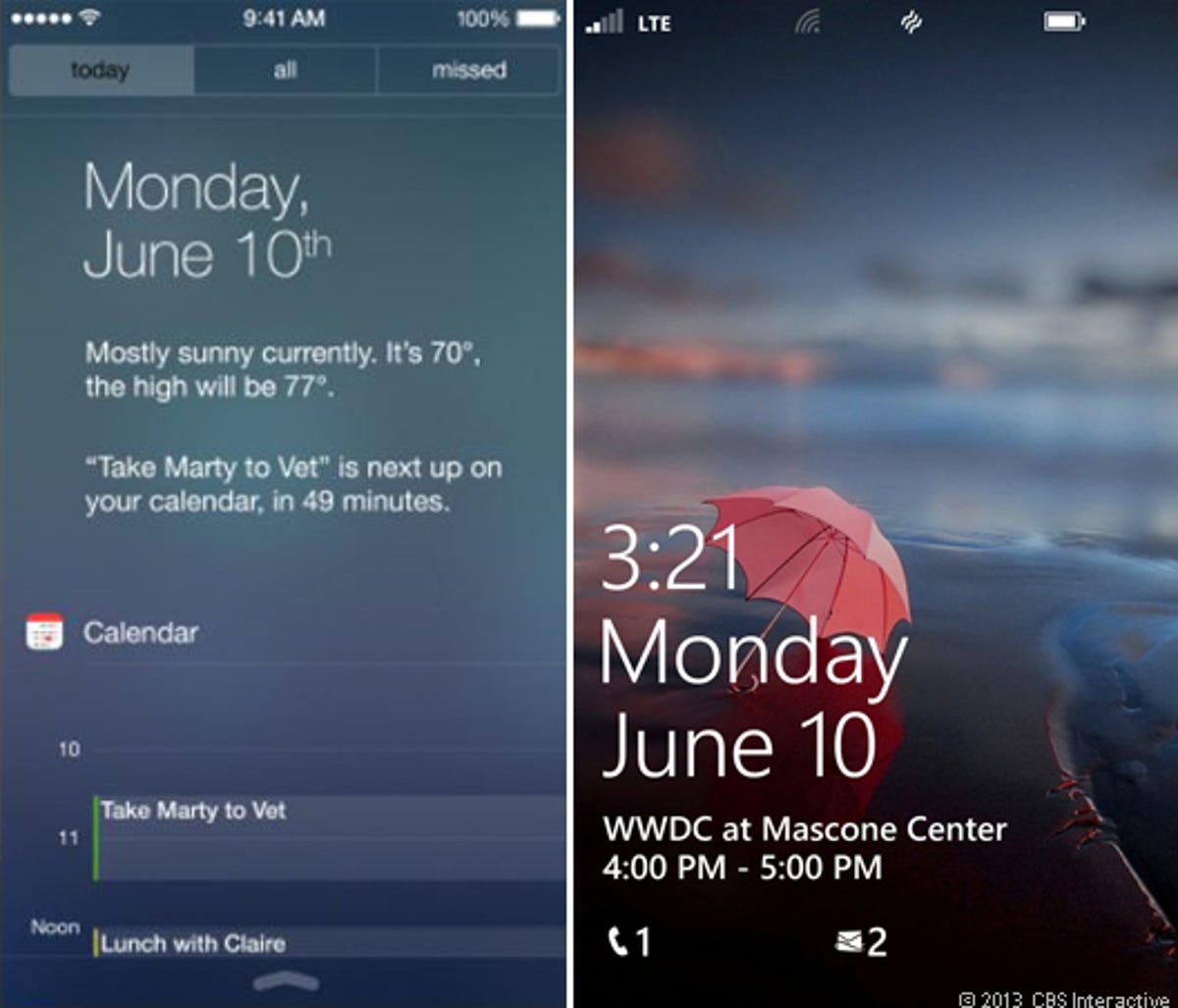
Notification Center aesthetics
Apple's iOS 7 sports a new Notification Center with a Today tab (left) that looks almost identical to the lock screen you'll find on Windows Phone 8 devices. Meeting, date, and weather info are shown on both platforms. Heck, even the font appears to be the same. People who use the Android app DashClock will also feel that iOS 7's Notification Center looks familiar.
More Galleries

My Favorite Shots From the Galaxy S24 Ultra's Camera
20 Photos
Honor's Magic V2 Foldable Is Lighter Than Samsung's Galaxy S24 Ultra
10 Photos
The Samsung Galaxy S24 and S24 Plus Looks Sweet in Aluminum
23 Photos
Samsung's Galaxy S24 Ultra Now Has a Titanium Design
23 Photos
I Took 600+ Photos With the iPhone 15 Pro and Pro Max. Look at My Favorites
34 Photos
