11 top apps redesigned for iOS 7 (pictures)
In an earlier slideshow, I gathered up the apps that would either already fit in with iOS 7's design scheme or had plans to make the switch. In this slideshow I have many big-name apps that have the new look.


More apps getting the new look
It was widely rumored before iOS 7 was even announced that it would come with a brand-new look. After WWDC in June, we knew that the design had been simplified and wondered how app developers would respond when it came time for the iOS 7 launch.
I put together a slideshow called "12 apps that are ready for iOS 7", just before the actual launch. But now that many iOS users are getting acquainted with the new operating system, several big-name apps have also been redesigned to fit Apple's new look. Some of them were ones that I covered in the earlier slideshow, but many others have made significant design changes to adopt the new design standards. Without further ado, here are 11 apps that have made the switch to the flatter, more simplified aesthetic.
Alien Blue
Alien Blue is one of the apps I had early mockups for when I put together the "12 apps that are ready for iOS 7" post. True to the mockup, Alien Blue has all the telltale flat buttons and increased use of white space to fit in with the new look.
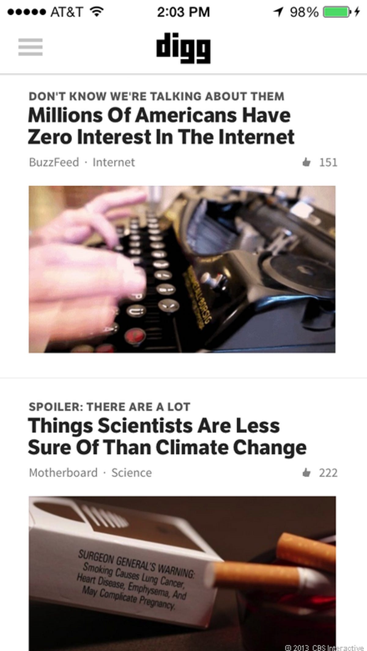
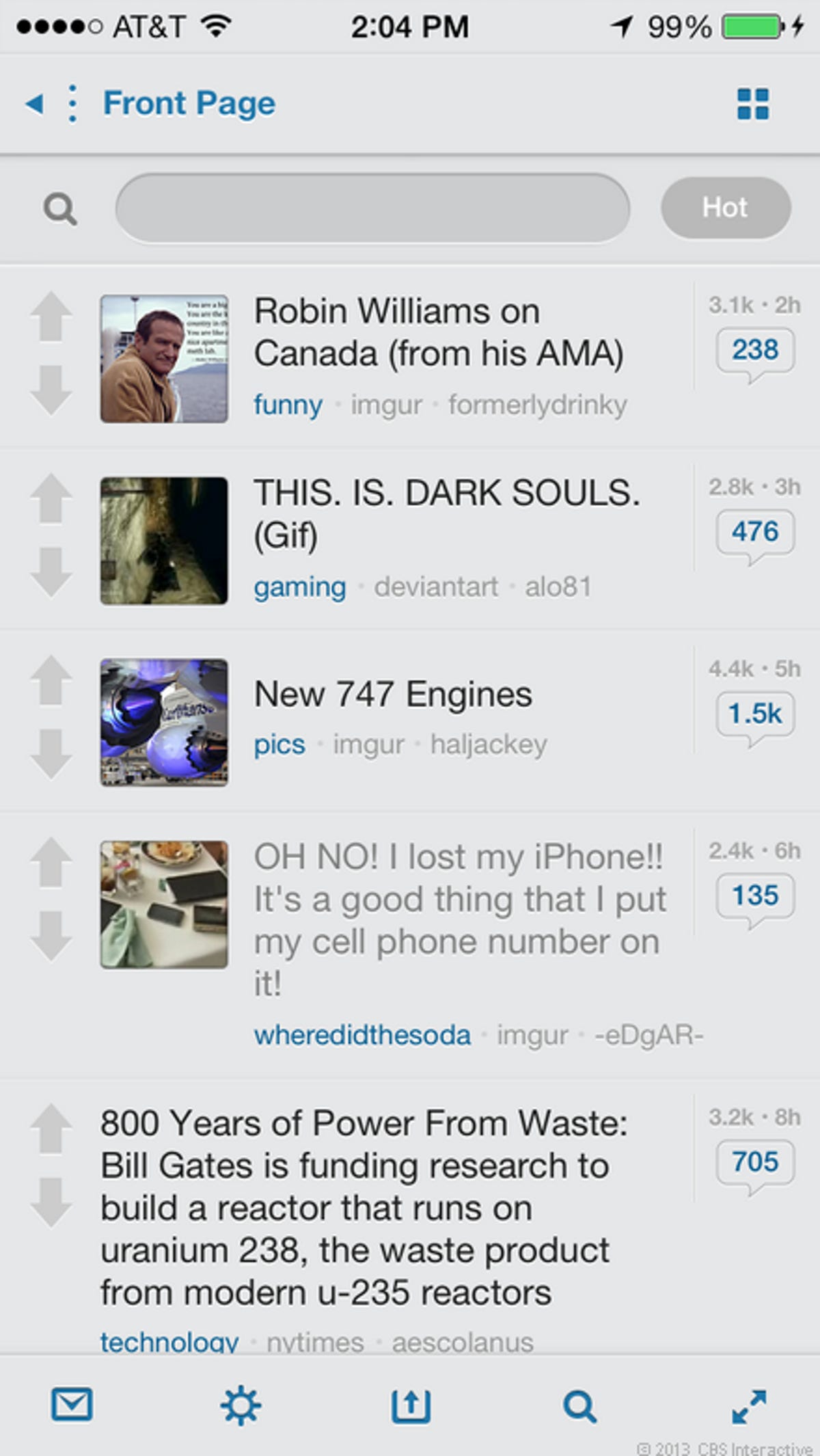
Digg
Digg is another social link aggregator like Alien Blue, but for Digg.com. The app didn't have a long way to go to fit in with iOS 7, but you can see the flattened buttons at the top and there is no shortage of white space. The people at Digg didn't have to change the app much, but now it has the iOS 7 look in spades.
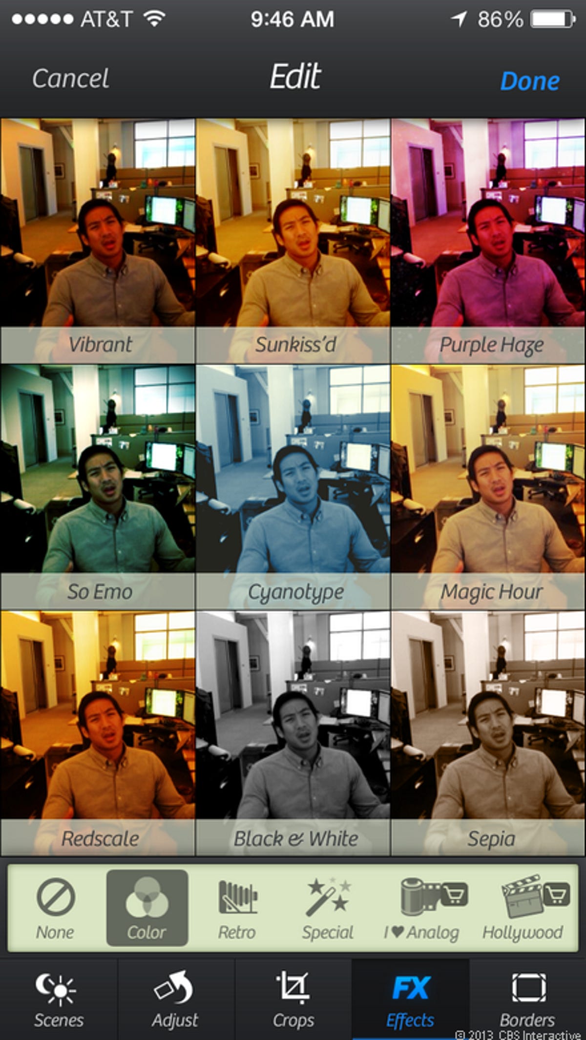
Camera+
Camera+ is one of the most popular photo-editing apps ever in the App Store. You can see here that the buttons on both top and bottom have all been flattened, but the app keeps some of its signature design aesthetic with the gray-on-white icons for effects and film selections.
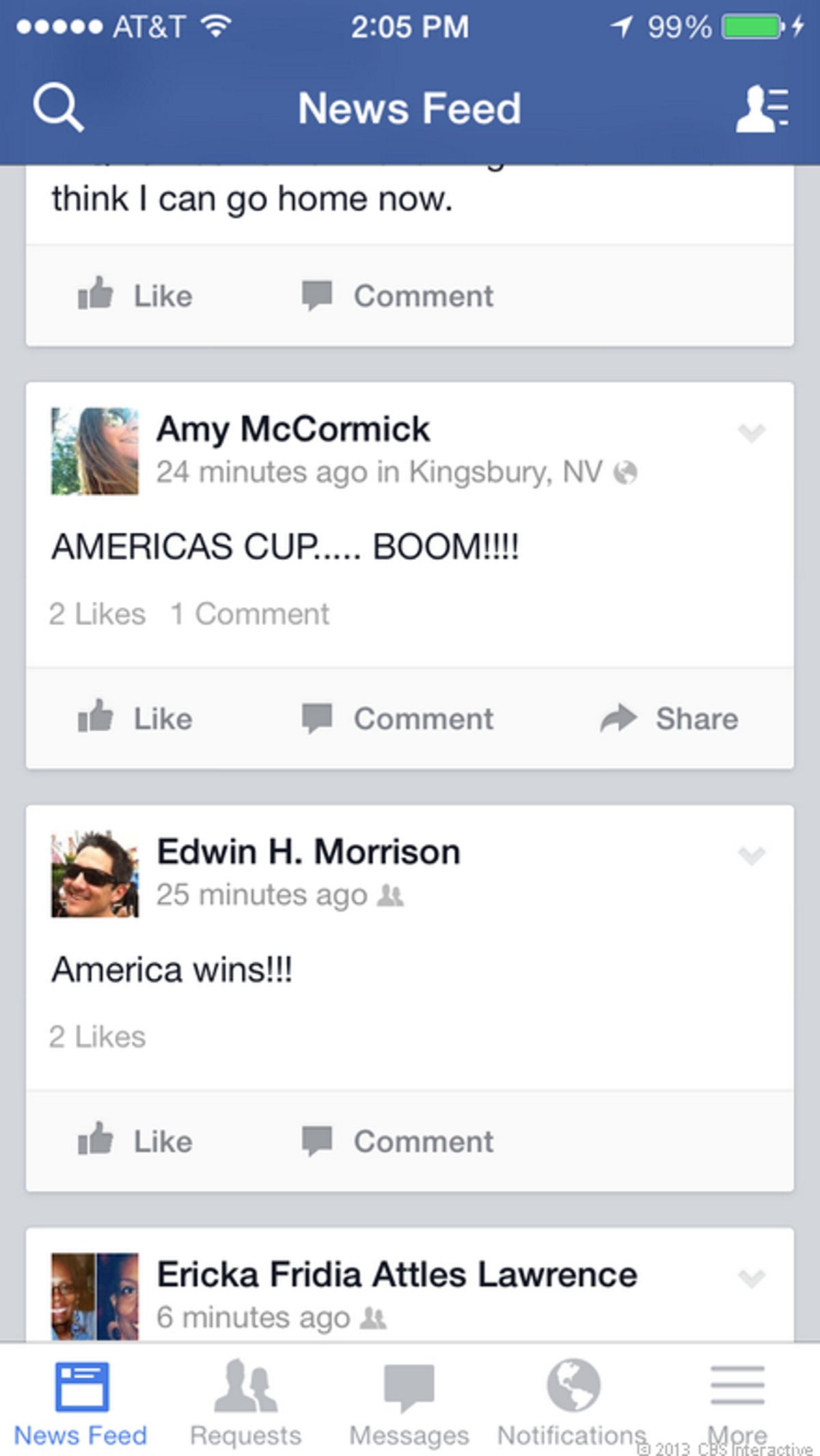
Facebook got a makeover since launch as well, and you can now see the influence of the iOS 7 design in your main news feeds and the buttons on both the top and bottom of the screen.
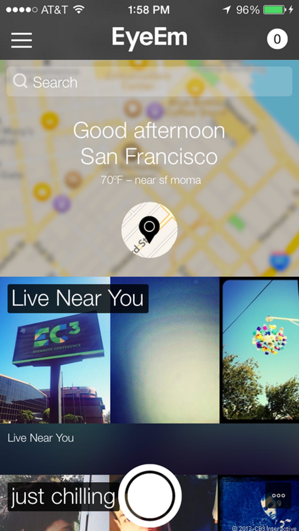
EyeEm
EyeEm is a lesser-known photo sharing site that I've liked for quite a long time. It organizes photos by location, but also by specialized tags that users can create on their own. What results is a fun way to browse through pictures in categories you don't see on other photo-sharing sites.
EyeEm took the iOS 7 UI redesign to heart, not only with the flat buttons, but by simplifying your main feed of photos. The map at the top that shows your current location is new as well.
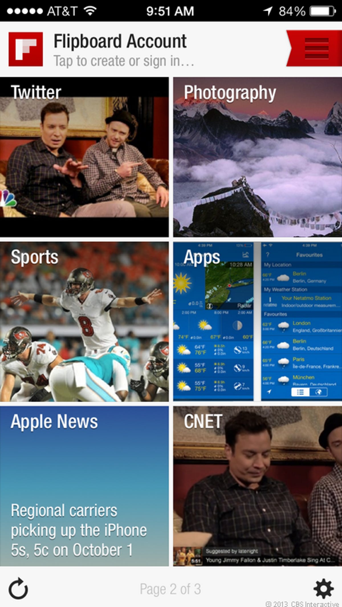
FlipBoard mostly already had a flat design even before iOS 7 was announced. But now you'll see white borders on the top and bottom with flattened buttons for iOS 7. One thing I noticed is that it kept the older looking share button with the rectangle and swooping arrow rather than the newer square with the arrow coming out of the top.
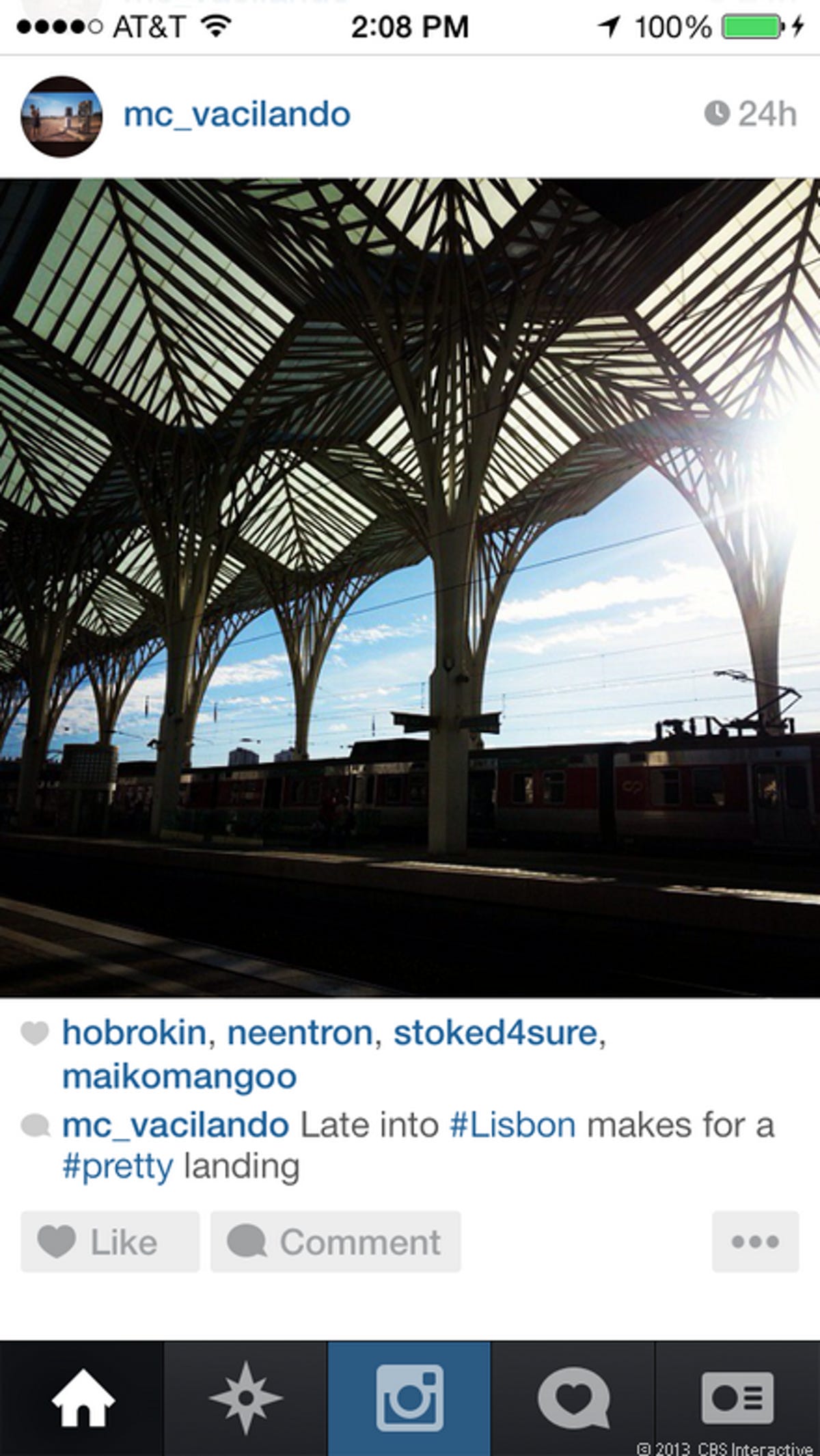
Instagram jumped on the redesign express as well, but it left one important thing untouched. In this slide you'll notice the flattened buttons at the bottom along with a ton of white space (notice the blue bar at the top is gone). But the interesting thing is that Instagram took a stand when it came to its icon.
When you think about it, it makes sense. Instagram is a photo-sharing powerhouse that is all about photos and its filtered look. I think that keeping the old icon shows that it cares about aesthetics, and maybe more importantly, the brand. It remains to be seen if Instagram will ever bow to the iOS 7 pressure, but I respect that it stuck to its guns, at least on the icon.
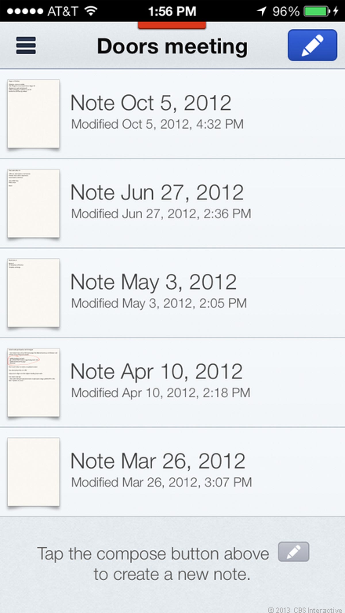
Notability
Notability is a longtime favorite note-taking app of mine that is perfect for both taking notes in class and in business meetings. Developer Ginger Labs was ready with a redesign at launch, focusing on more space and a simplified look.
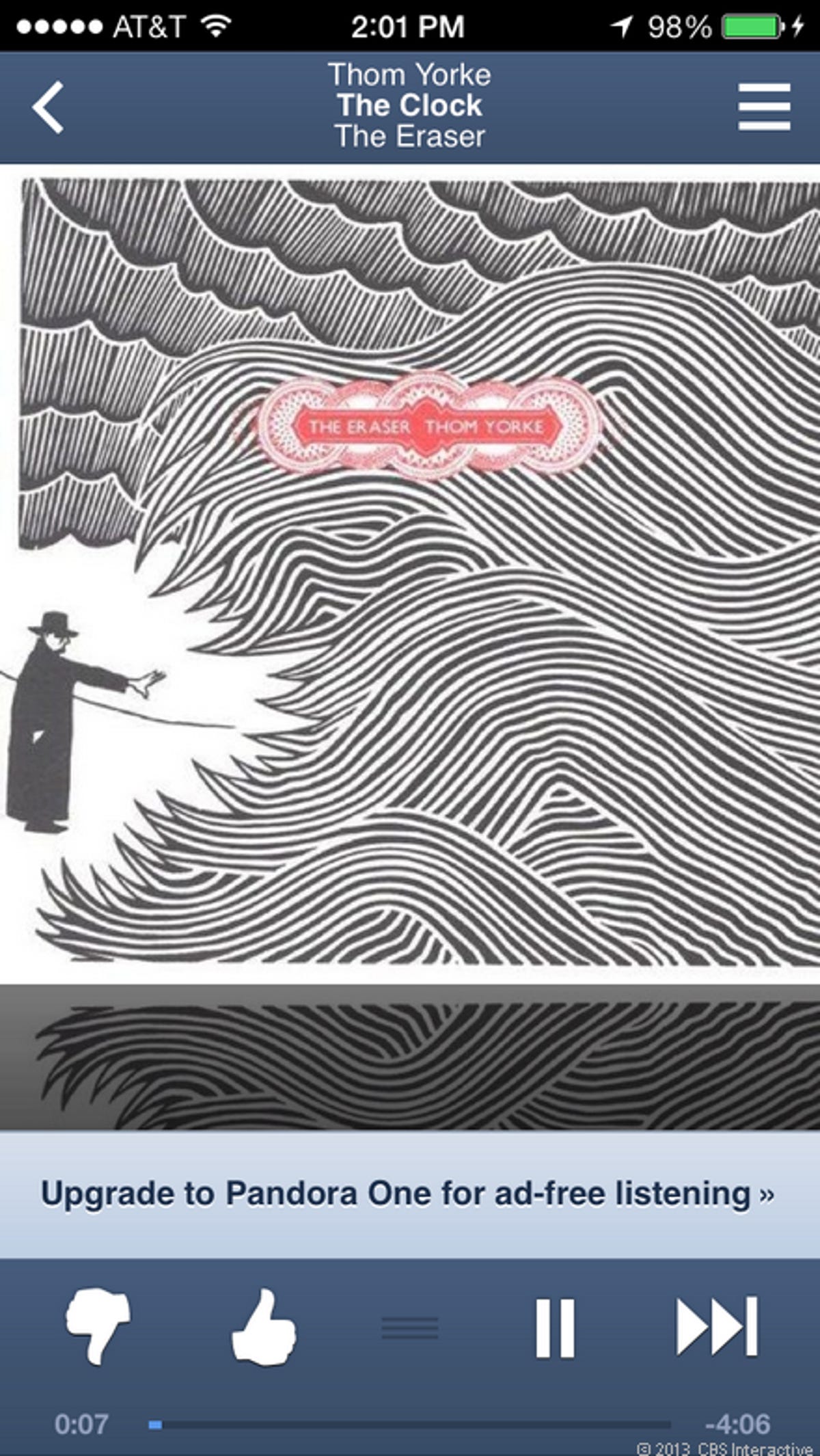
Pandora
Pandora did away with the 3D blue bar at the top along with the raised navigation buttons and flattened everything out. The result is a much cleaner look to help you focus on the music you're listening to.
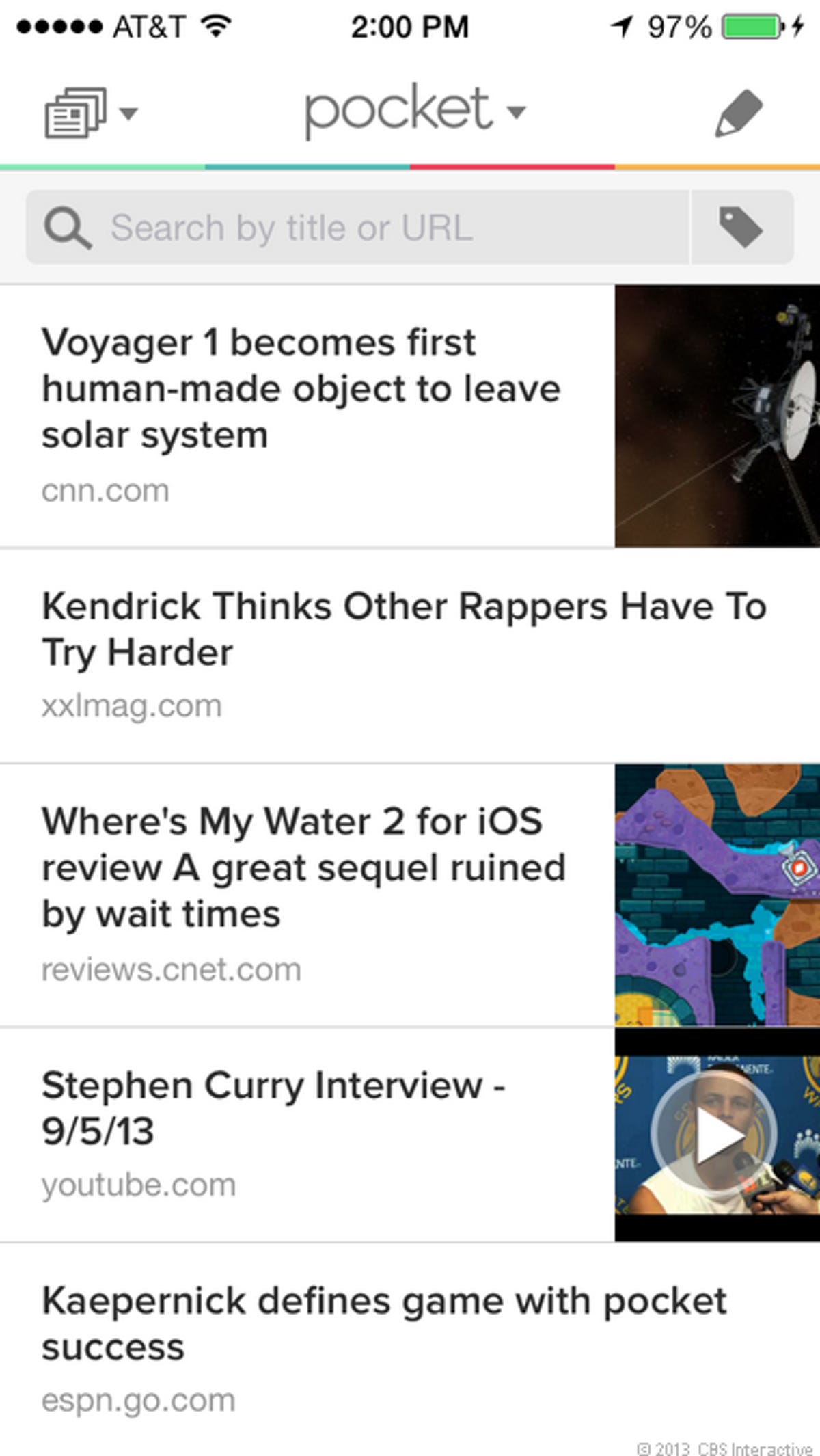
Pocket is another app I included in my earlier post of 12 apps that are ready for iOS 7. Though I couldn't get any mockups for the redesign, the developers assured me one would be ready for launch. We can now see that the new look uses a lot of white space and the buttons have been simplified.
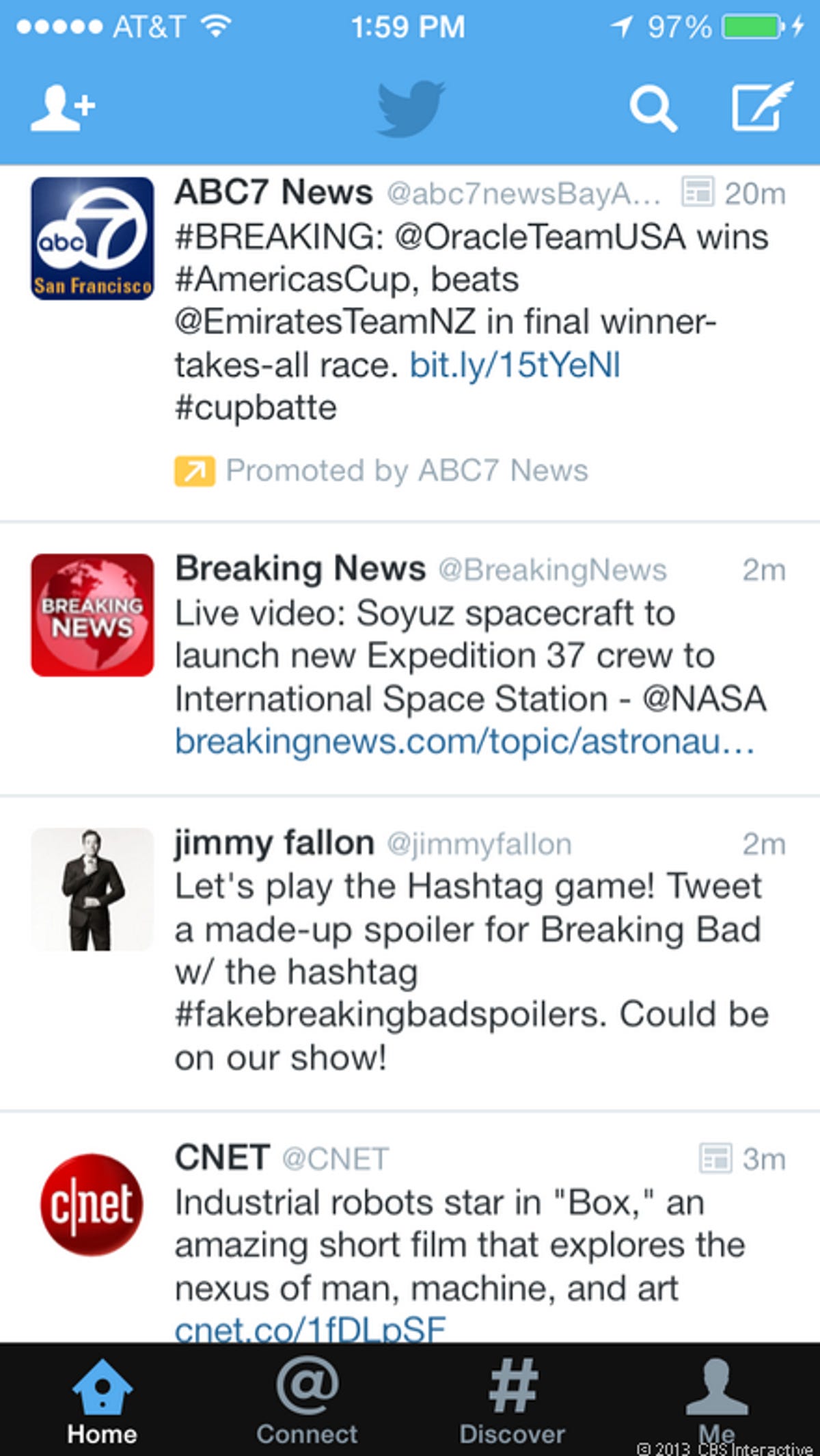
Twitter gave its iOS app a face-lift as well. Like many of the other apps, the buttons on top and bottom have been flattened out to fit the new look.
More Galleries

My Favorite Shots From the Galaxy S24 Ultra's Camera
20 Photos
Honor's Magic V2 Foldable Is Lighter Than Samsung's Galaxy S24 Ultra
10 Photos
The Samsung Galaxy S24 and S24 Plus Looks Sweet in Aluminum
23 Photos
Samsung's Galaxy S24 Ultra Now Has a Titanium Design
23 Photos
I Took 600+ Photos With the iPhone 15 Pro and Pro Max. Look at My Favorites
34 Photos
