A smoother experience all around in Yosemite
With the Yosemite public beta available, CNET takes a more in-depth look each week with individual new features from the OS, this week continuing with Yosemite's redesigned interface.


Mac OS X 10.10 Yosemite is coming this fall, and in the past few weeks I've already written about the new Spotlight search features, Mail Drop and Markup, and new Notifications features in the latest version of Apple's operating system. This week, for the fourth and final installment of my series on Yosemite, I'm taking a closer look at the redesigned interface.
Unlike the OS's new features, the redesign won't change how you work, but it will change the look and feel of your Mac for the better.
Why design matters
It's no secret that a redesigned operating system can be a big deal for regular users. Windows 8 is a prime example -- remember how the new Start menu with its live tiles made headlines and threw people for a loop? Yosemite's new look isn't quite as drastic, but it's still a change.
Though Yosemite isn't a huge change, it's still the most significant face-lift to Mac OS X since the OS launched as a beta in September, 2000. Similar to the way iOS changed from iOS 6 to iOS 7, in Yosemite the rounded, candy-coated icons and skeuomorphic design elements that have long been part of OS X are now gone. But, while Yosemite has a different look, it won't change the way you use your Mac. Instead Yosemite makes it feel both modern and more efficient, and it's an improvement over previous versions.
New icons
Yosemite's new flatter icon styles in the Dock are similar to what you have in iOS 7, but they're not an exact copy. There are still enough differences between the two to give Apple's desktop and mobile devices a unique feel of their own.
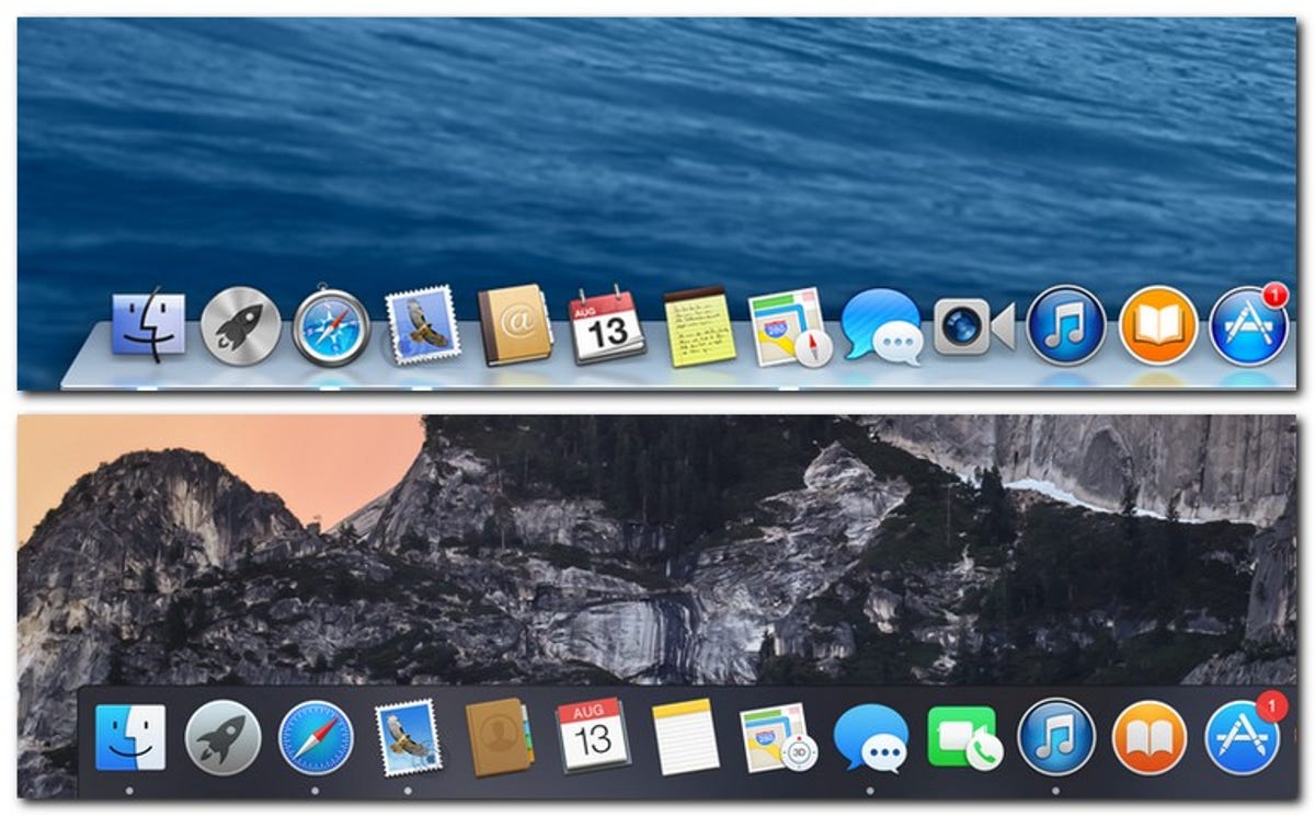
In the image above, you can see just how the reflections and 3D elements are gone in Yosemite, replaced by flatter icons that mostly resemble iOS 7, but with minor differences. As an example, in iOS 7 your Safari icon is a blue compass inside of a white background, while Yosemite eliminates the background color, leaving the compass icon by itself. It's not big difference, but it's enough to differentiate the mobile experience from the desktop.
Apple made them slightly different but still very recognizable, so even with the changes, you'll still use your Mac just like you did before.
Translucent windows and toolbars
Another change is how application windows hint at the content behind them. Apple told me it is to give your desktop more depth, and while I don't quite see that as the result, it definitely looks better.
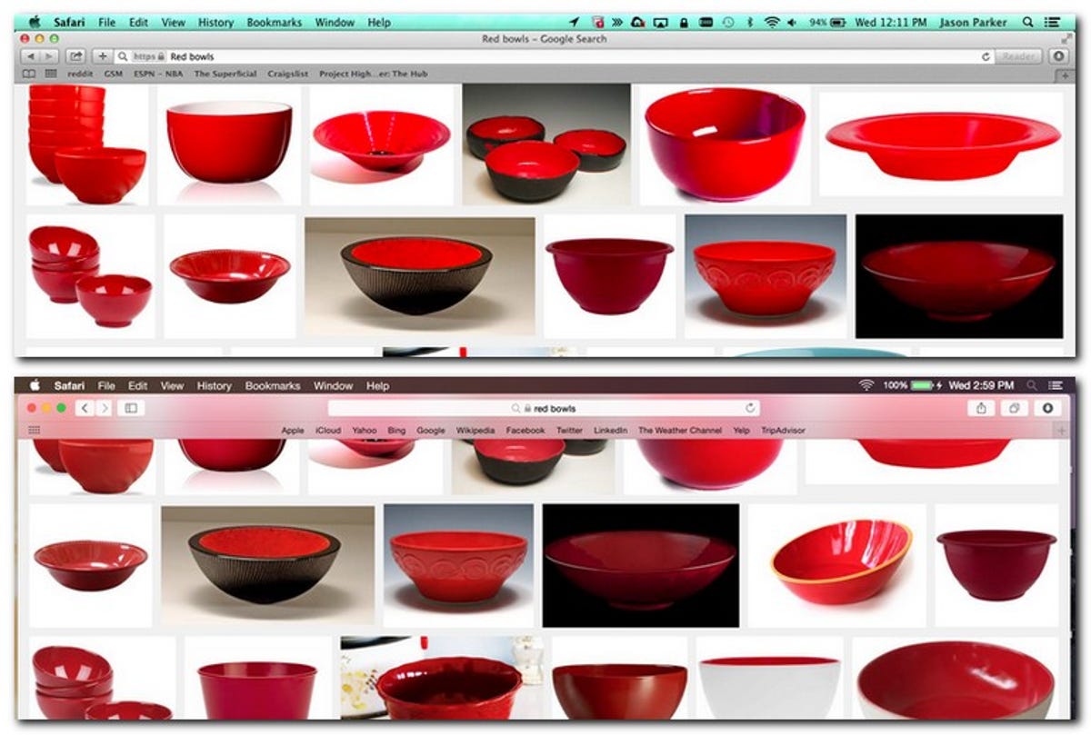
In the above image, you can see the way Mavericks shows the search result for a series of red images as you're used to. But in Yosemite, the top toolbar shows the color of the content behind it.
You'll also notice that the Safari top toolbar has been streamlined to concentrate more on the content of the Web page you're viewing, without losing the features you get from Mavericks. This smaller toolbar design change is true throughout Yosemite, which Apple says is to keep the interface out of the way while you browse the Web, talk on Facetime, or chat using Messages.
Switching to full screen and back
Another minor change is in the way you interact with application windows. Mac OS X Lion introduced full screen apps that would maximize to the edges of your screen. A button in the upper right lets you toggle between full-screen apps and regular windows, while the red, yellow, and green buttons in the upper left, respectively, let you close, minimize (with zoom effects), and resize a window.
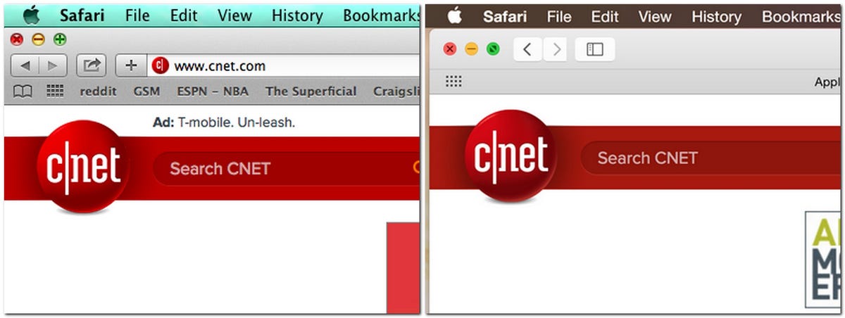
Apple has made just a small change here, but it makes more sense. In Yosemite, the arrows in the upper right have been removed, changing the green button in the upper left into your full-screen toggle. This is obviously nothing spectacular, but having a separate button for switching to full screen made little sense, so it's nice that you can interact with windows from one area.
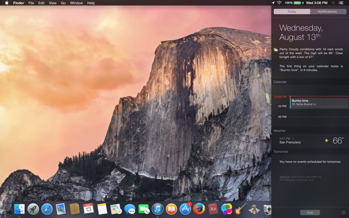
New day view in Calendar
Keeping with the theme of retooling elements you already know is the new Day view in the Calendar app. In this next example, you get all the same information in Mavericks, but it's done in a much more sensible way in Yosemite.
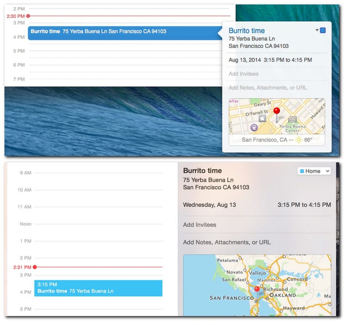
You'll notice from the upper image from Mavericks that I've highlighted an event, which brings up a small pop-up with all the information for the event and map so I can get directions. But in Yosemite, the Day view makes all of this information part of the same (translucent) window.
Again, we're not talking about anything groundbreaking here, just a smarter way to display the information Yosemite offers, like everything else I've talked about here.
Not truly necessary, but cool nonetheless
Are translucent application windows going to change the way you work? Certainly not. Nor will thinner toolbars, or flatter icons, or a retooled Today view. But all of these minor changes transform your Mac to make it feel more modern as you go about your daily business.
I already talked about the major feature changes and new additions in my previous posts linked at the beginning of this article, but -- to some extent -- Apple's light-handed design approach is one of the most important new features. The reason is that Mac OS X Yosemite is not going to confuse you or send you searching for features you remember from previous versions of Mac OS X -- they're all right there. It's just that Apple thought of ways to make things easier, while bringing the Mac OS X interface design into the modern era with a new look and overall feel.