Yandex browser's tidy new interface puts Web apps first
A subdued address bar and revamped new-tab page gives the browser a clean look that the Russian company says is better suited to Web apps. Yandex plans a mobile-device version later.


- Shankland covered the tech industry for more than 25 years and was a science writer for five years before that. He has deep expertise in microprocessors, digital photography, computer hardware and software, internet standards, web technology, and more.
Yandex, the Russian search, email and e-commerce site, has released a new version of its browser that tries to pare down user-interface distractions to the absolute minimum.
The software, available as an early alpha version for testing, is designed to focus as much as possible on Web content, with interface elements like the address bar and back button presented in subdued form. It also serves as a model for Yandex's planned future browser for mobile devices, the company said.
"To be comfortable with websites that look more like desktop programs, users need a totally different browsing experience so that they would feel like they are using a desktop rather than a Web app," Yandex said of the new version, released Thursday in alpha-testing form. "To meet this requirement, we stripped our browser of everything nonessential, integrated search even deeper, redesigned the user interface to make it more simple, more informative and more engaging, and...made the Chromium-based browser faster."
The new Yandex browser does indeed look different, but it's just the newest step in the industry's removal of interface elements. The move began in 2008 with Google's Chrome, which was named for the fact that it actually did away with a lot of user interface elements called chrome that surround the Web content. Internet Explorer, Firefox, Opera and Safari followed suit. It's rare nowadays to see menu bars across the top of a browser window, while status bars are hidden by default and toolbars are frowned upon as clutter.
Browsers, though free, can be financially important by driving traffic to search engines. Those searches produce revenue from search ads. The Yandex browser, marketed as "Yandex.Browser," first launched in 2012. Based on the open-source Chromium project at the heart of Google's Chrome, naturally it uses Yandex as its default search engine.
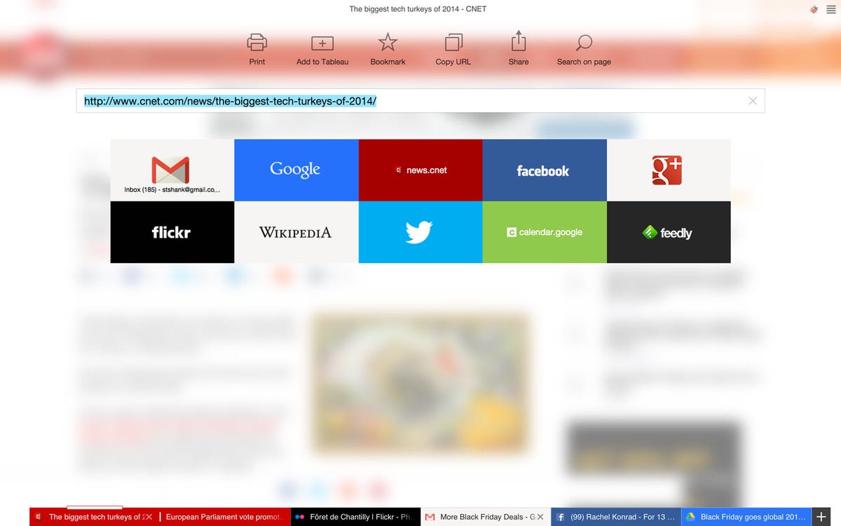
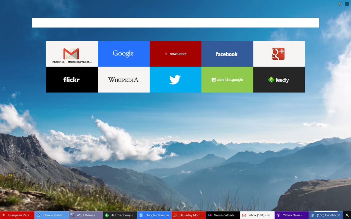
The new version does indeed look somewhat different from most of today's browsers. It puts video backgrounds on the new-tab page, for starts, and a customizable grid of tiles similar to Opera's Speed Dial grants quick access to pinned or frequently used sites. A right click on the new-tab page background lets you pick those links, change the background video or image, and pause the background video.
Browser tabs are organized along the bottom of the page. Multiple tabs from one domain -- for example, several articles at CNET -- are grouped into a single bunch. The most recently used tab is on the top of the stack, but it's not obvious there are others until you click on the top item, at which point the others appear side by side in the tab section. That cuts down on tab clutter, but it can be confusing. For example, Google Calendar and a Google search page compressed into the same tab, even though they're functionally very different sites, but Gmail and Google Inbox get tabs of their own.
Each tab is color-coded, coordinated with the website's own colors. A thin white bar overlays the top of the active tab to help you figure out where you are along the tab strip. This approach to color coordination helps you figure out what's what, but like other browser makers, Yandex hasn't figured out what to do with people who have dozens and dozens of tabs open.
The layout looks like it'll work reasonably well on a touchscreen interface and mobile devices. That's no coincidence, Yandex spokesman Vladimir Isaev said.
"We do plan to use same approach when building a new browser for tablets and for smartphones," Isaev said.