Yahoo's new logo sports dancing exclamation point
While still purple and in all caps, new logo goes sans-serif and includes a reverse white-on-purple version.


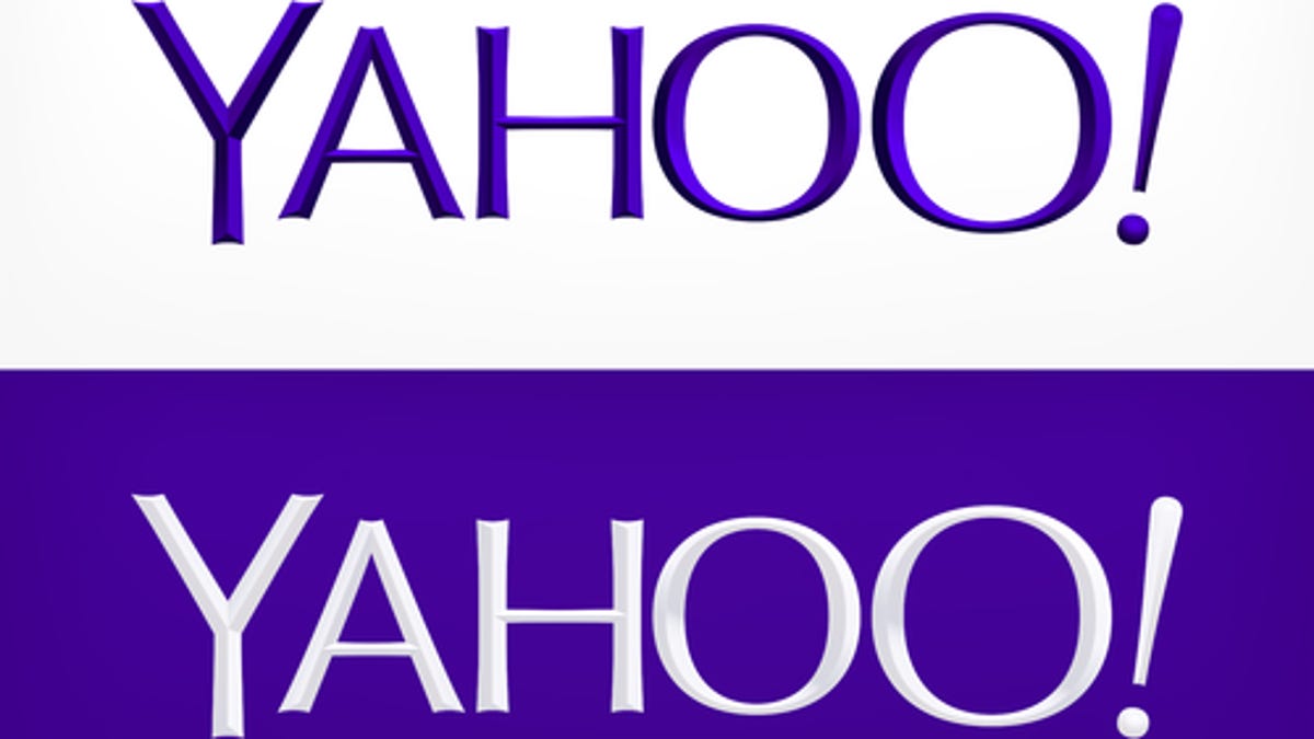
After a month-long typography fashion show, Yahoo crowned a new corporate logo Wednesday night.
While still purple and in all caps, the company's new logo dumps the serif-like font for a sans-serif presentation with distinctive interior elevations. It also adds a twist to its familiar exclamation point, allowing it to dance around half the logo during page refreshes before settling at the end of the company's name. An alternate version includes a reverse white-on-purple presentation.
Yahoo CEO Marissa Mayer described the process of designing a new logo in a Tumblr post this evening that said the new logo reflects the personality of the company she took over last summer: "whimsical, yet sophisticated."
There are no straight lines in the new logo because "straight lines don't exist in the human form and are extremely rare in nature, so the human touch in the logo is that all the lines and forms all have at least a slight curve," she wrote.
The design team wanted a mathematical consistency to the new logo and leaned toward letters with thicker and thinner strokes. Lowercase and sentence case presentations were also considered, Mayer wrote.
"But, in the end, we felt the logo was most readable when it was all uppercase, especially on small screens," she wrote.
Yahoo announced in early August that it would parade a series of new logos each day for one month, after which the logo that best exemplified the company's "renewed sense of purpose and progress" would be unveiled. However, while the updated logo is intended to reflect a new corporate personality, Yahoo made clear it would retain the familiar exclamation point, purple complexion, and trademark yodel that have represented the company for the past 18 years.
While changing a logo is unusual, due largely to the cost and effort that go into building logo recognition, it's not unheard of. To maintain consumer recognition, new logos tend to retain at least some element of their predecessor.
Google unveiled a new logo in May for its recently acquired Motorola Mobility, replacing the decades-old red button "M" for a rainbow of colors and a "Google company" tagline. A little more than a year ago, Microsoft introduced a redesigned logo that retained the long-standing four-color Windows image but did away with the wavy look for a squared-off image.
Not all logo redesigns resonate well with consumers. A new AOL logo in 2009, designed to reflect its divorce from Time Warner, was met with derision. The design, which dumped the familiar all-caps logo, was called "lame" by GigaOm's Om Malik. "It is ambiguous at best, and as sexy as the obese, shapeless humans living on Axiom, the flagship of the BnL fleet in Pixar movie 'WALL-E.'"
So is Yahoo's new look a hit or a miss? Take the poll and let us know your opinion. Also, review the other logos below and let us know if one was more appealing, if any.