Smart phone OS comparison chart is our new wallpaper
Visualise everything you need to know about the various smart phone operating systems in a chart the size of a tablecloth, then snag our pick of the best phones for each one.
We spent the whole weekend drawing a giant chart of every smart phone operating system's strengths and weaknesses to hang on the back of our door. Now we wish we hadn't bothered, because the folks over at MyPhoneDeals.co.uk have done it for us.
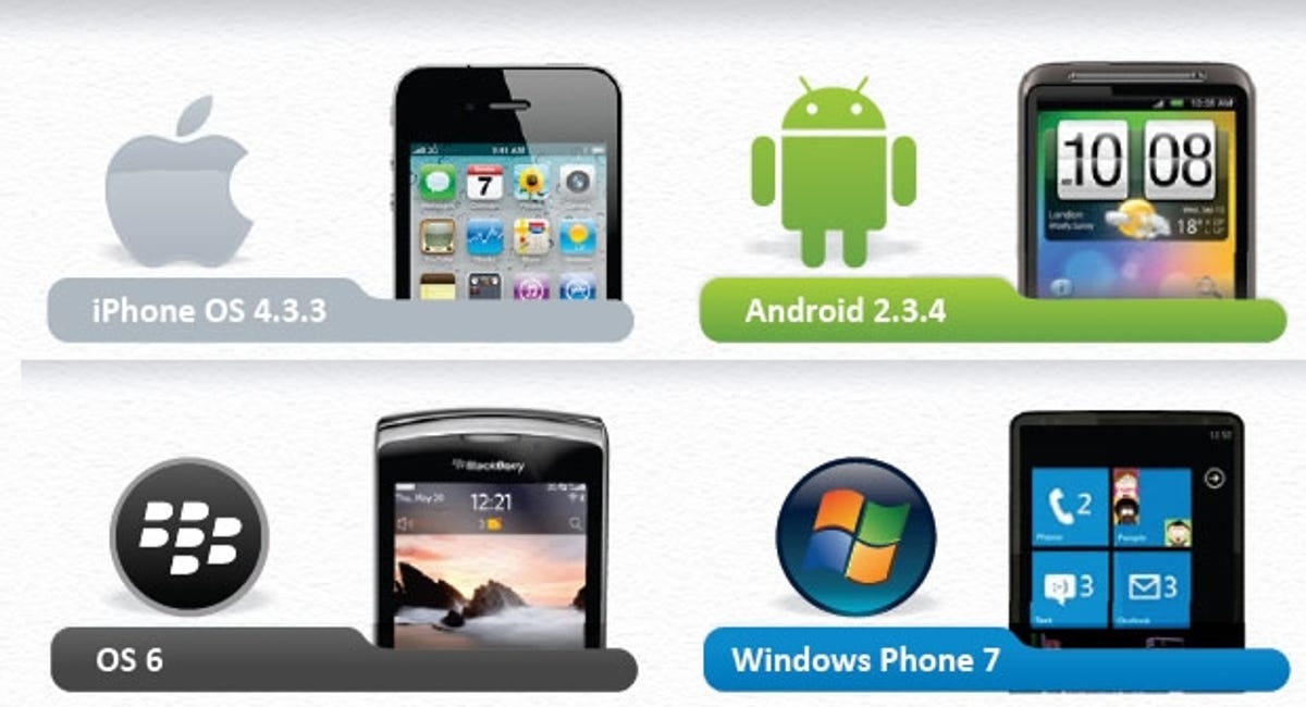
The epic smart phone software chart covers iOS 4.3.3, Android 2.3.4 Gingerbread, BlackBerry OS 6, and Windows Phone 7.
We like the chart for its pixel-packing completeness, but we also like that it doesn't focus on mere specs. It breaks down the pluses and minuses of Android's open app Market, for example, in pithy sentences.
We've given the chart a once-over, and we agree with most of the calls that the authors made on various features. Keep in mind, however, that just because an OS scores lower in certain areas doesn't mean it's unrecoverable crapola. It may just not be up to the standards set by its competitors in that area.
Once you spot the OS that suits you, here are our picks for the best phones currently on sale for each one:
- iOS 4.3.3: iPhone 4
- Android 2.3.4 Gingerbread: HTC Sensation and Samsung Galaxy S 2
- BlackBerry OS 6: BlackBerry Torch 9800 and BlackBerry Bold 9780
- Windows Phone 7: Samsung Omnia 7 and HTC HD7, although most Windows Phones are very similar.
The chart will need some updating soon, with most smart phone OSs expecting major upgrades this year. Apple is planning to release iOS 5 in the autumn, with new drop-down notifications for things like new emails, a feature it's pinched from Android. Around the same time, we'll be seeing Windows Phone Mango, which adds a multi-tasking menu so you can switch between open apps.
RIM is planning to bring its BlackBerry tablet OS, currently showing off on the PlayBook to phones, although we don't know when. Similarly, Android Ice Cream Sandwich will add the advantages of the tablet version, Honeycomb, to phones.
Click the image below to see the full chart in all its giant glory:

Image credit: MyPhoneDeals.co.uk