Navigating the changes to Google Maps at I/O 2013
To call the new version of Google Maps a "refresh" or "update" seems like an understatement. The service has been completely overhauled.


- North American Car, Truck and SUV of the Year (NACTOY) Awards Juror
Google showed a completely overhauled Google Maps service and Web interface today at I/O 2013. The site is receiving changes and updates on the front and back end to make it easier for user to navigate and developers to work with.
The most obvious changes are the visual updates and redesigned elements, featuring a Google Now-inspired "cards" aesthetic, deeper integration of the Google+ social network for recommendations, and a reshuffling of how users interact with the site and how information is presented to them.
Before you start spamming your browser's refresh button over at maps.google.com, you should know that this new Google Maps is currently invite-only -- limited to Google I/O 2013 attendees. But don't worry, we're giving you an early look at the new features right now.
Old vs. new
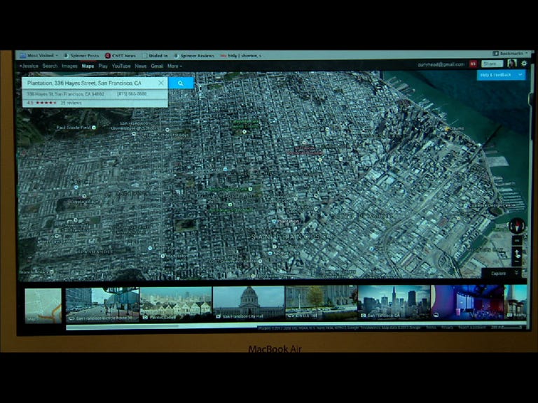
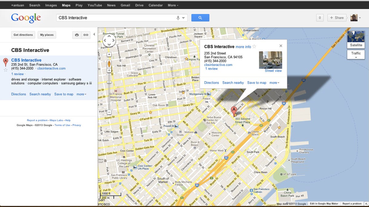
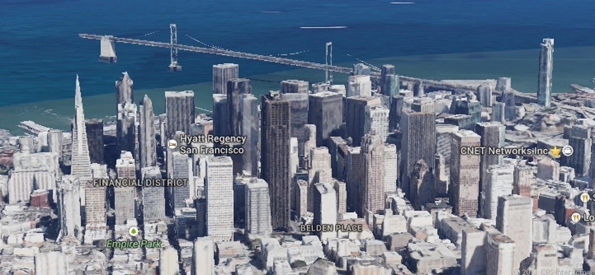
Most of us are familair with the current Google Maps interface with its two-column interface that places the search results and directions on the left and the map on the right. The new Google Maps interface breaks the map out of the box, filling the browser window with a brighter, smoother map. In the search giant's own words, "The map is the UI." Google also tells us that these vector maps scroll more smoothly and render more quickly.
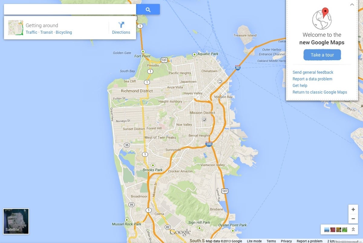
Floating search bar
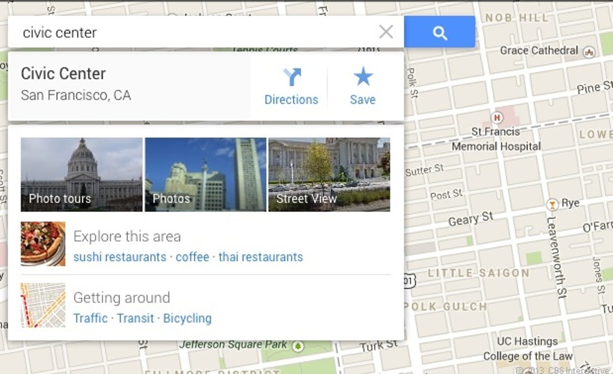
The search bar is still located near the top, but it now floats atop the all-encompassing map, rather than being separated out. Start typing a search term and it still attempts to autocomplete your query. Google has done away with the Top Results column; instead suggested locations are highlighted and named on the map itself. Once you settle on a specific location, Maps will display more information beneath the search bar with floating cards that by no accident are reminiscent of the Google Now mobile interface. Shortcuts for navigating to that location or saving it for later are large and easy to tap.


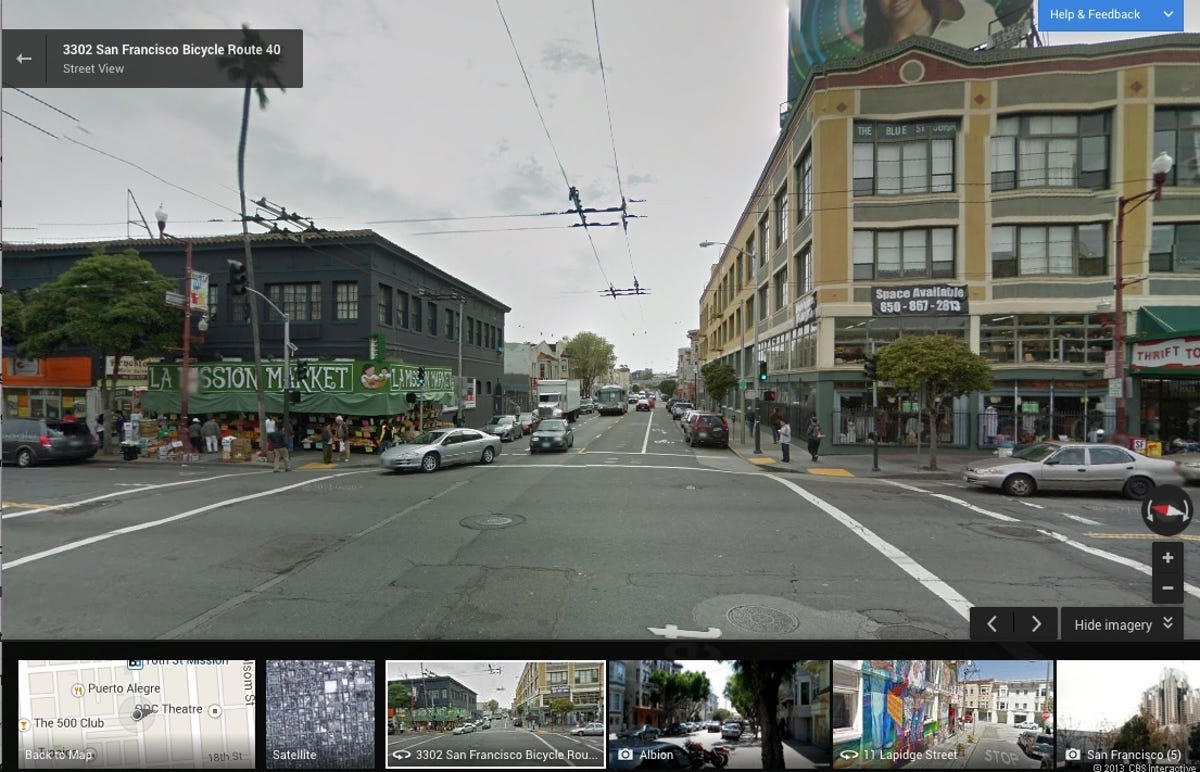
More emphasis on Street View and 3D
Street View and 3D building and landmark data are nothing new to Google Maps. However, the new version of the service unveiled at I/O 2013 places a much heavier emphasis on these features as tools for helping users to find their way around. Zoom in close enough and the map automatically drops to Street View. There's also usually a Street View shortcut in one of the information tiles that pops up when you select a destination.
The interface has also been tweaked. The zoom bar has been reduced to just two buttons at the bottom-right corner of the screen -- a move that forces users to make use of the mouse and scroll wheel to pan and zoom around the map. (Or, in the case of the Google Chromebook Pixel, pinching and flicking on the touch screen will also get the job done.) There's also a new Tilt button that makes it so you can quickly access the 3D building and landmark view by tilting the map's virtual camera.
We found browsing the 3D map with satellite imagery caused the entire Maps interface to slow to an annoying crawl, but were impressed that the whole experience was rendered in the browser with no need for additional plug-ins.
Google Maps inside
Like previous versions of Google Maps, this new design makes it possible to bring Street View indoors to virtually walk around certain businesses and public places. The new version of Maps takes advantage of user-submitted Android Photo Spheres to provide pannable, 360-degree views of interiors that may have been missing before.
Google Maps also features interior maps and layouts of participating businesses, in some cases with multiple floors. Need help finding the soft pretzel place in your local mall? Google Maps could act as a directory.

Smarter routing
Google Maps still offers dedicated pathfinding for driving, transit, walking, and bicycling along with display modes for live traffic, transit routes with (in certain cities) live updates, and bike-friendly streets and paths. However, if you leave Google Maps in its default mode, it exercises a bit of judgment in deciding not just the way that you go, but how you get there.
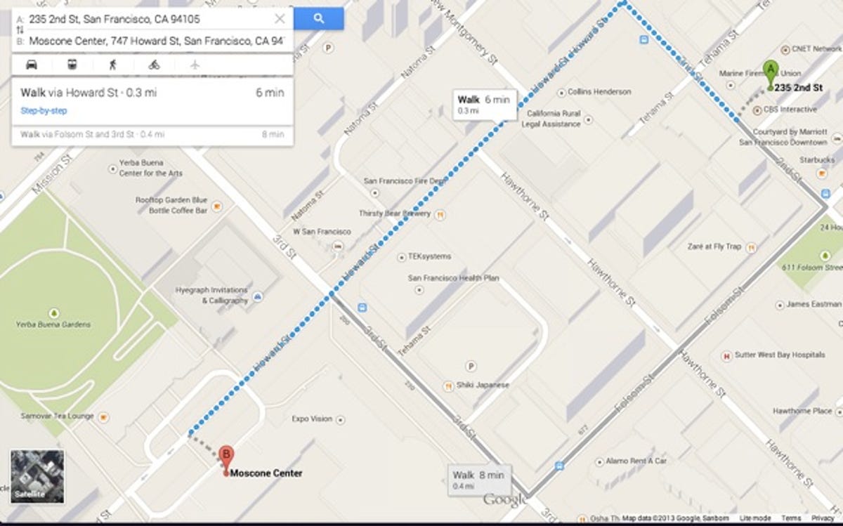
For example, when I searched for directions to the Moscone Center from my apartment, Maps defaulted to driving directions. However,when I searched for directions from CNET's offices to Moscone, which is just two blocks away, Maps automatically changed the travel method to walking. For longer routes, Google Maps will even calculate multiple potential paths, highlighting the fastest route in blue, while shading the alternates in gray. Clicking one of these alternate routes switches to it.
Additionally, as soon as you've selected a point on the map, Maps will begin planning a route to that destination in the background from destinations that you often access (in my case, CNET's offices in downtown San Francisco) and highlight that route in light blue.


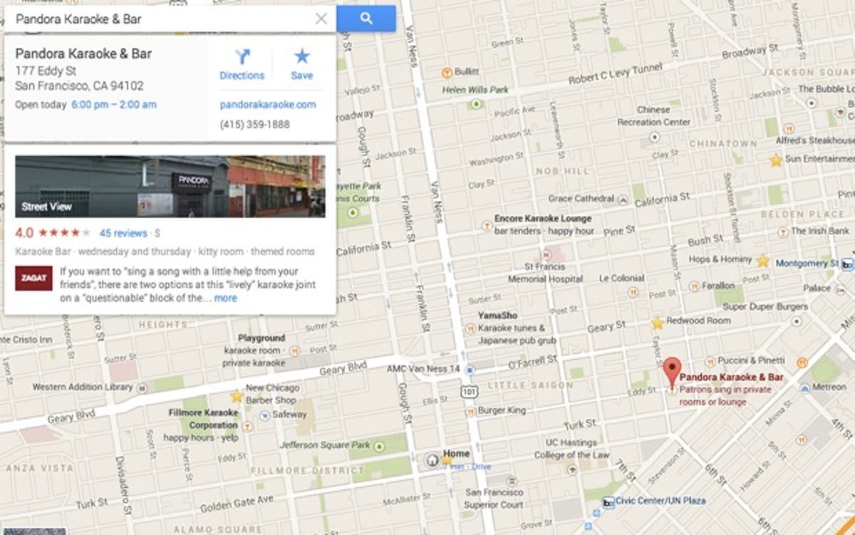
Depending on the locations that you're currently searching for, those in your search history, and places that your friends have rated, the destinations that are highlighted on your Google Map will be different from mine. For example, I often search for and check into karaoke bars in San Francisco, so if you were to look at my default map view you'd see a lot of places that are like karaoke bars. Someone else may see a bunch of sushi places or movie theaters.
Clicking on a destination to get more information continuously changes the maps. Click on a popular whiskey bar and places like it will instantly populate the map, with their names displayed in a darker, larger typeface than the rest of the places.
Editors' note: We're updating this story as it develops with more screenshots. Stay tuned.