NASA shows 60 years of climate change in 15 seconds
A NASA video shows changes to temperature maps of the earth from 1950 all the way through to 2013.


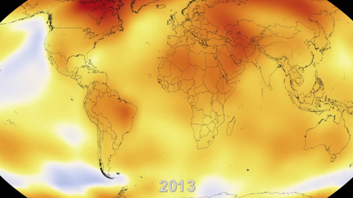
(Screenshot by Michelle Starr/CNET Australia)
A NASA video shows changes to temperature maps of the earth from 1950 all the way through to 2013.
When you put all the data together, it becomes pretty hard to deny that global temperatures are slowly, but surely, rising.
A new video released by NASA shows just over six decades of global temperatures, making it pretty clear that the world is getting warmer. In fact, according to NASA data, nine of the 10 warmest years on record have occurred since the year 2000 (the other was 1998), with the hottest years being 2010 and 2005.
According to the NASA Goddard Institute for Space Studies (GISS), which analyses global surface temperatures, the average temperature for 2013 was 14.6 degrees Celsius, which is 0.6 degrees higher than the mid-20th century baseline. The average global temperature has risen 0.8 degrees since 1880.
Long-term trends in surface temperatures are unusual and 2013 adds to the evidence for ongoing climate change," said GISS climatologist Gavin Schmidt. "While one year or one season can be affected by random weather events, this analysis shows the necessity for continued, long-term monitoring."
GISS attributes the rise in global temperatures to the increase in greenhouse gas levels, driven by man-made emissions, in the Earth's atmosphere. It notes that, while successive years may not necessarily be warmer sequentially, overall trends will see a continued rise. The level of carbon dioxide in the atmosphere — over 400 parts per million — is higher now than at any time in the last 800,000 years. In 1880, it was just 285 parts per million.
Watch the video below to see climate change in action. Yellows, oranges and reds show higher than average temperatures.
Via climate.nasa.gov