Myspace returns with Windows 8-style redesign: Is it enough?
Myspace has shown off its new design direction, but is it enough to save the shrinking social networking site?
Remember Myspace? Nah, me neither. But I hear it was a once-loved social networking site, doomed by the emergence of Facebook and Twitter. It's now back with a vengeance -- and a brand-new design.
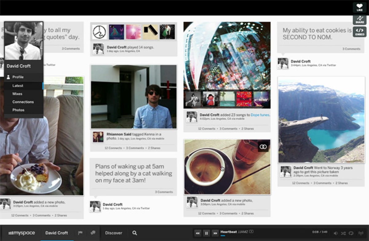
The new design looks very Windows 8-y -- with a hint of Pinterest -- with tile-like designs and pages seemingly going on forever as you pan right over them. It looks to have taken the best from Microsoft's new OS and made it look better. The attractive young 'users' pictured don't hurt either.
You can head over to new.myspace.com to check out the demo video and sign up for an invite -- trust me, it looks great.
When you first sign in, you'll be met with the option to go through your Facebook or Twitter account. Admitting defeat? Perhaps, but it's a realistic approach. Just as Twitter and Facebook now share features (your tweets can go up as Facebook statuses, for example), it gets across the idea that the new Myspace is a complimentary service, not a competing one.
When you get on your profile, the usual profile pic is at the top, floating amid its version of Facebook's cover photo. The page shows you all your activity, be it pictures you've uploaded, music you've listened to, or mixes you've created.
Now for the fun bits. Myspace has always been centred around music. For the last few years most of its user base has been up-and-coming bands trying to make a name for themselves in the music industry.
New Myspace certainly embraces its muso heritage (to the extent that the demo auto-plays music, infuriatingly). Footing the page at all times is a mini-player, letting you control your Myspace music. Down the side you can flick to the Mixes section, which lets you see all of your created playlists alongside photos you've associated with them, so when you listen back to that terrible house-party mix, you can remind yourself of the good times with party photos alongside it.
Along with the immovable mini player at the bottom there is the Myspace home button. Touch this and you get through to the equivalent of your stream -- a newsfeed-like affair. This shows you all of your friends' activity, with the emphasis on music and the music your friends listen to.
Clicking the Discover button is much the same as Twitter. You can see all the music that's trending around the world. You can easily add any of these newly discovered tunes to your playlists with a great looking drag-and-drop animation. You can also click onto events and see when your favourites are heading to a venue near you.
Unsurprisingly, Justin Timberlake is involved -- he is one of the new owners after all. You can search for your favourite artist (in the demo's case it's obviously JT) and head straight over to their profile, see the music they're listening to, including all of their own, see their 'connections' and see their updates, just like Twitter.
All in all, I think the new design looks great. "We're hard at work building the new Myspace, entirely from scratch," the website says. "But we're staying true to our roots in one important way -- empowering people to express themselves however they want. So whether you're a musician, photographer, filmmaker, designer or just a dedicated fan, we'd love for you to be a part of our brand new community."
With Apple failing miserably to incorporate music into social networking with Ping, and the combination of Facebook and Spotify underwhelming (and sometimes annoying), I reckon the new Myspace stands a chance. The new system looks refreshing, clean and, most importantly, seems like a website you would want spend some time on.
So head on over, watch the video and let me know what you think. Are you as excited as me? Or am I just hoping for too much from a doomed-since-the-start service? Let me know in the comments below or over on our Facebook wall.