Microsoft reacts to gripes over Windows 8 Start screen
In its latest blog post, Microsoft stands by its new Metro Start screen but is now promising a few changes to resolve specific concerns.


Responding to complaints over the Metro-based Windows 8 Start screen, Microsoft is still trying to defend the new user interface but has promised to make some tweaks to appease unhappy users.
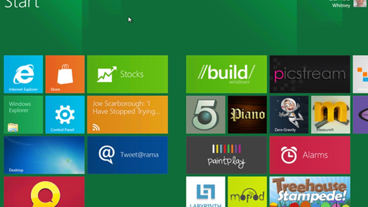
In the company's latest Building Windows 8 blog, Windows Live President Steven Sinofsky admitted that Microsoft has received some harsh criticism from people who just don't like the new Metro UI Start screen.
"We've seen some small amount of visceral feedback focused on 'choice' or 'disable'--a natural reaction to change, but perhaps not the best way to have a dialogue leading to a new product," Sinofsky said.
But Microsoft is apparently listening to the feedback. In the blog, Marina Dukhon, a senior program manager lead on the Core Experience team, addressed specific comments from people critical of the new UI.
• Windows 8 to offer both Metro and desktop interface
• Microsoft explains reason for Windows 8 Start menu
• Microsoft defends its Windows 8 Metro Start screen
• Windows 8 Developer Preview: Come and get it
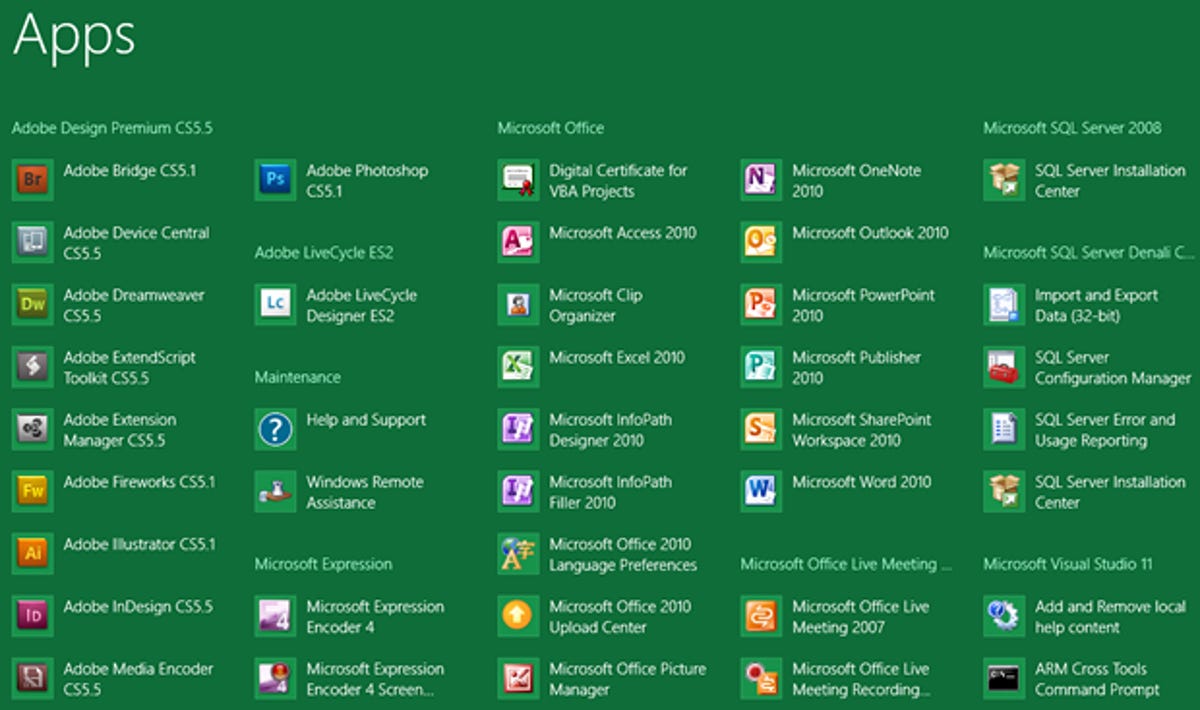
One disgruntled commenter called the new Start screen a "mess of icons" and said that it "just doesn't work, nor does it have any advantages over the superior Start Menu." Another person wrote that "the current metro-list of all apps is not suitable, since that lists everything alphabetically and I don't know the names of all those additional programs."
In response, Dukhon pointed to the inefficiency of the traditional Windows Start menu with its scrolling rows of folders and shortcuts as proof that a change was needed.
But in a concession to the feedback, she revealed that Microsoft is working on a new Apps screen that would mimic the design of the current All Programs menu. The Apps screen would let users organize their apps into groups, so that they can more easily find specific programs by category or product name.
"This way, if you are looking for something that you know came in your Visual Studio suite, but can't recall the exact name of the app, it should be much easier for you to find," Dukhon said. "And your alphabetical list should no longer be cluttered with app tiles that have obscure names because the developer was relying on the folder name to convey the actual name of the executable.
The Apps screen would also be denser and allow for more content, thereby reducing the need to scroll back and forth to see the entire list.
Another person commented on the limitations of the Metro Start screen on PCs by saying that "while I can see that the Metro style Start replacement works well for touch screens on small form-factor computers it will dramatically reduce my productivity on a desktop with a large widescreen monitor."
In response, Dukhon threw out a lot of facts and figures trying to analyze the "spatial arrangement on the Start screen," perhaps not the most user friendly way to address the issue. But she said that people would be able to customize the Start screen, an area that should see some improvement in the Windows 8 beta.
"The personalization of the Start screen is one of the features that we want to make great, and we're still iterating on it and to make it better," Dukhon said. "In the Windows Developer Preview, you can already try flexible group sizes, unpinning tiles, and resizing wide tiles to square tiles. And in the Beta, you'll also be able to use other improvements based on this dialog, in addition to creating, naming, and rearranging groups."
Yet another person stated that the new Start screen simply feels less efficient than the traditional Start menu. Again, Dukhon tried her best to tackle this issue using data and calculations to defend the new Start screen. But in the long run, this is another area that Microsoft knows needs improvement.
"Based on your feedback, one of the things that we're doing to make it faster to get to All Programs is to take you directly to the Apps screen when you click Search in the desktop," she said. "This potentially removes another step from this task, making it even more efficient in Windows 8 to launch an app from the desktop relative to Windows 7. Another thing that we're doing is increasing the number of rows of tiles that you can see on large monitors so that you can fit even more of your favorite apps closer to your mouse and make it faster to launch apps than before."
Finally, Dukhon reminded people that their feedback is based on the current Developer Preview, which is a work in progress, and that much still needs to be done to finalize the user interface. But the company launched the Developer Preview in part to allow people to share their comments.
"We did this in order to foster the dialogue and we want folks to understand that the product is not done," Dukhon said.