Microsoft revamps its Office 365 app icons with a simplified look
The company is redesigning the logos for Word, Excel and PowerPoint for the first time in five years.


- Named a Tech Media Trailblazer by the Consumer Technology Association in 2019, a winner of SPJ NorCal's Excellence in Journalism Awards in 2022 and has three times been a finalist in the LA Press Club's National Arts & Entertainment Journalism Awards.
Microsoft is rolling out a redesign of its app icons for Office 365.
Microsoft Office is rolling out new app icon designs for the first time in five years.
Icons for apps such as Word, Excel and PowerPoint will sport a more simplified look, Microsoft said in a Thursday blog post. The changes will start showing up on mobile in the next few months, and on Windows and Mac in the months following.
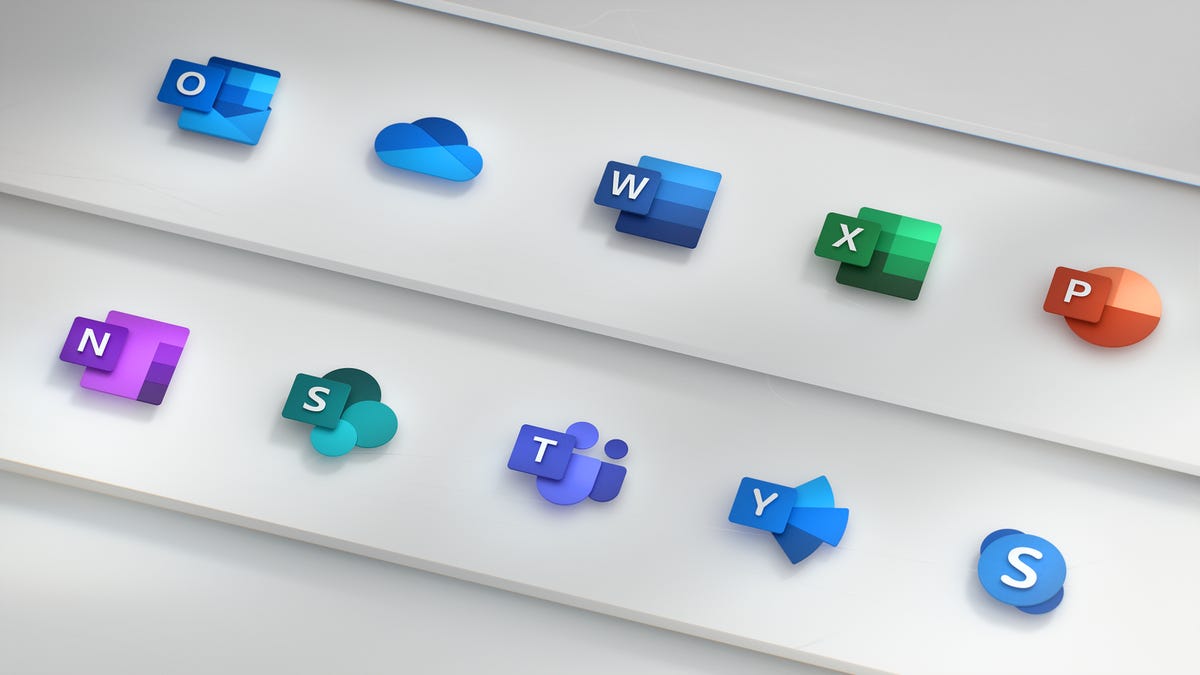
The new icons show two separate panels: one with a letter on it (such as a W for Word), and another with an app symbol (such as lines of text for Word). The previous icon design merged the two panels.
"This allows us to maintain familiarity while still emphasizing simplicity when inside the app," Microsoft said in its blog post.
The letter-to-symbol ratio on the icons has also shifted. Whereas the previous icons emphasized the letter of the app, the new icons emphasize the app's symbol, "since the letter feels representative of the tool itself, whereas the symbol speaks to the content created within it," Microsoft said.
The icons maintain Microsoft's conventional color coding, which includes blue for Word and green for Excel. But the hues of the new icons are bolder than those used for the previous icons.
More than one billion people in a variety of industries, locations and age groups use Microsoft Office, the software giant says. The icon redesign is meant to reflect the simplicity, versatility and connectivity of Office 365, the company said. As an example, the company pointed to Office users working together in real time irrespective of the devices they're using.