iTunes 10 user interface sees some minor changes
Apple's iTunes 10 upgrade brings a number of interesting enhancements to the program, including the "Ping" social-networking option and the new clutter-reducing "hybrid" view for album covers and song listings. Despite these features and other new improvements, when it comes to the user interface there are some outstanding drawbacks in the new version of iTunes.


Apple's iTunes 10 upgrade brings a number of interesting enhancements to the program, including the "Ping" social-networking option and the new clutter-reducing "hybrid" view for album covers and song listings. Despite these features and other new improvements, when it comes to the user interface there are some outstanding drawbacks in the new version of iTunes.
When you launch the program for the first time, the initial impression is that somehow the window may not be in focus. As an OS X user I am used to window elements being crisp and colorful when a window is in focus, and the iTunes 10 window appears a bit washed out.

The main reason for this is the sidebar. In older versions of iTunes all the icons in the sidebar were various colors (blue for the libraries, green for the iTunes Store items, and purple for smart playlists, with other colors dotted around). This really filled out the sidebar and made it come alive, but in iTunes 10 we see all items are a dull gray color that blends in with the background of the sidebar and washes it out.
Oddly when you put the main iTunes window out of focus by bringing up another window (for example, the iTunes preferences) or switch applications, the contrast between the items in the sidebar and its background increases and makes them more visible.
Along with the sidebar changes, there are some minor details about the new iTunes look that contribute to it looking washed out:
- Lighter check boxes
- No vertical dividers between columns
- Fainter dividers between column titles
Though these issues are things that you can get used to, they do initially make you do a double-take at times, especially when using other more colorful applications such as the Finder.
Beyond the window contents, there is one other major feature change in iTunes that not only differentiates it from prior versions of iTunes but also from most other OS X applications, and that is the size and placement of the close, minimize, and zoom buttons.
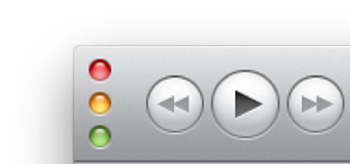
Practically all OS X windows have had these buttons along the top title bar, but in iTunes 10 Apple has removed the title bar and slid the buttons down along the left side of the bar similar to its placement when in "mini-player" view. Why Apple did this is beyond me, especially since it does not save much screen or window real estate (about 2mm in my measurements).
Beyond any small benefits the new button placement may have, the change is a bit of a hypocritical move given Apple's persistence on consistent interface design guidelines. For a while Apple has advocated standard interface element layouts to its developer community, so to see the company break this in iTunes is a bit odd.
Luckily the new button positions can be reverted back by changing a hidden setting for iTunes 10. To do this, go to the Terminal and enter the following command, and then relaunch iTunes (to revert this change, repeat the command with "NO" instead of "YES"):
defaults write com.apple.iTunes full-window -boolean YES

Lastly there's the iTunes 10 icon, and peoples' stance on this is more of a matter of perspective. I personally think it's about time we see something different from the previous iTunes icons; however, a few other people have a point when they say the icon looks bland. Though not colorless, the icon does also change from the theme used in Apple's other icons, which is the lack of use of any objects or devices in it.
If you look at most of Apple's icons, there are things like stamps, ink wells, compasses, calendars, photos, goggles, and other devices that are relevant to the application being represented. In iTunes the device was the CD, but in the new icon there is no device or object, and it looks more like an elevator button than what we've come to expect from Apple. It's not necessarily ugly, but is a change that people have noticed.
As with changing the window button positions, you can change the iTunes icon back as well; however, it is not a matter of altering a hidden setting. For any OS X application, file, or folder, you can get information on it in the Finder (highlight it and press Command-I) and then select the icon at the top of the resulting information window. Then copy any desired picture (do a Web search for "iTunes icon" to get an older version, and then copy that) and paste the picture into the information window when the icon is selected (it will have a blue outline when selected). This will change iTunes' icon, a change that can be reverted by selecting the icon and pressing the delete button.
Do these changes indicate a change in Apple's theme and style options for OS X? In the past Apple has undergone some similar changes. The first was the switch from the blue candy-stripe theme to the uniform-gray or brushed-metal look. The second that comes to mind is the Tiger to Leopard change in the Finder's folder icons, which did away with colorful icons for the default home folder items.

The changes in iTunes 10 are small and style-based, and do not affect the program's performance or features, but do outline that the user interface is a very important aspect of the program.
Questions? Comments? Have a fix? Post them below or e-mail us!
Be sure to check us out on Twitter and the CNET Mac forums.