Desktop design: Apple vs. Sony
Crave takes a look at recent desktop designs from Apple and Sony.


It's likely that more than a few would-be Mac buyers who decided that for whatever reason they couldn't part with Windows ended up with a VAIO. All PC manufacturers place an importance on design, of course, but no two more than Apple and Sony. Both companies recently put out updates to their all-in-one and small-form-factor systems. Let's take a look at how they compare.
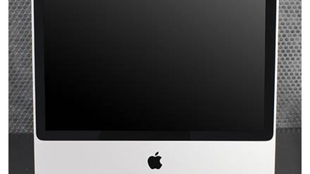
Apple's latest iMac effort returns the shape and stand of the previous iteration but adds an anodized aluminum finish to the enclosure and a glossy glass panel to the display. The case is made from a single piece of aluminum, which means nary a seam to collect dust or dirt except for around a small panel on the bottom you can remove to add more RAM. With its VAIO LT19U, Sony has really taken a step forward, but to this reviewer's eyes, it's still no match to the iMac in terms of overall design. (There's a surprising gap in price, which is also not in Sony's favor.) Sony goes for the floating-in-space look with the VAIO LT19U, using a clear strip of plastic in the frame. No question it lends the system a unique look, but the overall appearance looks busy to me because the clear section of the frame sits between a gray bezel that frames the display itself and a thin gray border on the outer edge. I prefer the cleaner lines of the iMac, with its simple black bezel surrounding the screen and a thin strip of aluminum showing along the sides and top that elegantly widens below the screen. The thicker bezel on the VAIO also makes the size of the screen seem smaller. To its credit, Sony cleaned up the back its all-in-one, which previously looked like the underside of a laptop with black vented plastic interspersed with ugly white manufacturing stickers.
Apple didn't change the design of the Mac Mini. It didn't have to; the Mac Mini just about the smallest SFF PC you'll find (without venturing into Stealth territory), and it's an undeniably cool-looking little PC with that anodized aluminum again along the sides, a Lucite top, and a rugged rubber base. Sony's VAIO TP1 has been widely compared to a Roomba in appearance, so I'll choose another object: a toilet paper dispenser. You know, the kind you find in public restrooms where the toilet paper is inside the thing. (Perhaps that's why Sony calls it the TP1.) I appreciate Sony taking a risk here, but this VAIO looks more odd than good. It looks more like an accessory you'd add to the first flat-panel iMac of yore rather than a PC you'd buy today. Add the fact that you can get two Mac Minis (and a copy of Vista Home Premium) for the price of a lone TP1, and it's hard to make an argument (You absolutely need an HDMI port? You hate right angles?) for Sony's round PC.
What's your take on Apple's and Sony's desktop designs? Let me and Crave readers know below.
Care more about features than design? See all the specs compared here.