'Cosmic Panda' puts a shine on YouTube
YouTube could be getting a makeover. The Cosmic Panda experimental redesign offers a slicker, darker experience.


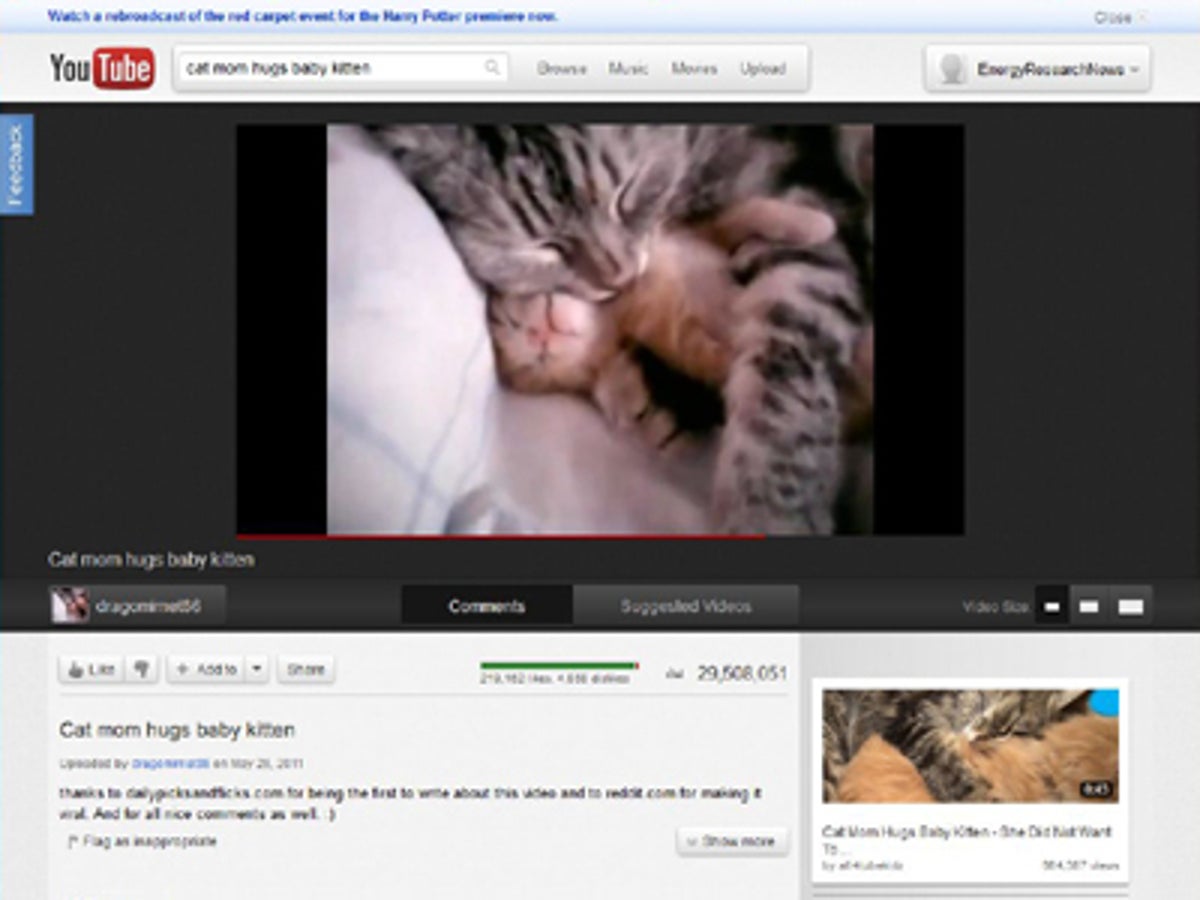
It looks like YouTube is going slicker, simpler, and darker. Take a look at the experimental redesign rolled out today. Dubbed "Cosmic Panda," it boosts the old, cluttered, entirely-too-white video portal into the realm of contemporary Web design in many ways. It's about time, but I'll take it--it's pretty good.
Videos and thumbnails are easier on the eyes, controls are more intuitive, and you can do more channel customization.
Videos are set against a dark background to lower the contrast between the page background and video content. Thumbnails are bigger, and on playlists they show up immediately below the playing video. Videos come in three sizes rather than two, plus full-screen. And the Like, Add to, and Share buttons are visually set off from the video controls to cleanly separate viewing from organizing.
Cosmic Panda's biggest change is in channel customization. You can choose among four templates:
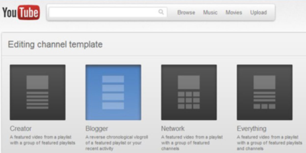
Creator: a video above a group of playlists
Blogger: a reverse chronological vlogroll of a playlist or your recent activity
Network: a video above a group of channels
Everything: a video above a group of playlists with a group of channels below
The Branding tab on the channel setup page makes for fewer clicks to add a background image or change your profile picture (dubbed an avatar).
You can also keep videos running when moving between videos, playlists, and channels. Sadly, this is available only in Chrome. I hope Google won't let this state of affairs persist.
Cosmic Panda doesn't break any ground, but it does put YouTube's look and feel and ease of use about where it should be. I did notice a disturbing resemblance to MySpace customization, though. Here's hoping next time YouTube aims for hitting it out of the park--taking it two steps ahead rather than just playing catch-up.