Browser makers get past high-resolution image impasse
Newer screens packed with pixels are great for detail, but only if software can take advantage of them.


- Shankland covered the tech industry for more than 25 years and was a science writer for five years before that. He has deep expertise in microprocessors, digital photography, computer hardware and software, internet standards, web technology, and more.
It looks like browser makers have settled on a way to handle high-resolution images, which are now common with the arrival of screens like Apple's Retina displays.
Browser makers haven't offered Web developers a consistent, easy way to show the right image for a given screen's size and resolution -- an idea called responsive design. That's been a shame, because screens with high-pixel densities are increasingly common on laptops, tablets, and smartphones and can offer crisp, detailed photos and graphics.
The first breakthrough came in September when support emerged for a standard called srcset, which was nudged along when Apple added the feature to Safari. The approach seemed to be winning out over a rival proposal, the introduction of a new "picture" element.
But that consensus was shattered when Google introduced another option called src-N, which appealed to Mozilla's Firefox developers. A long debate ensued over November, December, and January that produced a different outcome: a hybrid approach emerged that includes srcset and also adds some of the src-N ideas to the picture element.
One change that src-N had offered over srcset was "art direction," which, for example, lets a Web developer show a cropped version of a photo on a smaller screen.
There was "too much pushback on src-N, so we gave up on it," said one of its authors, Tab Atkins Jr., in an e-mail to CNET. The Responsive Images Community Group has been working on the new approach since then, he said.
"This approach seems cleaner than src-N," said Apple's Maciej Stachowiak of the newer approach. The curious can examine a draft version of the responsive-images specification to see how it works in detail.
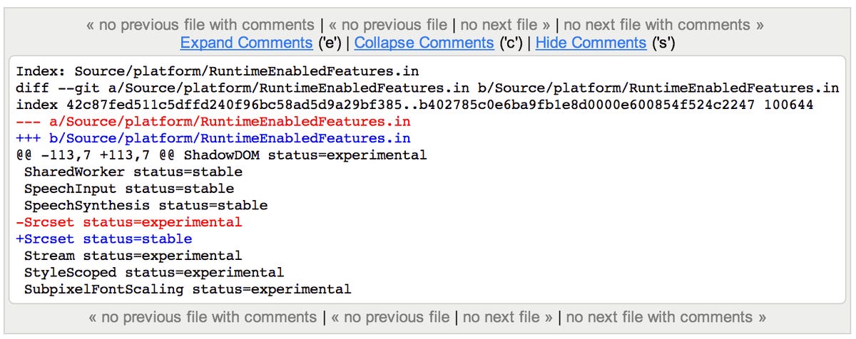
Google is moving ahead with the idea with srcset support arriving in Chrome as a first step. On Sunday, developer Yoav Weiss added srcset support with a one-line change that moved srcset from an experimental to stable feature.