BBC maps all UK car crashes since 1999
The BBC has created a fascinating animation that depicts the number of road accidents that have occurred in Great Britain since 1999.

Ever wondered how many car crashes occur in the UK? No, probably not. And if you have, you've probably guessed the number was somewhere north of 'quite a few' and moved on with your life. That's how we roll.
The bods at the BBC roll in a very different way. Not only have they questioned just how many road traffic accidents occur on UK streets, they've channelled their warped curiosity into creating a visual illustration of all serious crashes (ie those that have resulted in injury) since 1999.
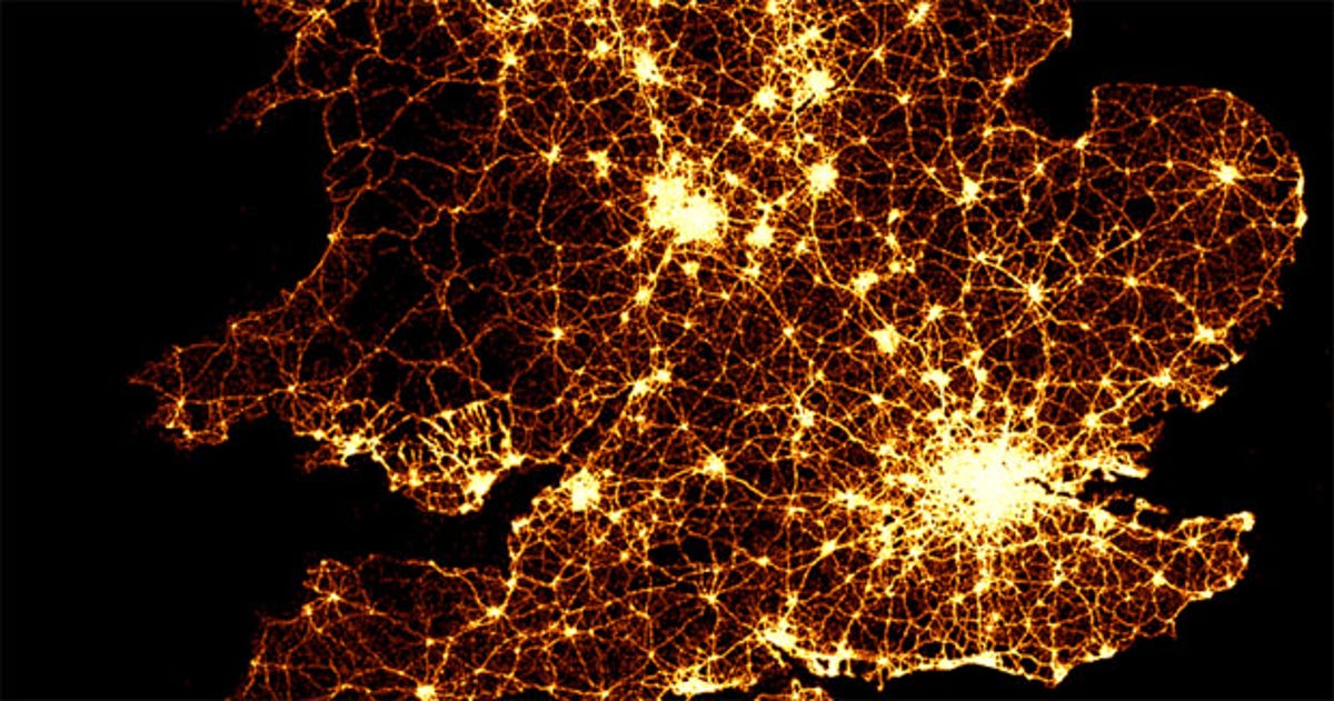
What they came up with is a time-lapse animation that shows 12 years of road crash data, with each crash represented as a point of light on a map of the UK. The brighter the area of light on the map, the more collisions have occurred in that area.
The animation, which looks a bit like a real-life aerial shot of the UK, is a fascinating means of depicting crash intensity, and provides visual insight into when and where road traffic accidents occur the most.
The animation clearly shows the number of crashes increasing in the daylight hours as more people take to the road, with definite peaks in the morning and evening rush hours. It also shows more crashes occurring in big cities -- London, Manchester and Newcastle are lit up like like fireworks -- while smaller towns and cities appear relatively safe.
The Beeb has also prepared separate close-up animations that show how many crashes occurred in specific regions including London, the Borders, the North, the Midlands, South Wales and the West.
Head on over to Auntie B's webbed area now to see the data in all its glory for yourself, then flick back to our Facebook page to tell us what you think.