Apple's total rethink of the Apple Watch is exactly the step forward it needed
First impressions: WatchOS 3 could be the start of a much better wearable.


- Nearly 20 years writing about tech, and over a decade reviewing wearable tech, VR, and AR products and apps
The Apple Watch is Apple's most beleaguered product. It's not fast enough. It's not always intuitive. It's not the best fitness tracker. But that might change very soon. And at Apple's WWDC developers conference, the company wasted no time addressing all of the ways it would improve. And the differences could be profound.
Bothered by slow apps? Here, look at this. A demo of app-opening that went from spinning wheel to instant.
Confused by how to navigate? Here, a list of apps you can open, by pressing a side button.
Wearable tech is still a weird new world, and not always a very popular one. Certainly not a necessary one. But the Apple Watch looks like it's ready to regroup and attack the challenges again in the fall with WatchOS 3. It's that fresh attitude that made Apple Watch my favorite part of WWDC. Here are my first impressions of what's to come.
Rethinking the interface
The side button currently is used to bring up a circle of friends to contact. Not anymore. In WatchOS 3, it's a way to bring up a Dock full of apps, with previews of bits of information to glance at. Swiping up on an Apple Watch right now brings up Glances, an attempt to do the same thing. But that'll be gone: instead, swiping up will bring up a control panel of quick settings.
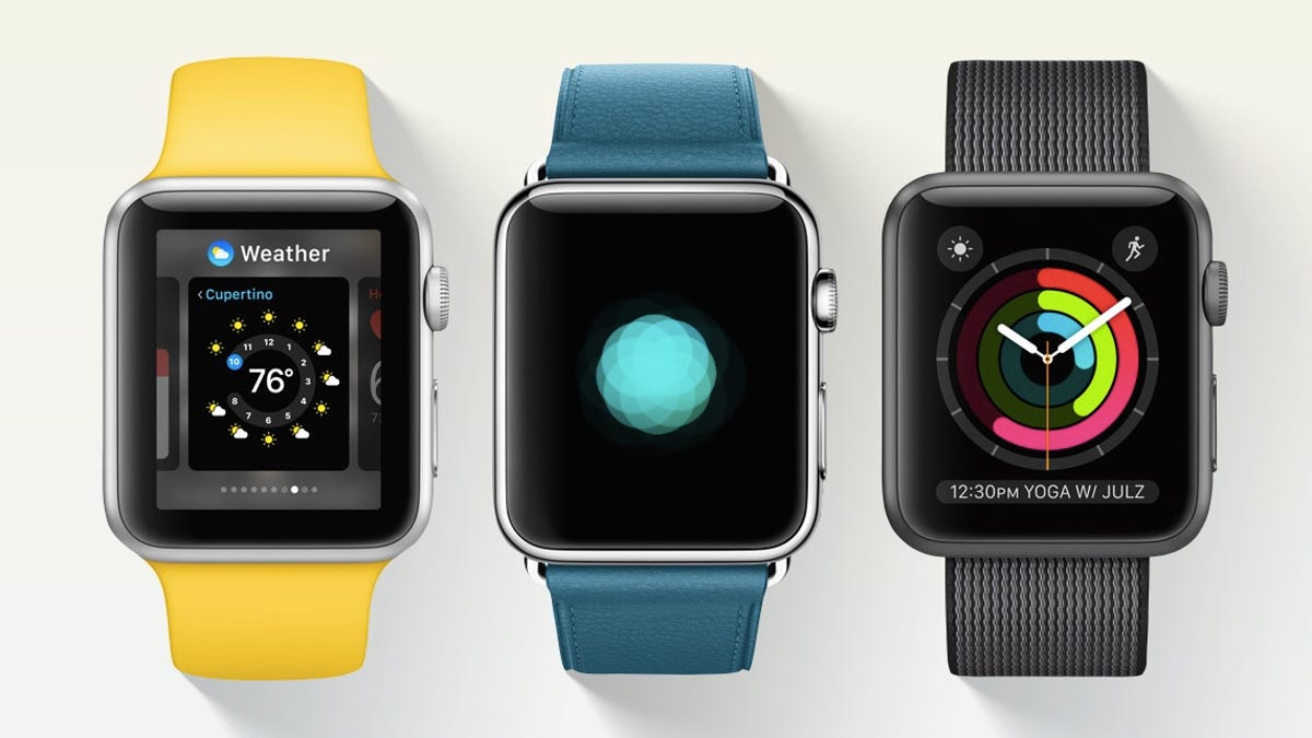
Change your watch face? Swipe left and right. Currently, you have to press in using Force Touch.
Apple is remapping the pieces of the Apple Watch interface, and doing it boldly. It's needed: the watch feels complicated right now, needlessly so. Now Apple seems to be acknowledging it.
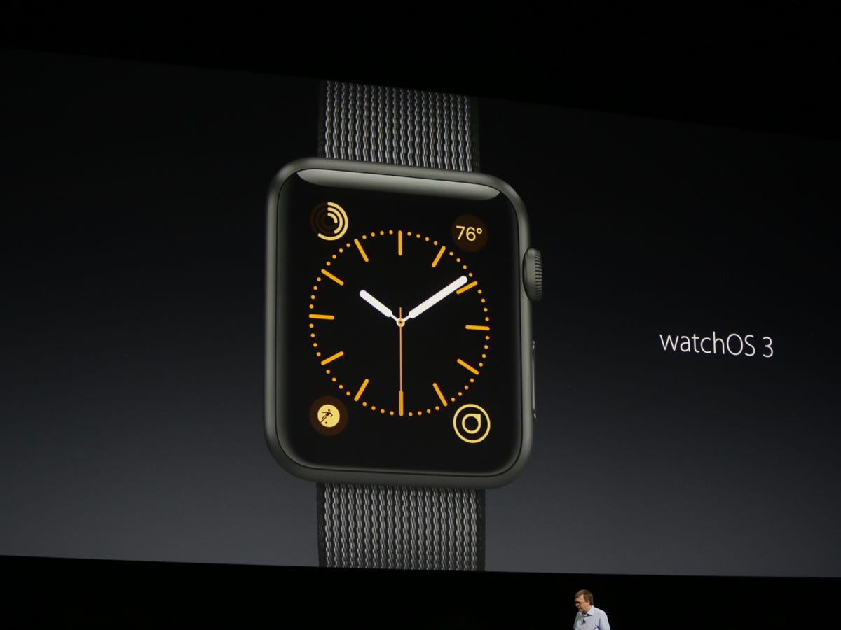
Anything on the watch face, or in the dock, now loads up faster thanks to background updates.
The need for speed
Rather than trying to slap new features on a new device, the Apple seems to be homing in on the Watch's most essential ideas. I use a smartwatch mainly for messages, bits of info, reminders, fitness, and telling time. I stop using a smartwatch when it's not fast enough.
Speed could be WatchOS 3's biggest improvement. Apps don't literally load faster: they preload in the background, cleverly lying in wait. So, they now pop up instantly when activated. But the smarter work happens behind the scenes. Background functions are all over the blueprint of WatchOS 3: in its automatically-refreshing apps, the Apple Watch might start feeling more like a living thing on my wrist. Not just a pager that forwards emergency messages, but an ever-updating ticker.
The Apple Watch updates certain apps up to 50 times a day in the background: those in the Dock, which you can assign 10 to, plus 5 more complications. Others load the traditional (slower) way. But 15 apps on fast-track seems like enough for me.
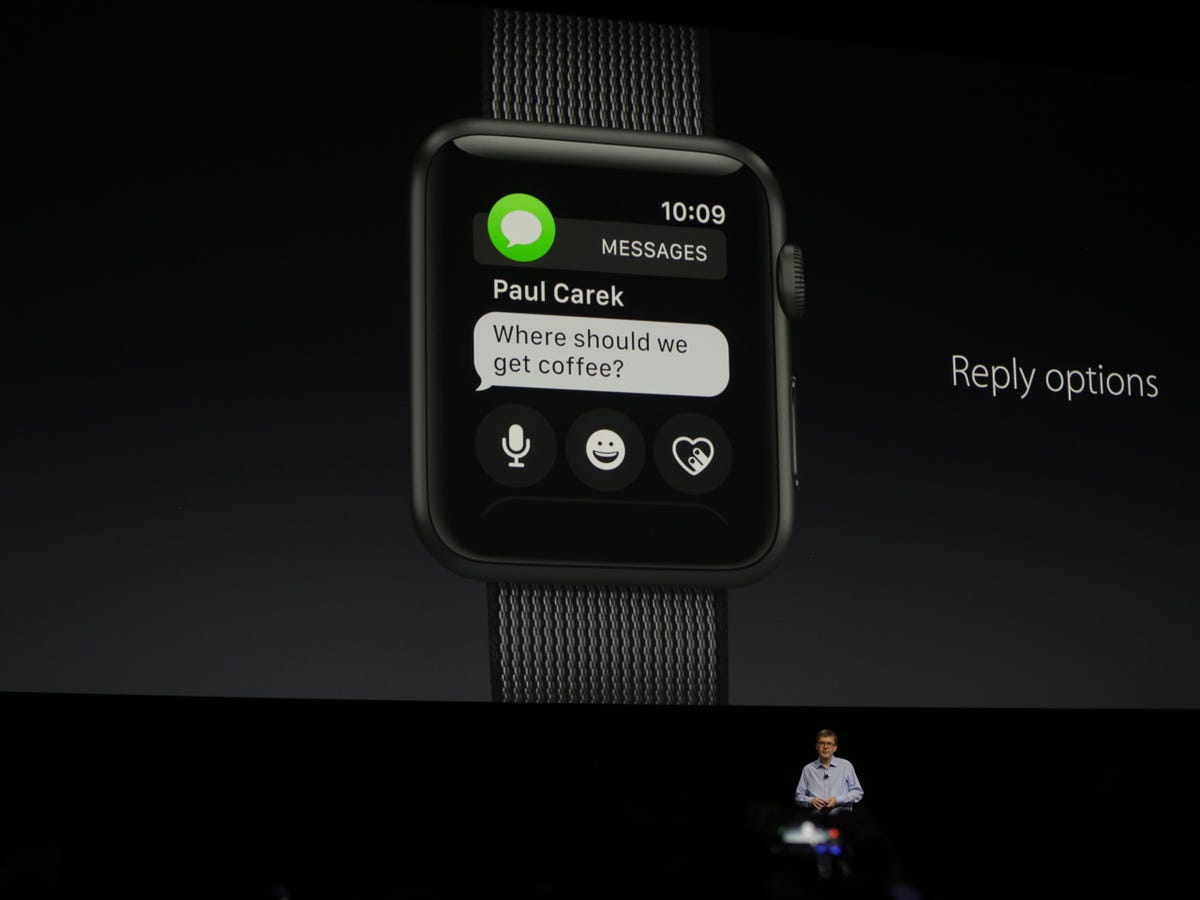
Messages now contain more of the message options, instead of the now-vanished Friends circle.
Messages stay in one place
All the crazy, sparkly, sticker-filled messaging of iOS 10 can be received on an Apple Watch, or at least most of it. It seems to matter more on the watch. It's harder (or, even impossible) to load alternative messaging apps, and ways to communicate are generally more restricted. So, emoji and stickers carry more meaning.
Responding, the recent stickers get saved to send them back to people. You can't load in new stickers like you will on iOS 10, but it's a start. The new finger-scribbling handwriting mode gets around the difficulty of spelling names or entering specific numbers (much like Android Wear 2.0). And all the weird "Digital Touch" stuff, like drawing, or sending heartbeats, is contained in Messages now. Where it should be.
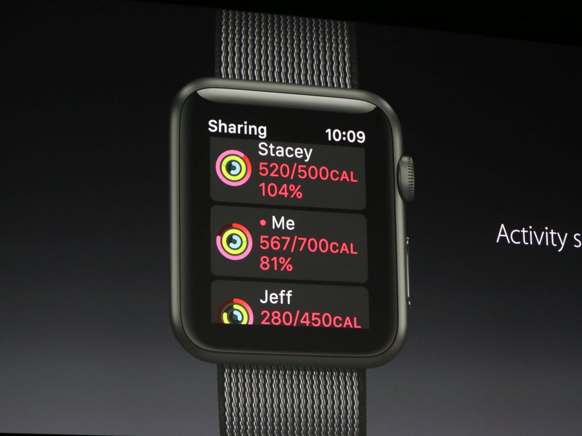
Apple Watch fitness gets social.
Being a better fitness tracker
Most of all, the Apple Watch wants to be everyone's fitness tracker. To be, as my family would say, a Fitbit. It would make sense to add more features, be better to use. Finally, there's a fitness watch face (three of them). There are socially-connected fitness goals and ways to keep up with friends. More info's crammed into the in-workout readouts, for one-glance ease.
Third-party apps are going to get access to accelerometer, gyro and other wrist features. Maybe this will allow other fitness apps to finally feel like real on-wrist tracking alternatives. Or, maybe, coaching tools. And there's an effort at making inroads to relaxation and mindfulness with Breathe, another app on the watch. It sounds like another wellness metric, similar to what some standalone trackers like Spire already aim to do. Maybe, in the future, in addition to the three rings of activity, exercise and standing, breathing/relaxing will be added.
I don't think WatchOS 3 answers all the fitness needs of the Apple Watch, but it does a lot more than I expected.
Clean and simple
By eliminating parts that don't work and creating smoother ways to function, WatchOS 3 gets the Apple Watch back to the basics and does them even better. I've only had a first look, but I like what I'm seeing. I'd still wait till the fall to see what other surprises are in store (a watch face store still feels like a necessary no-brainer), and for WatchOS 3 to actually arrive...but I found the changes here matter. And they could indeed make Apple Watch a lot more useful.