Hands-on with the new and improved Android Auto
I spent a week with the first major redesign to Google's automotive interface in five years.


- North American Car, Truck and SUV of the Year (NACTOY) Awards Juror
Android Auto gets its first major redesign since being announced in 2014.
I've been using Android Auto -- Google's automotive smartphone interface -- almost daily since it hit the road back in the spring of 2015. And, in all of that time, the interface hasn't changed very much. Whether in one of the dozens of cars that I review every year or in my personal ride, Android Auto today looks about the same as it did when it was first announced five years ago at Google I/O 2014. But just a few months ago, at Google I/O 2019, we learned that Android Auto would be getting its first major redesign since launch. Last week, Google invited me to try out a preview build of the new look. I've been living with the new Android Auto for a few days now and I am loving it.
Here's everything that I've learned so far.
Started from the bottom (bar)
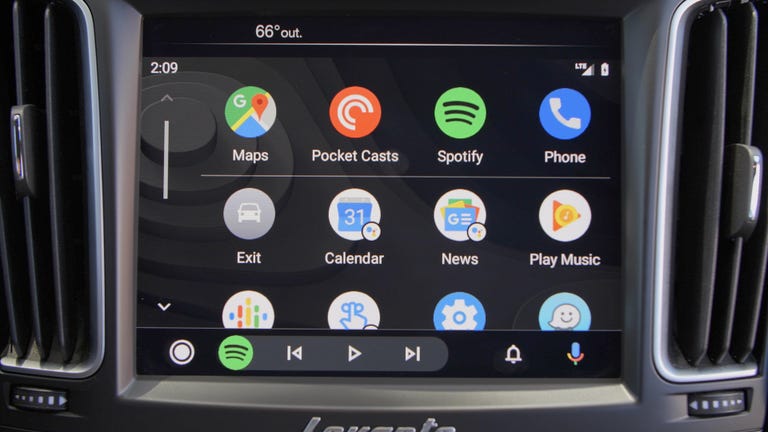
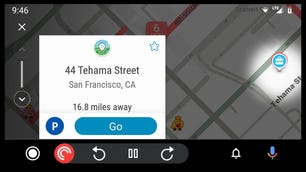
The lower edge of the Android Auto screen was traditionally home to five static shortcuts to the five main areas of the interface: navigation, phone, home, audio and OEM features. That bottom bar gets a lot more dynamic for this new generation. Now, you'll find links to the new app launcher in the lower-left corner and icons for notifications and Google Assistant voice search on the right.
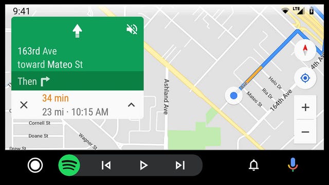
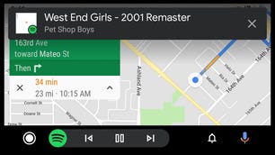
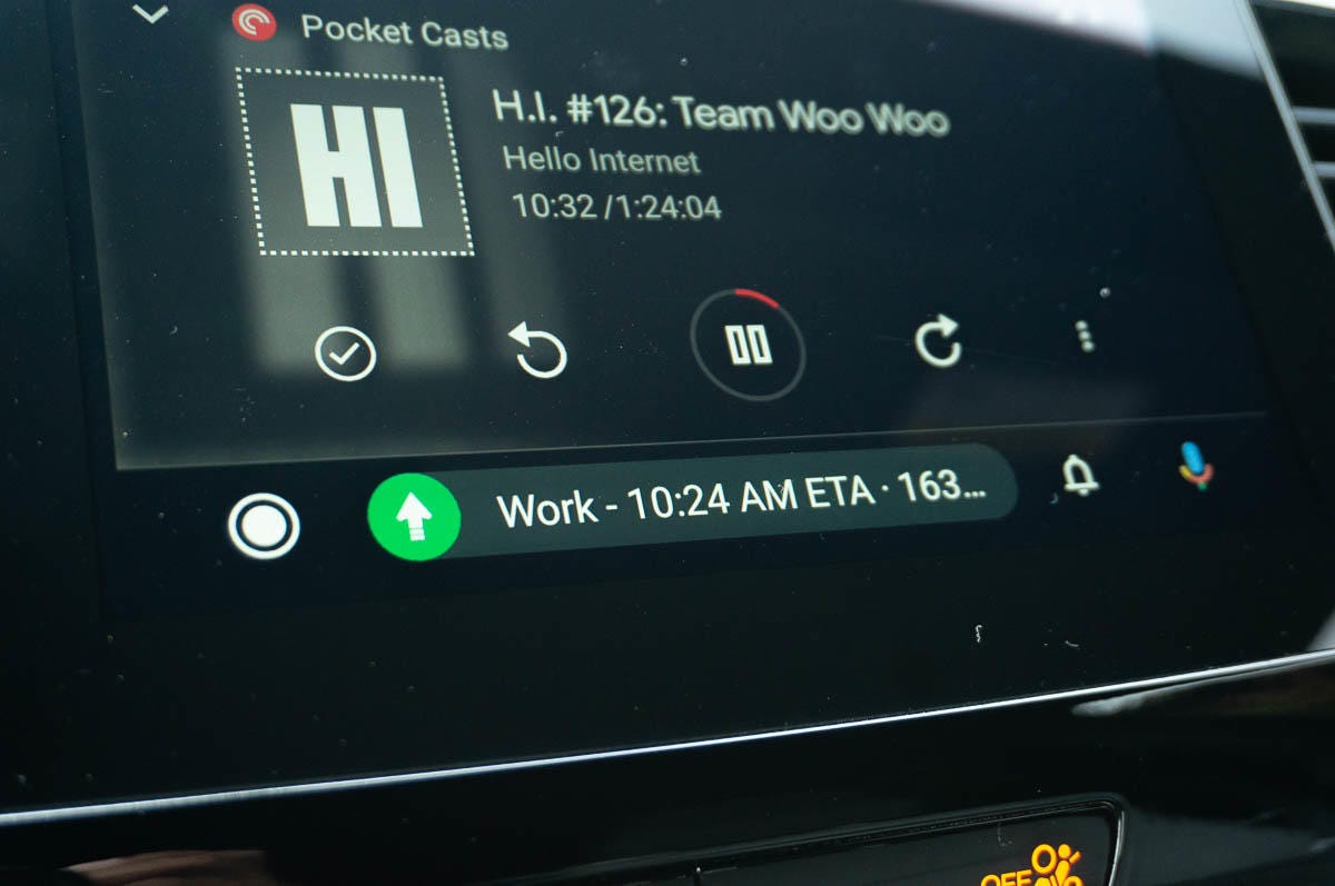
In the middle, a new multitasking area changes function depending on where you are in the interface and what tasks are running in the background. So, if I'm looking at the map in the main area of the display, the lower bar might display pause and skip buttons for an audio app that's currently playing or mute and end call buttons for a phone call in progress. Alternatively, if I'm viewing a music app's Now Playing screen, the lower bar can display the next navigation instruction so I don't miss a turn or an estimated travel time to a frequently chosen destination.
Jumping between two functions, for example audio and navigation, is also now as simple as tapping the round icon at the left edge of this new multitasking area.
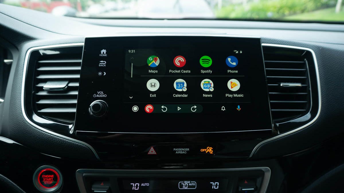
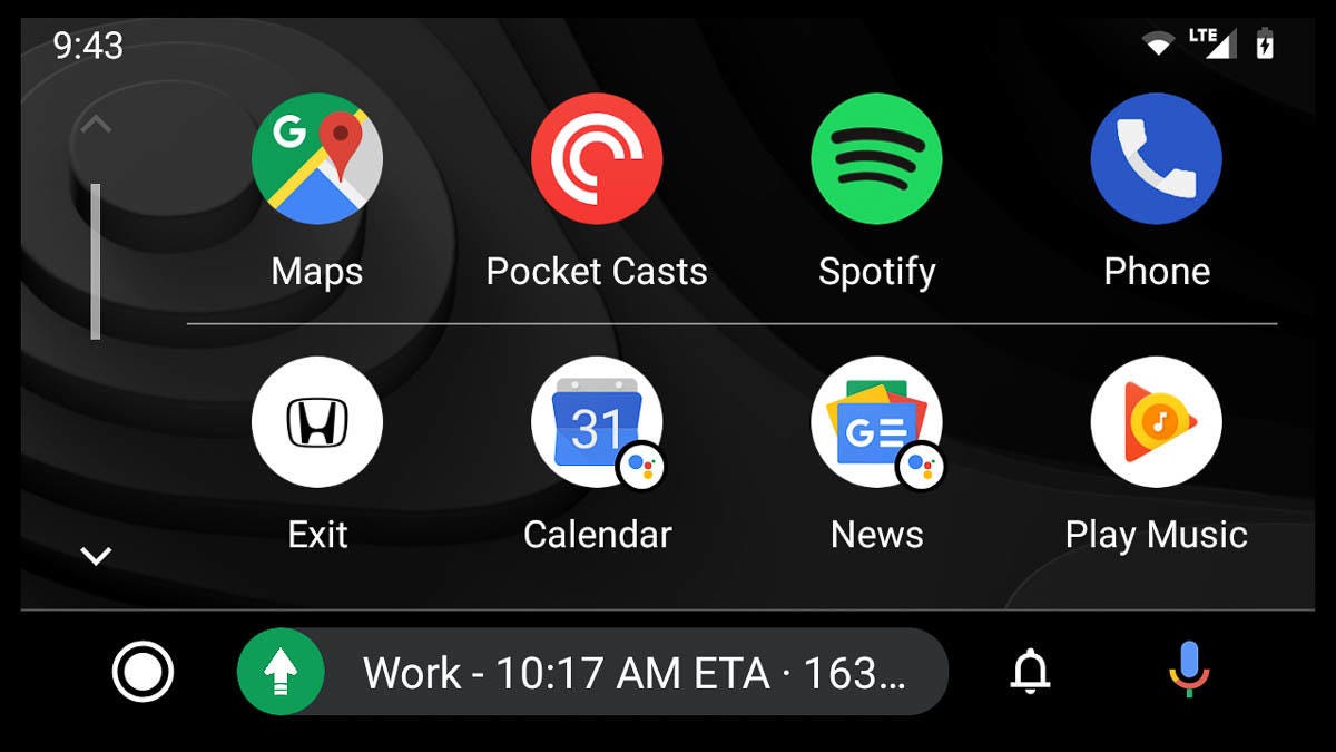
The new app launcher
Gone is the home screen's vertical list of cards that used to greet you when you launched Android Auto. Those notifications for missed calls, text messages, reminders and calendar appointments now live in their own notifications menu, accessible via a bell icon on the bottom bar.
Technically, there is no "home screen" for this generation. The system now launches straight into whatever app you were last running -- whether that was Google Maps , Audible or whatever -- which saves you a click when it's time to hit the road.
That circular icon in the bottom bar then takes you to Android Auto's new app launcher where all of the installed compatible apps live. It's organized in a grid that looks a lot like the Google Pixel launcher on Android phones . The top row of icons is home to your four most frequently used apps. (For me, that's Google Maps, Spotify, Pocketcasts and Phone.) Below that are the rest of the app icons and a few new surprises.
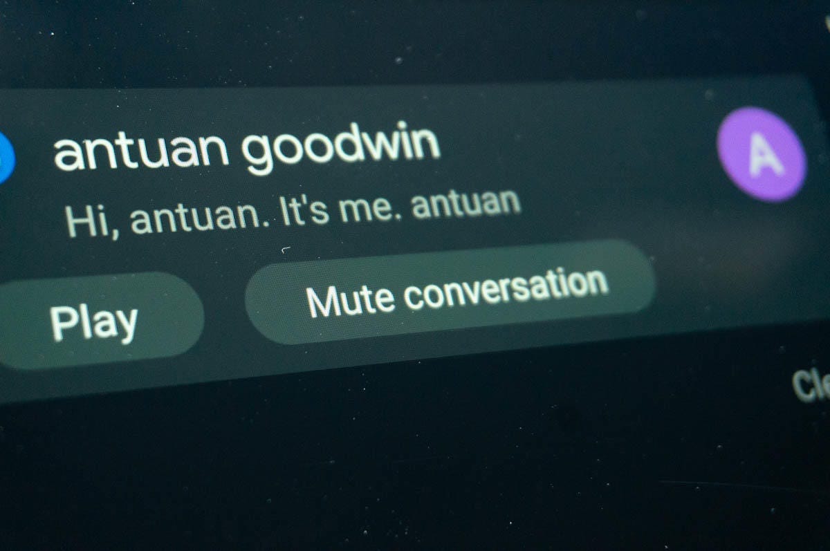
A feature I'm especially loving is the ability to temporarily mute notifications from individual conversations, which comes in handy when my "Miata Friends" group chat gets out of control.
Mixed in among icons for Waze, Google Play Music and more are new Google Assistant shortcuts to Calendar, News, Reminder and Weather. Clicking Calendar caused Google Assistant to read a list of appointments for the day from my Google Calendar; Weather gave current conditions and a forecast for my location; and News read aloud news headlines and podcasts that I'd previously told Assistant I was interested in.
The Reminder button didn't read my current Google Assistant reminders aloud -- those show up in the Notifications area. Rather, it prompted me to add a new voice reminder, which is a bit redundant when I can already do that by pressing the microphone and saying, for example, "Remind me to call Emme when I get to work."
A new Settings menu lets you adjust elements of how Android Auto works by calling up the settings screen on the host phone. I'd have preferred an on-screen menu, but at least you don't have to totally disconnect and reconnect anymore to make simple tweaks. Also tucked into the app launcher is the Exit icon, which sends you back to the host car's OEM interface in one click, which makes much more sense than how the old setup dedicated an entire submenu to this function.
Apps are now organized in an icon-based launcher that looks a lot like a chunky version of the Pixel Launcher for Google's phones.
Now playing
Google Maps and Waze look and function basically identical to before, but the rest of the apps have received a new dark theme and a new font. Album artwork, which was stretched across the Now Playing screen's background, has been shrunk back down into a small square. I don't think this looks as good, but it's certainly easier to read the song titles now and the darker scheme should help with nighttime visibility.
The status icons (for wireless and Wi-Fi signal strength and phone battery state) are smaller and tucked deeper into the upper right-hand corner and the time moves into the upper left. (Hopefully, they're not making room for an Android Auto notch.)
The new interface also supposedly supports "colorful accents that match your car's interior," according to Google, but so far I haven't noticed any difference in the three cars I've tested with so far: a 2020 Cadillac XT6, our long-term Honda Passport and the Maserati Levante in the Roadshow garage this week.
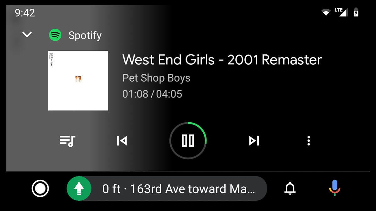
Most of the interface now features a dark color scheme and a new font for improved visibility.
Redesign roll out
I've got four years of muscle memory with the old Android Auto, so my first few hours with the new interface were a little awkward. But I quickly acclimated to the new multitasking system, jumping seamlessly back and forth between maps and music.
With the bottom bar showing complementary navigation info or audio controls all of the time, I found that I actually didn't need to jump back and forth nearly as much and I was able to focus even more on the road ahead -- always a good thing. I think, overall, this new version of Android Auto improves on both the form and function of the automotive interface and I'm looking forward to spending more time on the road with it.
The next generation of Android Auto should be rolling out to users over the next few weeks via a combination of app and server-side updates. Once updated, a notification in the in-car app will allow you to try out the new look and feel for yourself.
Originally published July 30.
Update, July 30: Clarified how the Settings menu works.
Update, August 8: Adds video.